Did you know we can use Power Apps to generate dynamic and powerful charts? Yes, we can generate visually appealing charts with other tools, such as Power BI, by leveraging Power Apps Chart Controls.
This Power Apps tutorial explains what does mean by Power Apps Charts, different types of chart controls in Power Apps and how to add a chart in Power Apps Screen.
Moreover, we will discuss how to use the Power Apps chart from the SharePoint list, Power Apps Pie chart, and how to work with the Power Apps Pie chart from the SharePoint list with various examples.
Power Apps Charts
Let’s discuss what Power Apps Charts is!
Power Apps Charts are graphical representations of data utilized within Power Apps to offer a visual context for data analysis and make it more straightforward.
These charts are essential for business applications because they help users quickly identify trends, patterns, and insights from data sets.
Refer to the image below for how Power Apps charts look like:
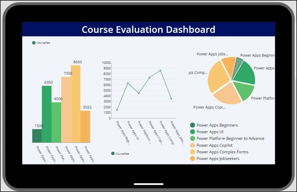
This is the overview of Power Apps Charts.
Different Types of Charts in Power Apps
The table below represents the Power Apps Chart types:
| Type of Chart | Description | Use Cases | Image |
|---|---|---|---|
| Column Chart | Displays data as horizontal bars; the length of each bar is proportional to the value it represents. | It is ideal for showing data changes or comparisons among items over time. | 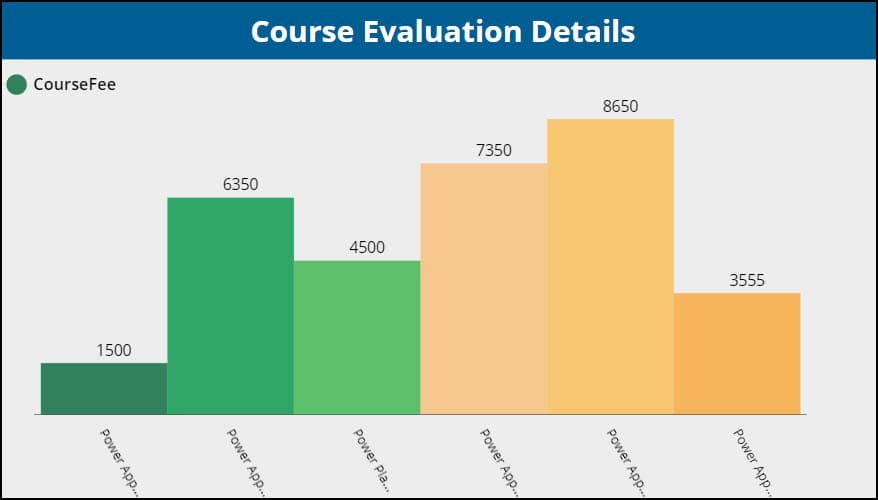 |
| Line Chart | It uses points connected by lines to represent data, typically to show trends over time. | Best for displaying data trends and changes over intervals, such as months or years. | 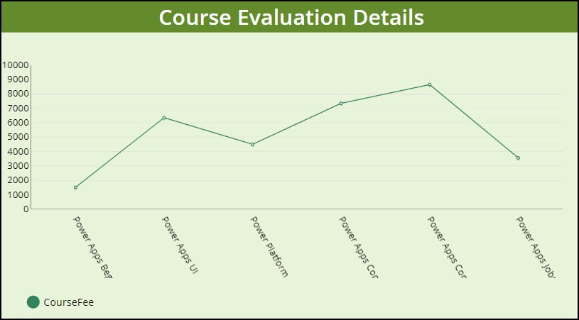 |
| Pie Chart | Represents data in a circular graph, with slices representing parts of a whole. | Suitable for showing proportions and percentages within a dataset. | 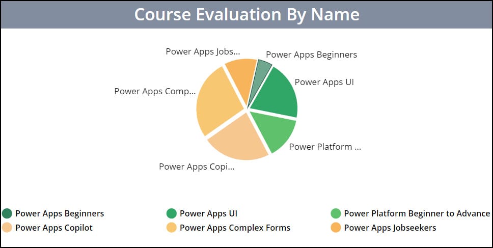 |
| Power BI tile | It lets you embed a single visual tile directly into your app from a Power BI dashboard. | Sales Performance Dashboard in a Retail Management App. | 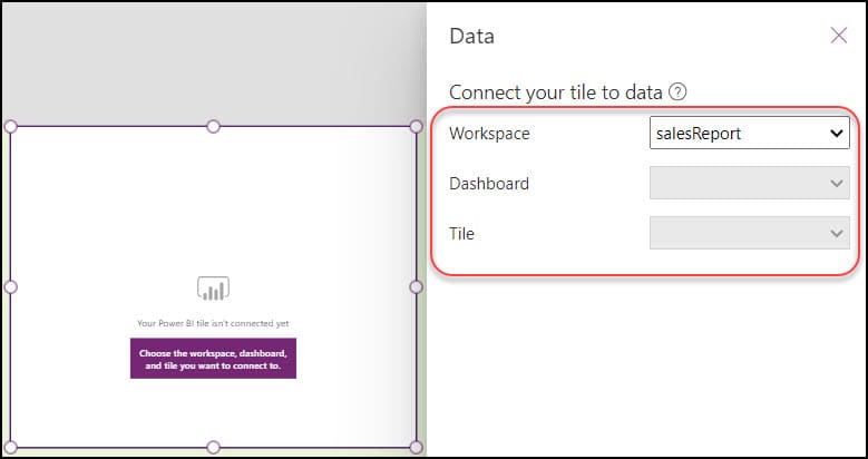 |
These are the four different chart controls in Power Apps.
Power Apps Chart from SharePoint List
Now, we will see how to use the Power Apps chart from a SharePoint List. Let’s achieve it step by step.
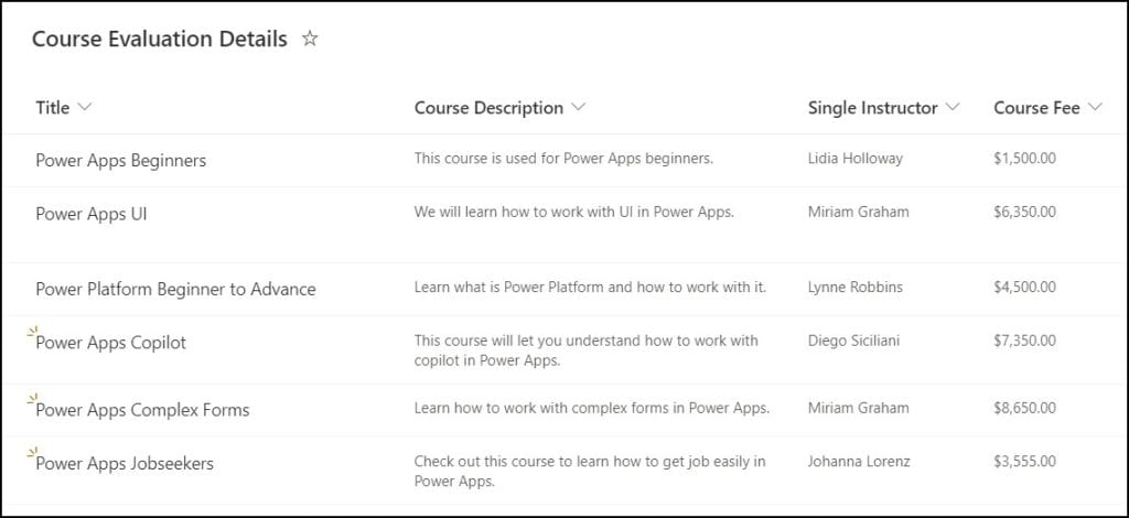
1. The screenshot below represents a SharePoint list named Course Evaluation Details. This list has the below columns with different data types:
| Column | Data type |
|---|---|
| Title | Single line of text |
| Course Description | Multi-line of text |
| Single Instructor | Person |
| Course Fee | Currency |
Refer to the image below:
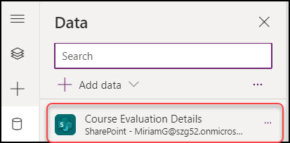
2. Sign into Power Apps with your valid Microsoft 365 credentials. Create a Blank Canvas app and connect the above SharePoint list datasource connector [Course Evaluation Details]. Once it’s connected to the app, it will look like below.
3. Next, go to the + Insert tab -> Expand Charts -> Select Column chart control. Then, the column chart will be added to the Power Apps screen with some sample data.
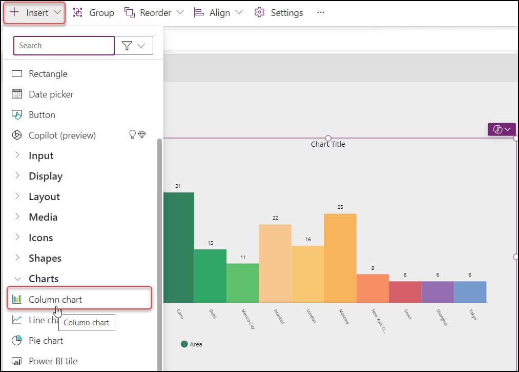
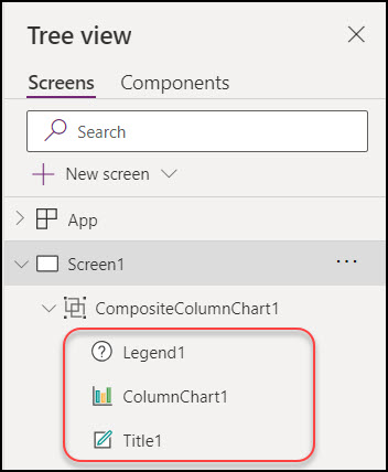
4. You can see three categories when adding a column chart to the app. Such as:
- Legend
- ColumnChart
- Title
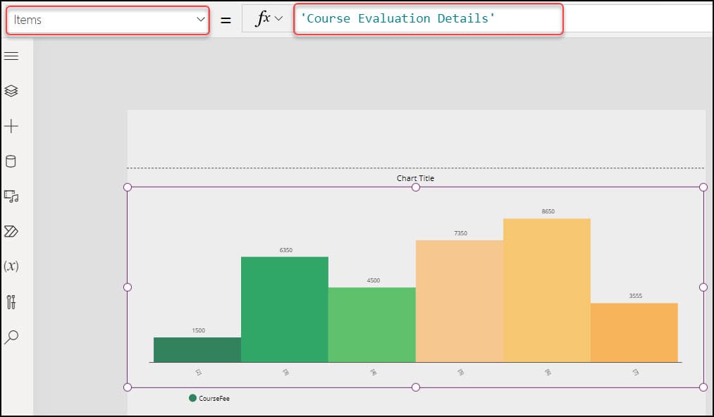
5. ColumnChart: Select the Chart control and set its Items property to the SharePoint list.
Items = 'Course Evaluation Details'Where,
‘Course Evaluation Details‘ = SharePoint List Name
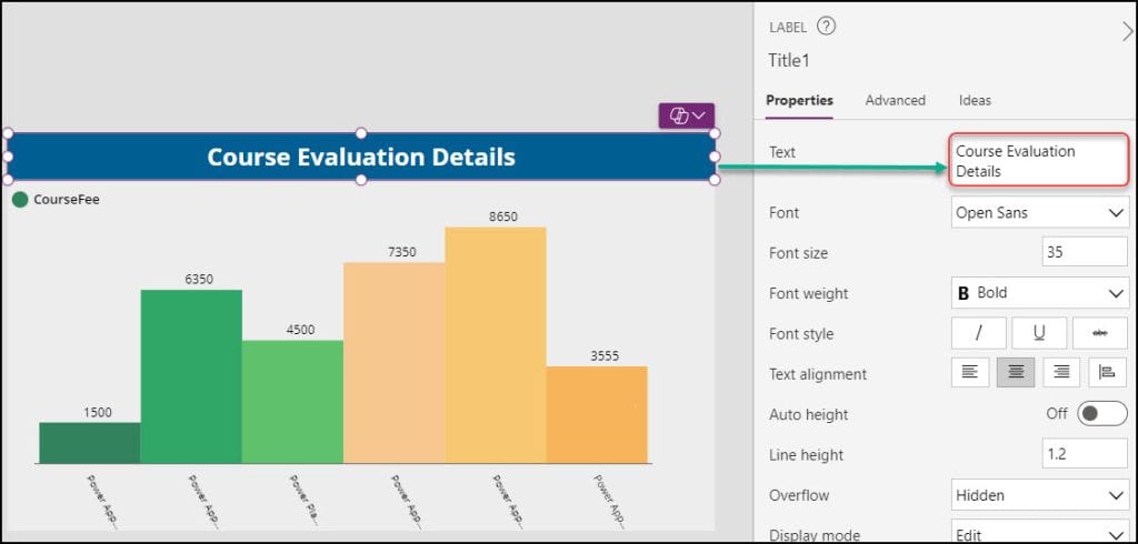
6. Title: To provide a title to the chart, select the top label control and set its Text property as:
Text = "Course Evaluation Details"You can provide any title as per your need.
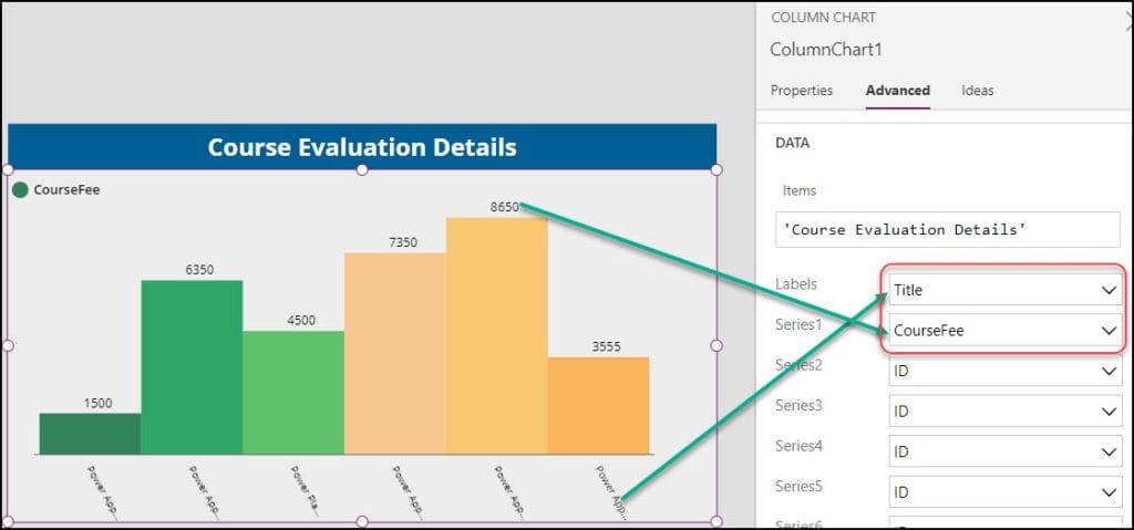
7. To display the data in the Power Apps Column chart, go to the Advanced tab and enter these field values:
- Labels: Select Title from the dropdown menu.
- Series1: Select CourseFee from the dropdown menu.
8. Legend: Specify the Power Apps Column chart Legend section. Select the Legend label and set its Items property as:
Items = ColumnChart1.SeriesLabels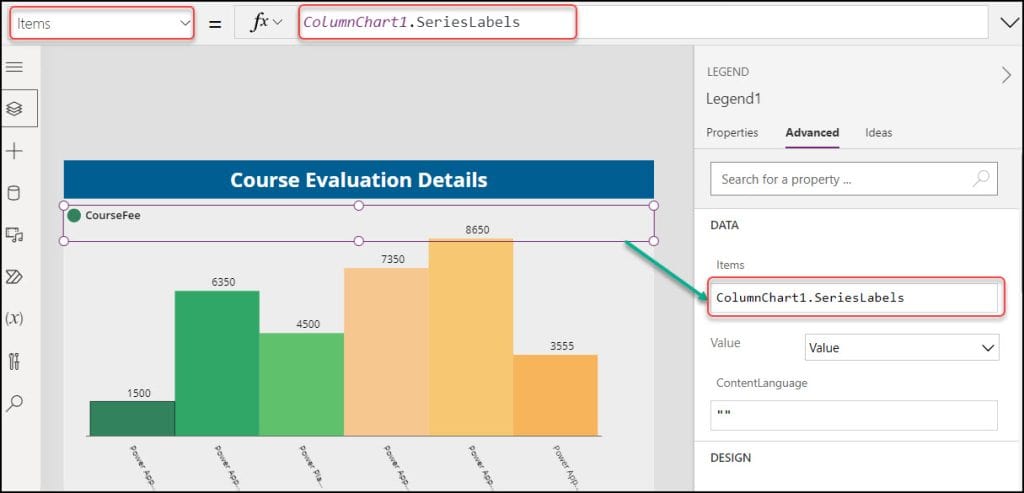
9. Finally, save, publish, and preview the app. You can view all the details in the Power Apps column chart.
This is how to display SharePoint List items in a Power Apps Chart control.
Power Apps Pie Chart
A Power Apps Pie Chart is a visual representation used within Power Apps to display data in a circular graph, with each slice representing just a portion of the total.
This graph helps display the relative sizes of data points in a single series. Refer to the image below of the data in a Power Apps Pie Chart control.
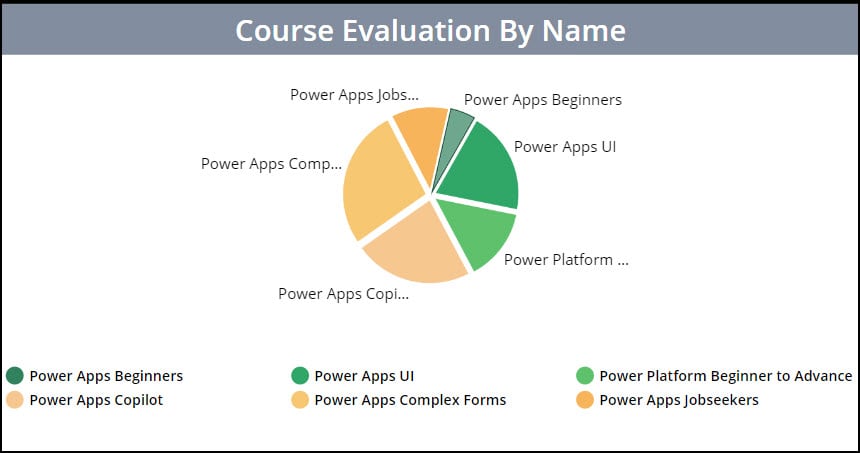
This is the overview of Power Apps Pie Chart control.
Power Apps Pie Chart From SharePoint List
Let’s discuss how to display SharePoint list items in a Power Apps Pie Chart control.
1. In Power Apps screen, go to the + Insert tab -> Expand Charts -> Select Pie chart control. Then, the pie chart will be added to the Power Apps screen with some sample data.
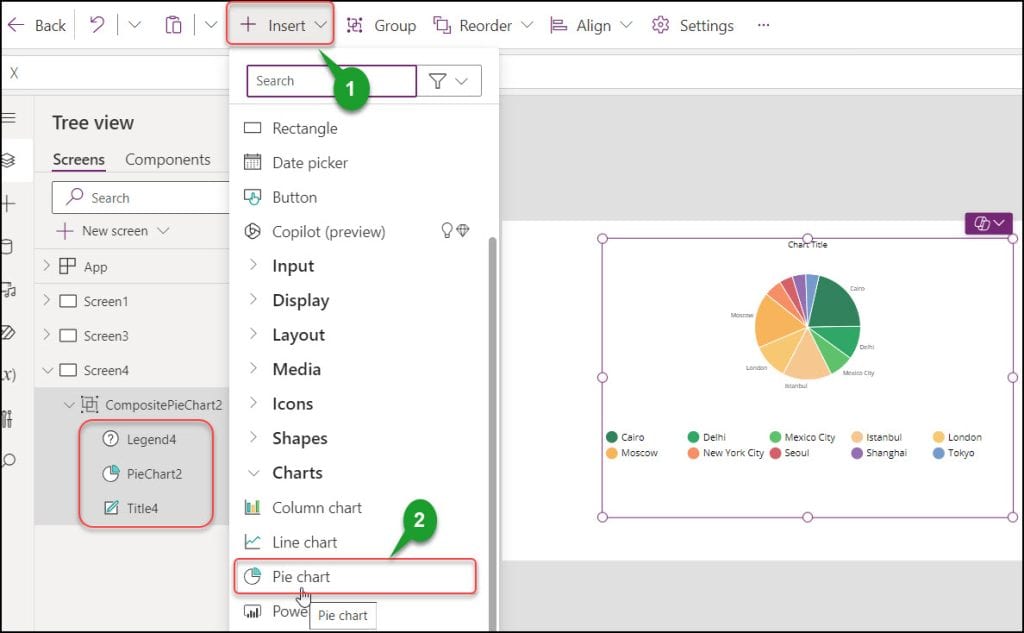
2. You can see three categories when adding a pie chart to the app. Such as:
- Legend
- PieChart
- Title
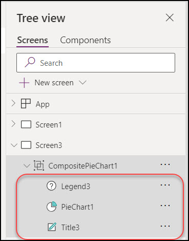
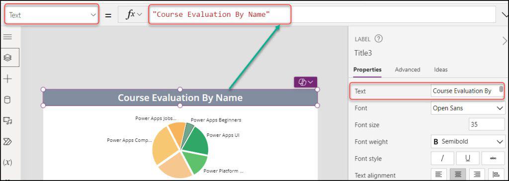
3. Title: To provide a title to the pie chart, select the top label control and set its Text property as:
Text = "Course Evaluation By Name"You can provide any title as per your need.
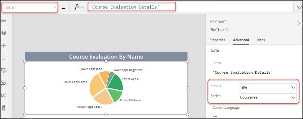
4. PieChart: Select the Chart control and set its Items property to the SharePoint list.
Items = 'Course Evaluation Details'Where,
‘Course Evaluation Details‘ = SharePoint List Name
Also, go to the Advanced tab and select the fields below:
- Labels: Select Title.
- Series: Select CourseFee.
5. Legend: Specify the Power Apps Pie chart Legend section. Select the Legend label and set its Items property as:
Items = ColumnChart1.SeriesLabels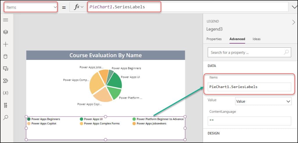
6. At last, save, publish, and preview the app. You can view all the details in the Power Apps pie chart.
This is how to display SharePoint List items in a Power Apps Pie chart control.
Conclusion
This Power Apps tutorial explained what Power Apps Charts are, the many types of chart controls in Power Apps, and how to add a chart to a Power Apps Screen.
Furthermore, we learned how to use the Power Apps chart from the SharePoint list, as well as the Power Apps Pie chart, and how to deal with the Power Apps Pie chart from the SharePoint list using various scenarios.
Also, you may like some more Power Apps tutorials:
- How to Increment Number in Power Apps Gallery
- Gallery Control in Power Apps
- Power Apps Modern Table Control [How to Use]
- Set Up Power Apps Gallery Border Between Items
I am Bijay a Microsoft MVP (10 times – My MVP Profile) in SharePoint and have more than 17 years of expertise in SharePoint Online Office 365, SharePoint subscription edition, and SharePoint 2019/2016/2013. Currently working in my own venture TSInfo Technologies a SharePoint development, consulting, and training company. I also run the popular SharePoint website EnjoySharePoint.com
Obrigado por compartilhar! Bom trabalho!
I translated to English and it seems you said, Thanks for sharing! Good job!
I appreciate your kind words, Rafael.
Hi,
Is it possible to sort or order the axis alphabetically?
Thank you
Sandor
busco dar formato de porcentaje en power Apps pero no he logrado hacerlo
nice, but still quite limited functionality.. what about showing data in %?