Do you know how to create Power Apps Grid View?
Well, in this Power Apps tutorial, we will learn what a Power Apps grid is and how to create a Power Apps grid gallery.
We will also see how to create a header in the Power Apps grid view and an editable grid [Add a new row, Remove a row] in the Power Apps canvas app.
Power Apps Grid View
In Power Apps, a GridView is a kind of control that shows a group of things in an organized, grid-like layout.
In simple terms, it displays data in rows and columns to make big data sets more accessible to read and work with. GridView functionality in Power Apps is usually accomplished through the Gallery control.
Power Apps Grid Gallery
Let’s see how to create a PowerApps grid view in gallery control step by step:
1. I have a SharePoint List named “IT Service Ticket“. This list has some columns with different data types as:
| Column | Data type |
|---|---|
| Name | Title with a Single line of text |
| Single line of text | |
| Department | Choice |
| Computer ID | Single line of text |
| Want to Upload Any File | Yes/No |
| Describe The Problem | Muliple lines of text |
Refer to the image below.

2. Sign into Power Apps with valid Microsoft 365 credentials.
3. Create a new Power Apps blank canvas app [+ Create -> Blank app -> Click Create under the Blank canvas app -> App name -> Choose Format] with a Tablet or Phone layout.

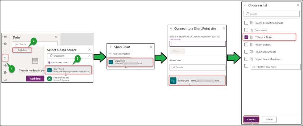
4. Connect the SharePoint list data source connector to the app. Go to the Data tab -> + Add data -> Search and select SharePoint -> Create or select a new or existing SharePoint connection -> Select the SharePoint site -> Choose SharePoint list -> Connect.
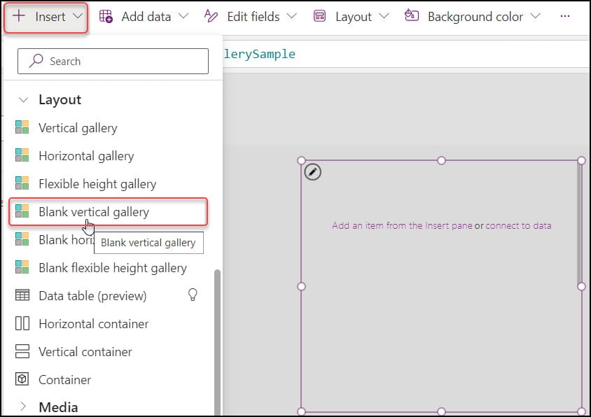
5. On the Power Apps screen, insert a Blank vertical gallery [+ Insert -> Expand Layout -> Blank vertical gallery].
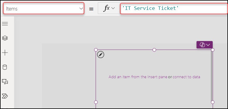
6. Select the gallery and set its Items property as:
Items = 'IT Service Ticket'Where,
‘IT Service Ticket‘ = SharePoint List Name
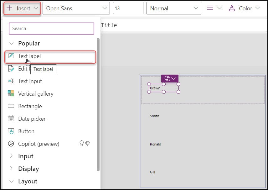
7. Select the first block of the gallery and add a Text label control to it. Set its Text property as;
Text = ThisItem.TitleWhere,
Title = SharePoint Name field
8. Similarly, add another Text label control on the right side of the Name and set its Text property as:
Text = ThisItem,Email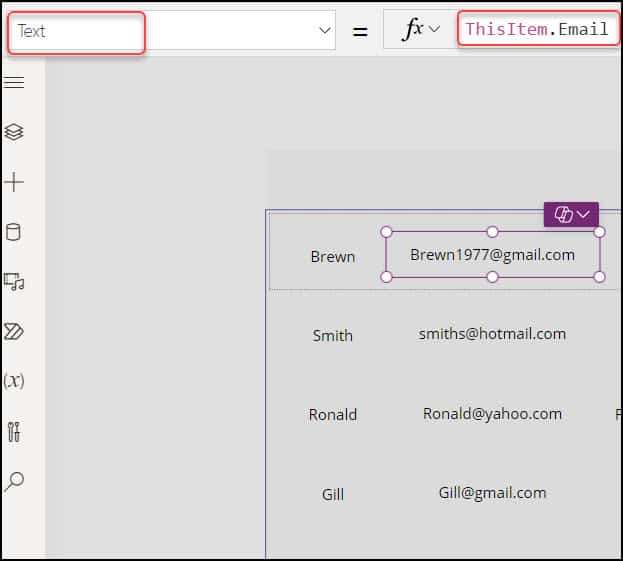
9. Even though I would like the Power Apps grid to display three additional fields, I have added three more Labels to the grid, as you can see below. I have renamed the five Label names as:
- lblName
- lblEmail
- lblDepartment
- lblCompID
- lblDescription
Also, set the remaining three label’s Text property as:
Text = ThisItem.Department.Value                                         // For Department Label
Text = ThisItem.'Computer ID'                                                  // For Computer ID Label
Text = ThisItem.'Describe The Problem'                               // For Description Label
Refer to the image below.

10. Now, we will set a border for all the labels. Select a Label -> Go to Properties -> Set 2 in the Border property, as shown below. Also, set all the Text alignment properties to the middle.
Similarly, you can provide more properties to your desired field, like Size, Layout, Color, Border, etc. Once it is done, set the height and width of every Label correctly.
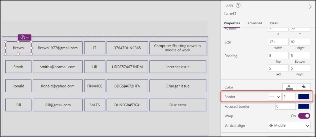
11. Save, Publish, and Preview the app. As you can see below, the tabular Grid view structure will display all SharePoint data.
NOTE:
To display all Currency values in the appropriate Currency format and all Date values in the appropriate format in the Data Grid view, refer to this Power Apps article: format number as currency in PowerApps
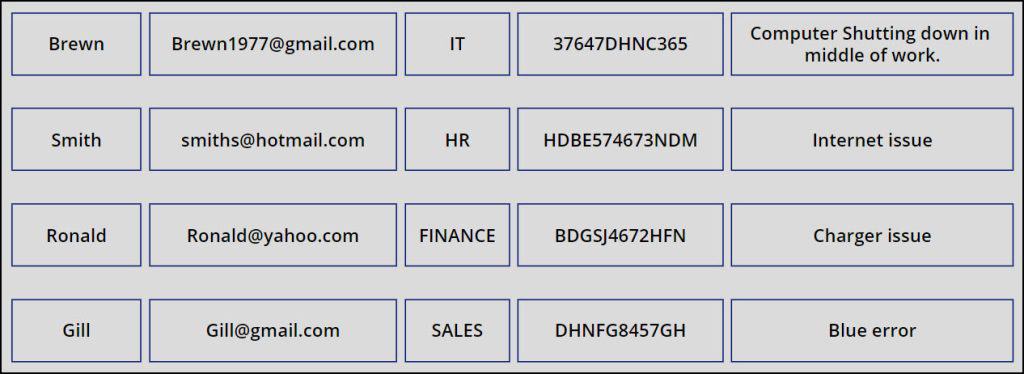
This is how to create a Grid view in Power Apps Gallery control.
Create a Header in Power Apps Grid View
A Grid view without a header does not look like a perfect one. For that, you must create a Header at the top of the grid to verify the grid data easily and look like a perfect grid.
In Power Apps, you can create a Grid view Header differently. Such as:
- Create a Power Apps Grid view header using a Data table control.
- Create a Power Apps Grid view header using Label controls or Input Text controls.
It takes longer to develop a Powerapps Grid view header if you wish to use the Label or Input text box controls since you have to adjust the controls’ formatting, height, and width.
Because of this, utilizing a Data Table to build a Grid view Header will be simple. Follow the instructions below.
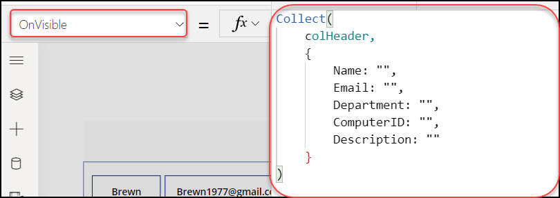
1. Create a Power Apps Collection to store the column Headers. Select the Screen and write the below code on its OnVisible property as:
OnVisible = Collect(
    colHeader,
    {
        Name: "",
        Email: "",
        Department: "",
        ComputerID: "",
        Description: ""
    }
)
Where,
- colHeader = Collection Name
- Name, Email, Department, etc. = Provide the column names that you want to put in the header
2. Run the Power Apps app and check whether the Collection is created. To check it, go to Variables (x) -> Expand Collections -> Select ellipses of the specific collection (…) -> View Table.
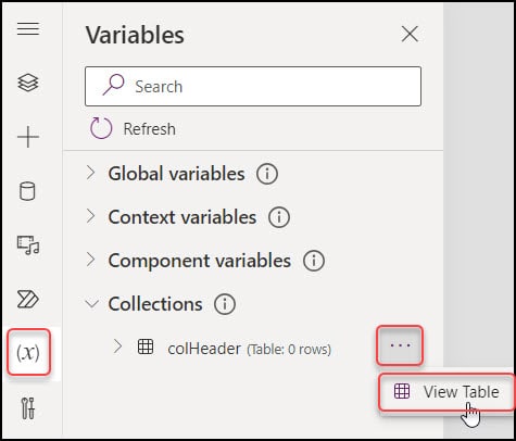
3. You can see your collection (colHeader) will be created with the blank data, as shown in the below screenshot.

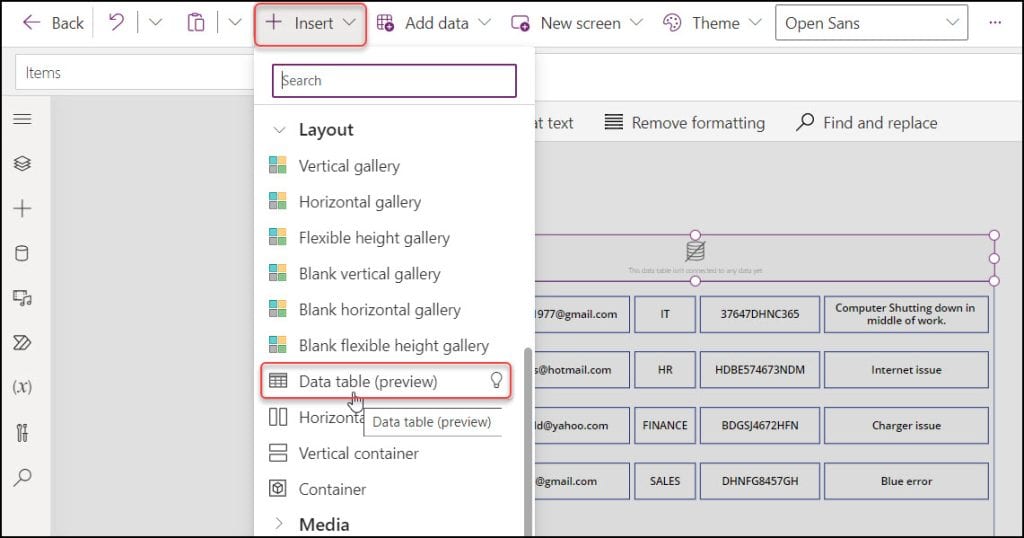
4. Next, in the Power Apps screen, insert a Data table control [+ Insert -> Layout -> Data table (preview)]. Replace this Data table control at the top of the gallery, as shown in the image below.
5. Select the Data table and connect the Data source property to the collection, i.e.
Data source = colHeader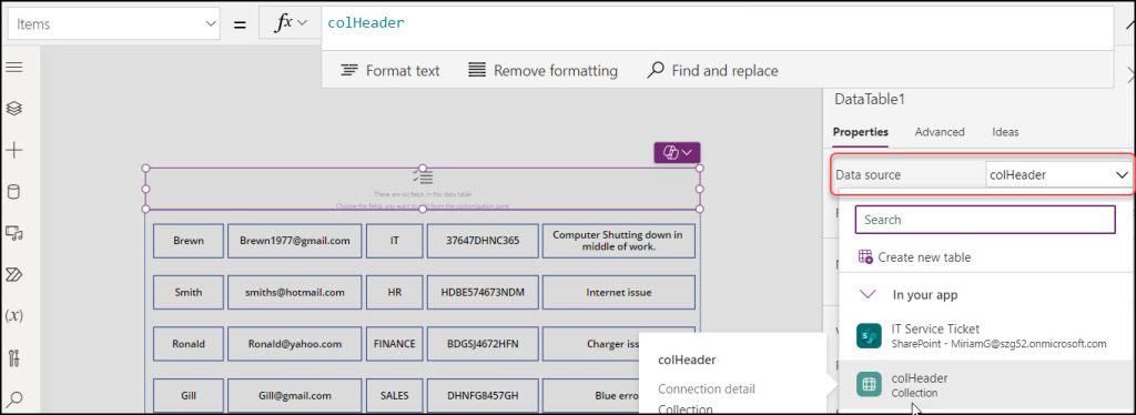
6. Go to the Properties Pane -> Edit fields -> +Add field -> Choose the desired fields you want to put in the Grid view header -> Hit the Add button, as shown in the screenshot below.
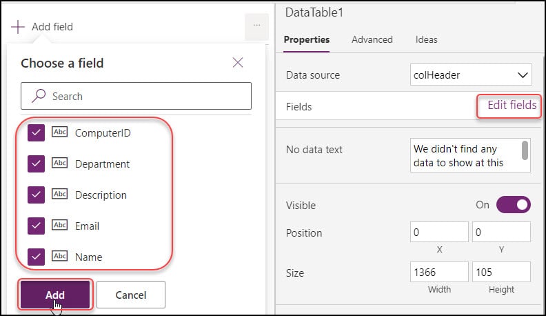
7. All headers will now be displayed at the top of the Grid view. Set and arrange the headers with appropriate data and column names. Also, you can design the headers using data table control properties like heading font-weight, heading font, heading size, etc.
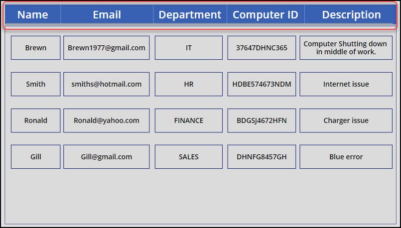
8. Save, Publish, and Preview the app. In Power Apps, you can see an appropriate grid display with appropriate headers.
This is how to create a header in Power Apps Grid View.
Editable Grid in Power Apps
Now, we will see some implementations in the Power Apps grid view.
Add a new row in Power Apps Grid View
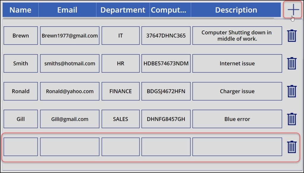
1. To add a new row in the Power Apps Grid View, insert an Add icon [+] and set its OnSelect property as:
OnSelect = Patch(
    'IT Service Ticket',
    Defaults('IT Service Ticket'),
    {
        Title: "",
        Email: "",
        Department: {Value: ""},
        'Computer ID': "",
        'Describe The Problem': ""
    }
)
Where,
- ‘IT Service Ticket‘ = SharePoint List Name
- Title, Email, etc. = SharePoint Column Names

2. Save, Publish, and Preview the app. Click on the + icon; then the blank grids will be created like the image below.
Remove a Row in Power Apps Grid View
1. Suppose you want to remove or delete any particular row from the Power Apps grid, then select the first block of the gallery and add a Trash icon.
2. Select the Trash icon and set its OnSelect property as:
OnSelect = Remove('IT Service Ticket',ThisItem);
Refresh('IT Service Ticket')
Where,
‘IT Service Ticket‘ = SharePoint List Name

3. Save, Publish, and Preview the app. Click the trash can icon next to the row you want to remove from the grid and that row will be gone.
Conclusion
I hope you learned about Power Apps grid view and how to create a grid view using Power Apps Gallery control.
This Power Apps tutorial also taught us how to create a header in the Power Apps grid view and some implementations of editable grid [Add a new row, Remove a row] in the Power Apps canvas app.
Additionally, you may like some more Power Apps tutorials:
- Count Rows in Power Apps Gallery Control
- Sort Power Apps Gallery By Month
- Select Multiple Items in Power Apps Gallery Control
- Add New Row in Power Apps Gallery Control
I am Bijay a Microsoft MVP (10 times – My MVP Profile) in SharePoint and have more than 17 years of expertise in SharePoint Online Office 365, SharePoint subscription edition, and SharePoint 2019/2016/2013. Currently working in my own venture TSInfo Technologies a SharePoint development, consulting, and training company. I also run the popular SharePoint website EnjoySharePoint.com
I want to add few more columns to my grid. can you let me know how to do it?
Hi
[Doubt] Is it also possible to write in some cells and they have code to search for data fields em database?