In this Power BI Tutorial, we will learn about how to change bar chart color based on the value in Power BI with a few examples, and also we will cover the below topics:
- Power BI bar chart conditional formatting multiple values
- Power BI bar chart conditional formatting highest values
- Power BI bar chart conditional formatting between two values
Power BI bar chart color based on the value
Let us see how we can apply the bar chart color based on the value in Power BI.
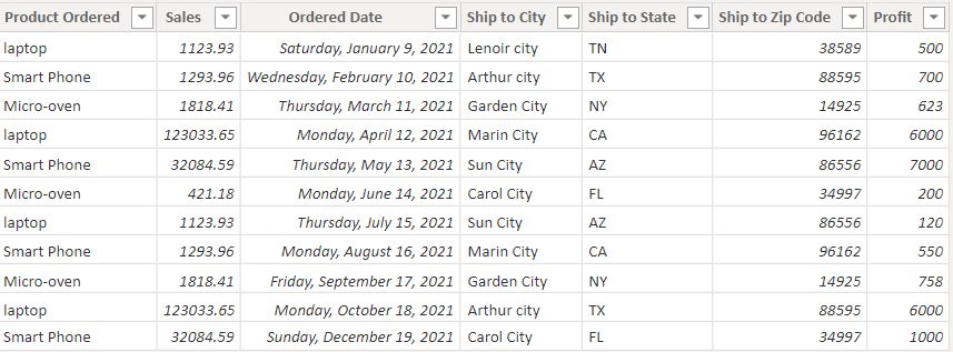
In this example, we are going to use the below-mentioned Products ordered table data to display the stacked bar chart with sales value by the city in Power BI.
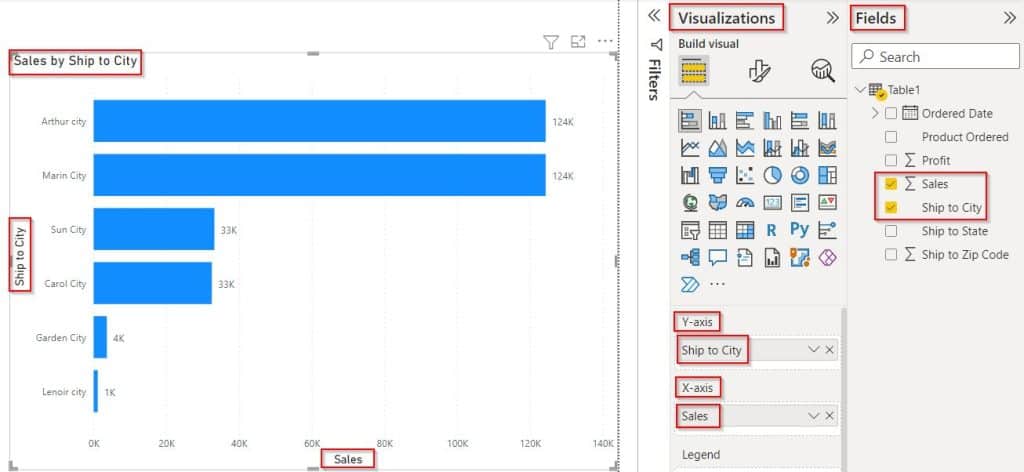
- Open the Power Bi desktop and load data into it. Selected the stacked bar chart visual drag and drop the sales field and the city field value in the field section.
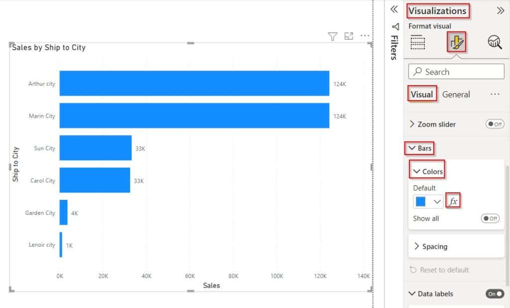
- To apply conditional formatting for bars, select the Format Visual under the Visualisation pane, and Expand Bars -> Colors under the Visual tab (highlighted in Red):
- Enable the background color and click on the Fx icon as shown below:
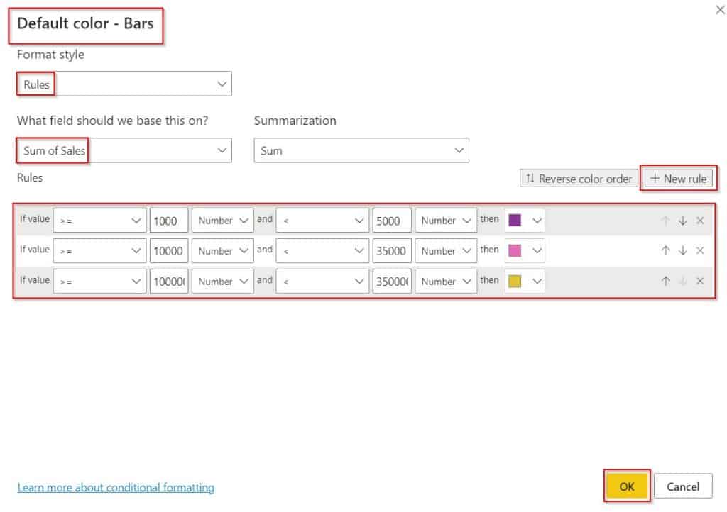
- Now, Select the Format style as Rules and choose the column field value, Now add the rule that you want to apply. Select +New rule to add a new rule condition.
- Add the condition to apply the conditional formatting for the sales column value.
- Click on the Ok button to display the bar chart visual based on the condition applied.
In the below screenshot, you can see that the bar chart displays the bar chart color changes the bar color based on the condition applied in conditional formatting.
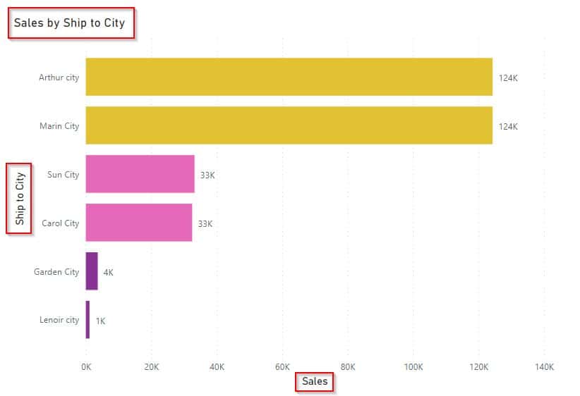
This is how to apply the bar chart color based on the value in Power BI.
Power BI bar chart conditional formatting multiple values
Here we will discuss whether it is possible to apply conditional formatting for multiple values in the stacked bar chart in Power BI.
- No, it is not possible to apply the conditional formatting for multiple values in the stacked bar chart and the stacked column chart in Power BI.
- We can only view the Fx icon to apply the conditional formatting for the bars and column charts with a Single field value.
- In Multiple field values, we cannot view the Fx icon option. In the following, we will clearly learn with examples.
- Load source data into the Power Bi desktop. Selected the stacked bar chart visual from the visualization.
- In the below screenshot, you can see that I have added two field values called Sales and Profit and displayed the bar chart.
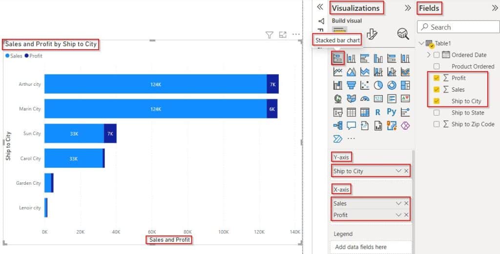
- To apply conditional formatting for bars, select Format Visual under the Visualisation pane, and Expand Bars -> Colors under the Visual tab.
- Here you can see that there is no Fx icon presented for multiple values as shown below: We can change the color of the bars. But it is not possible to change the bar colors by applying conditional formatting for multiple fields.

It is not possible to apply conditional formatting for multiple values in the stacked bar chart in Power BI.
Power BI bar chart conditional formatting highest values
Let us see how we can see how to apply conditional formatting for the highest values for the bar charts in Power Bi.
In this example, we will highlight the bar color for the highest value by applying conditional formatting in Power BI.
- Load source data into the Power Bi desktop. Selected the stacked bar chart visual from the visualization. Drag-drop the sales field and city field into the field pane section.
- Select the Format Visual under the Visualisation pane, Expand Bars -> Colors under the Visual tab and enable the background color and click on the Fx icon.
- In the conditional formatting window, select the Format style as Gradient and choose the column field value, by default, lowest value, Middle value, and Highest Value as shown below:
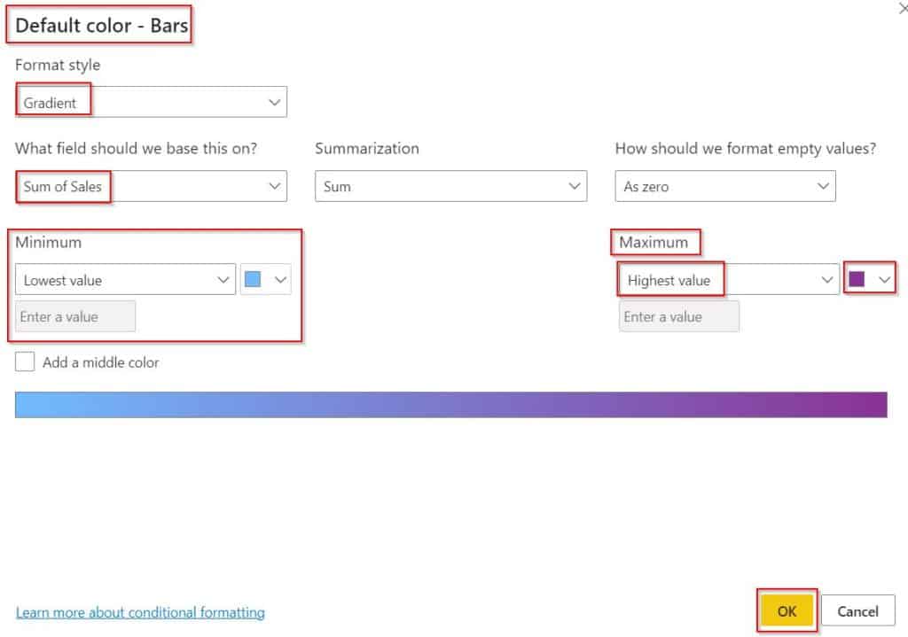
In the below screenshot, we can see that based on the condition applied for the highest value it displays the bar chart.
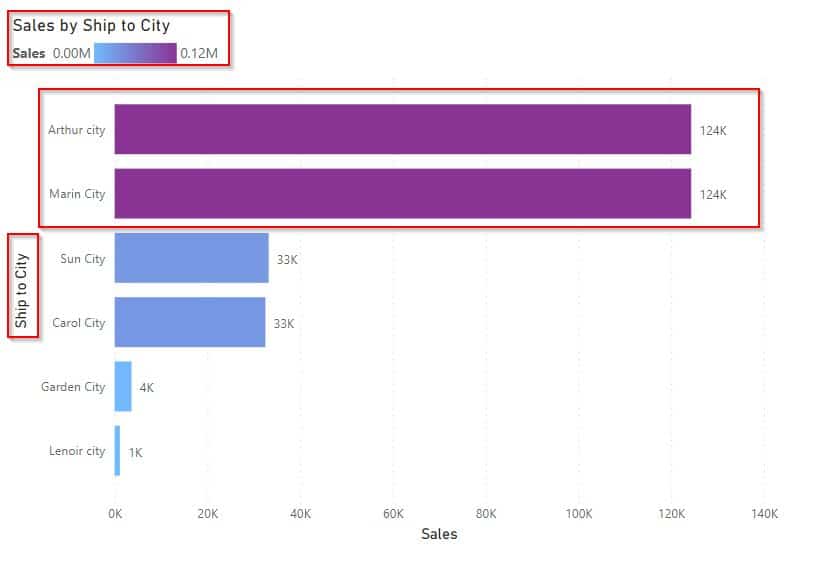
This is how to see how to apply conditional formatting for the highest values for the bar charts in Power Bi.
Power BI bar chart conditional formatting between two values
Here we will how we apply conditional formatting between two values using the custom values in Power BI.
In this example, we will add two custom values to apply the conditional formatting in the stacked bar chart in Power BI.
- Open the Power Bi desktop. Selected the stacked bar chart visual from the visualization. Drag-drop the sales field and city field into the field pane.
- Select the Format Visual under the Visualisation pane, Expand Bars -> Colors under the Visual tab and enable the background color and click on the Fx icon.

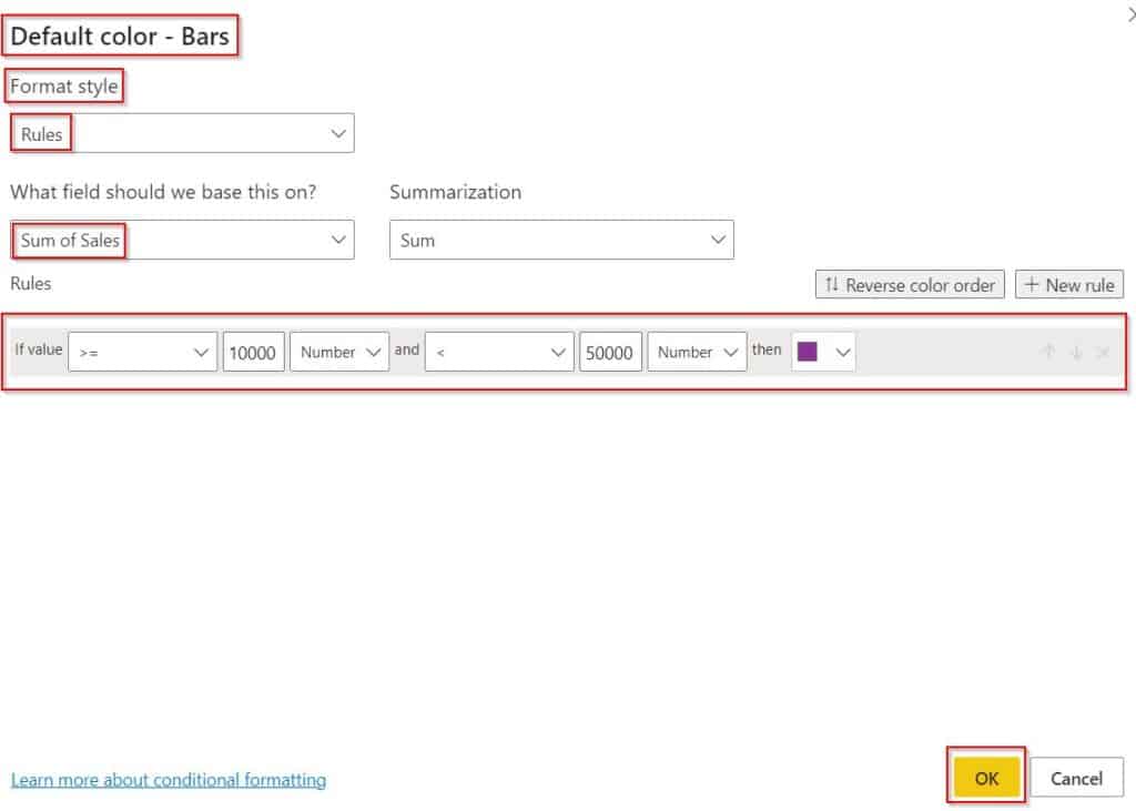
- Now, Select the Format style as Rules and choose the column field value, Now add the rule that you want to apply. Select +New rule to add a new rule condition.
- Add the condition to apply the conditional formatting for the selected sales value column.
- Click on the Ok button to display the bar chart visual based on the condition applied.
The Screenshot below displays the bar chart color based on the condition applied between two values.
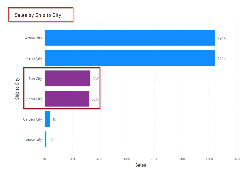
This is how to do conditional formatting between two values using the custom values in Power BI.
In this Power BI Tutorial, we have learned about how to change bar chart color based on the value in Power BI with a few examples, and also covered the below topics:
- Power BI bar chart conditional formatting multiple values
- Power BI bar chart conditional formatting highest values
- Power BI bar chart conditional formatting between two values
You may like the following Power BI tutorials:
- Power BI Group by Column [With Various Examples]
- Power BI DAX ISBLANK vs ISEMPTY
- Power BI Count If True
- Concatenate with Space in Power BI
- Power BI Conditional Formatting Based on Measure
I am Bijay a Microsoft MVP (10 times – My MVP Profile) in SharePoint and have more than 17 years of expertise in SharePoint Online Office 365, SharePoint subscription edition, and SharePoint 2019/2016/2013. Currently working in my own venture TSInfo Technologies a SharePoint development, consulting, and training company. I also run the popular SharePoint website EnjoySharePoint.com