When you think about stacked charts in Power BI, there are two main types: Stacked Bar Chart and Stacked Column Chart.
In this Power BI Tutorial, we will discuss What a Stacked bar chart Power BI is and how to create Stacked bar chart in Power BI.
Also, we will learn what a Power BI Stacked column chart is and how to create a Stacked column chart in Power BI.
Additionally, we will discuss the topics below:
- Power BI stacked column chart multiple values
- Power BI stacked bar chart with multiple columns
What is Stacked Bar Chart in Power BI?
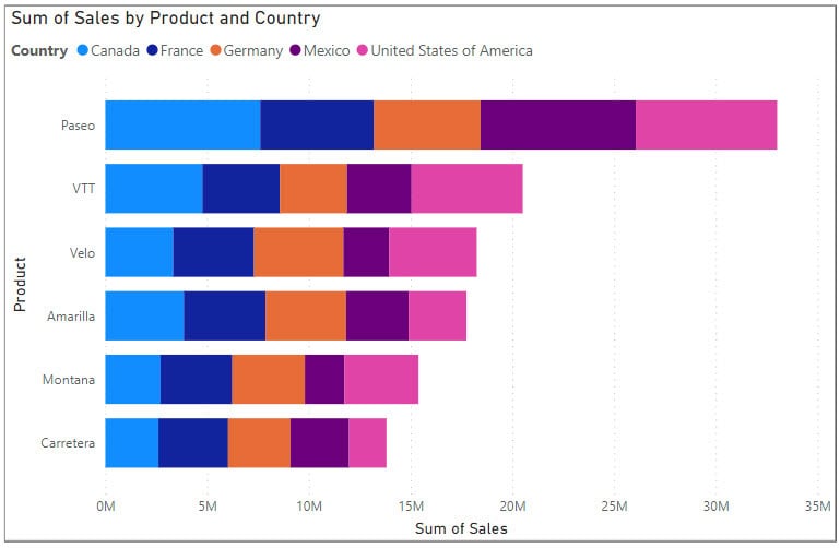
A stacked bar chart in Power BI is a visual representation of data that uses bars to show the total amount, with each bar segmented into different colored sections representing different categories or subgroups.
It helps you compare the total values across different categories while also showing the composition of each category relative to the total.
In the Power BI Stacked bar chart, the bars are displayed horizontally.
How to Create Stacked Bar Chart in Power BI?
Let’s see how to create a stacked bar chart in Power BI.
For example, you want to analyze your monthly sales data using Power BI to understand which product categories contribute the most to your revenue.
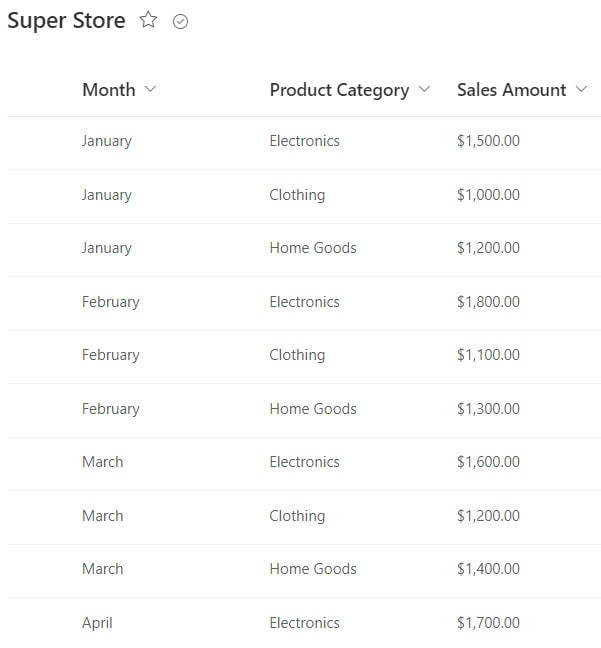
Here, we have a SharePoint list (Super Store) that contains below columns with various data types:
| Columns | Data Types |
|---|---|
| Month | Single line of text |
| Product Category | Single line of text |
| Sales Amount | Currency |
Now follow the below steps:
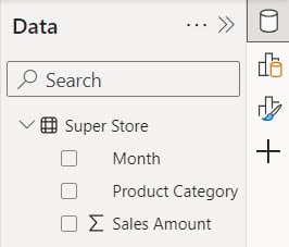
1. Open Power BI Desktop and load the data set. Then, in the Data pane, you can see your data set.
2. Under the Home tab, click “Visual gallery,” then click “Stacked bar chart.”

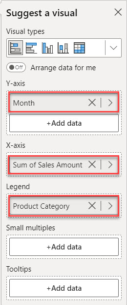
3. Then, using the +Add data option, add Month to the Y-axis, Sales Amount to the X-axis, and Product Category to the Legend field.
4. Then you can see in the report view the stacked bar chart created.
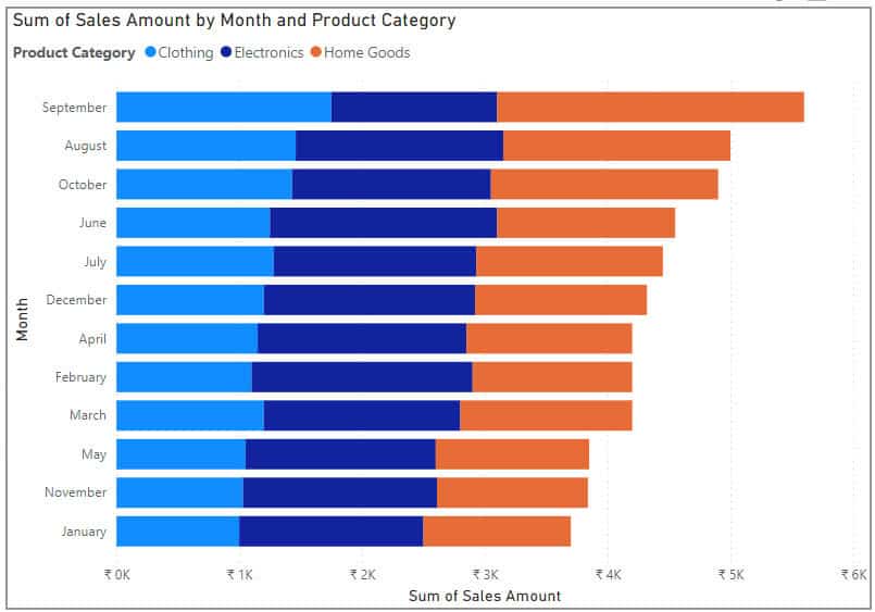
This way, you can create a Power BI stacked bar chart.
What is Stacked Column Chart in Power BI?
A stacked column chart in Power BI is a visual representation of data where each column represents a category, and the height of the column represents the total value of that category.
However, instead of showing just one value per category, it stacks multiple values on top of each other within each column. This allows you to see the total value for each category while also seeing the contribution of different subcategories to that total.
In the Power BI Stacked column chart, the bars are displayed vertically.
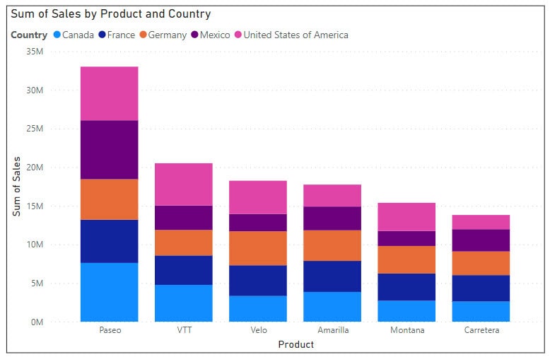
Stacked Column Chart in Power BI
In this example, we will see how to create a stacked column chart Power BI.
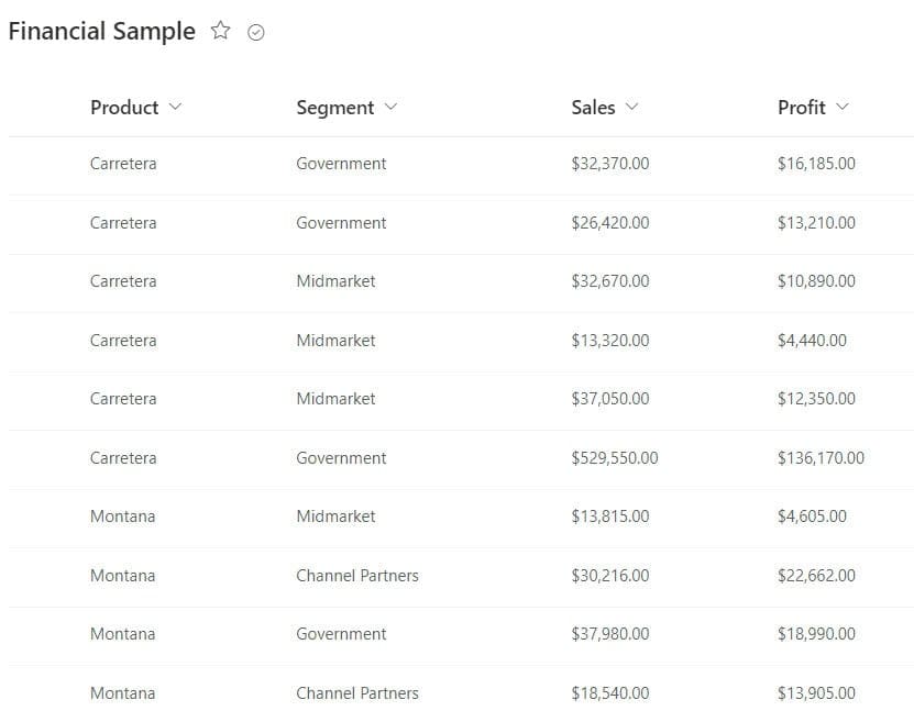
Here, we have a SharePoint list (Financial Sample) that contains below columns with various data types:
| Columns | Data Types |
|---|---|
| Product | Single line of text |
| Segment | Single line of text |
| Sales | Currency |
| Profit | Currency |
Now follow the below steps:
1. Open Power BI Desktop and load the data set. Then, in the Data pane, you can see your data set.
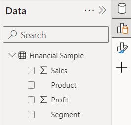
2. Under the Home tab, click “Visual gallery,” then click “Stacked column chart.”

3. Then, using the +Add data option, add Product to the X-axis, Sales to the Y-axis, and Segment to the Legend field.
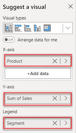
4. Then you can see in the report view the stacked column chart created.
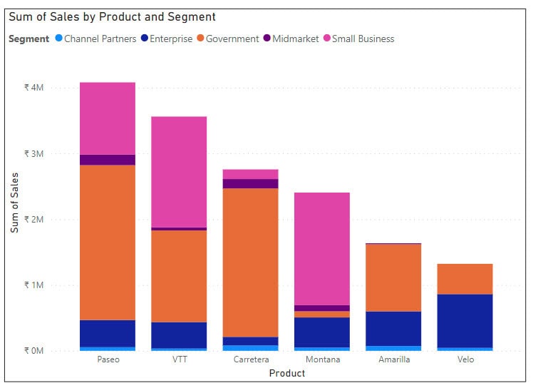
This way, you can create a stacked column chart in Power BI.
Power BI Stacked Column Chart Multiple Values
Let’s see how to create a Power BI stacked column chart with multiple values.
Unfortunately, Power BI doesn’t support adding multiple Y-axes in a stacked column chart directly. However, you can achieve a similar effect using Tooltips.
Now follow the below steps:
1. Under the Home tab, click “Visual gallery,” then click “Stacked column chart.”

2. Then, using the +Add data option, add Product to the X-axis, Sales to the Y-axis, and Segment to the Legend field.
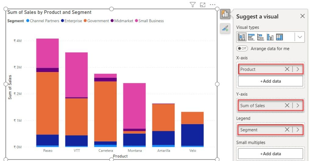
Now you can see you can not add another column in the Y-axis. For this, I am using tooltips.
3. Then, using the +Add data option, add Profit into the tooltips field.
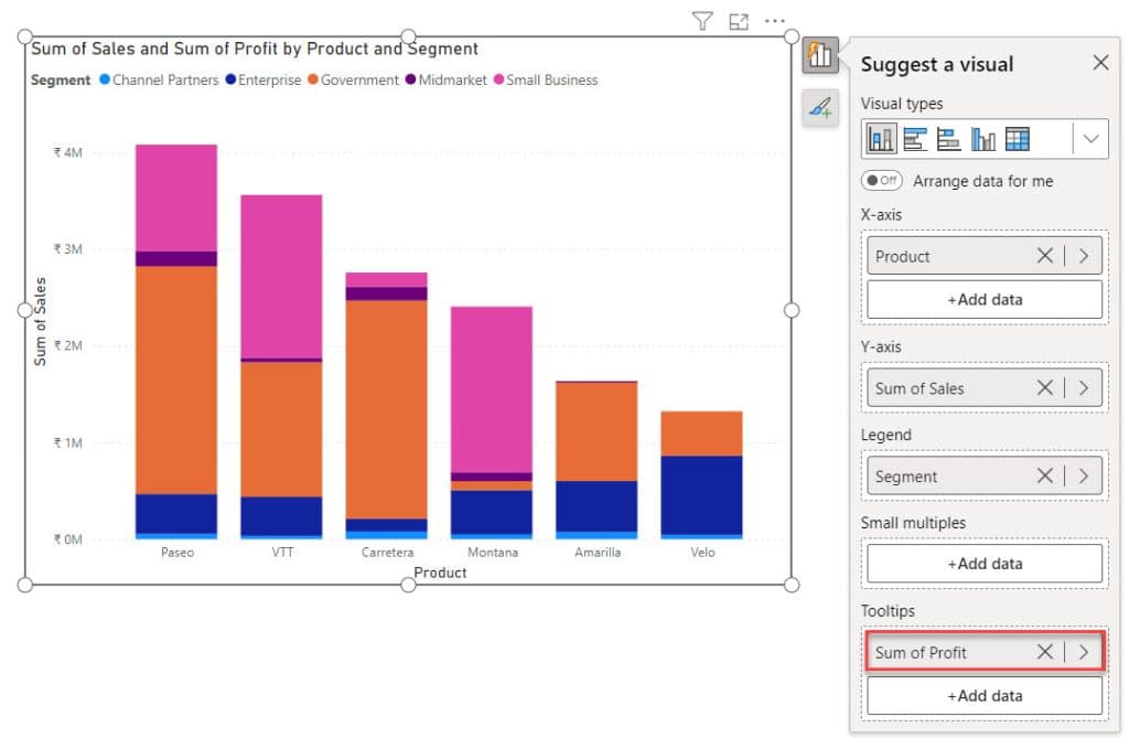
4. When you hover over any bar, you can see a profile for each product in a specific segment.

This method enables you to manage multiple values in Power BI’s effectively stacked column charts and bar charts with multiple values.
Power BI Stacked Bar Chart With Multiple Columns
Let’s see how we can display data in the stacked bar chart with Multiple columns.
If we add multiple columns directly, the bar chart will display based on the first field’s data by default. Using the drill-down feature is an alternative method to display a Power BI Stacked Bar Chart With Multiple Columns.
For this example, we use below table:
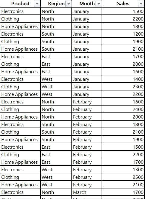
Now Follow the below steps to do this:
1. Open Power BI Desktop and load the data set. Then, in the Data pane, you can see your data set.
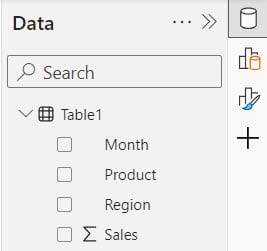
2. Under the Home tab, click “Visual gallery,” then click “Stacked bar chart.”

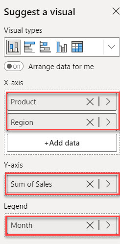
3. Then, using the +Add data option, add Product and Region to the X-axis, Sales to the Y-axis, and Month to the Legend field.
4. Then, you can see the Stacked Bar Chart will display based on the first field.
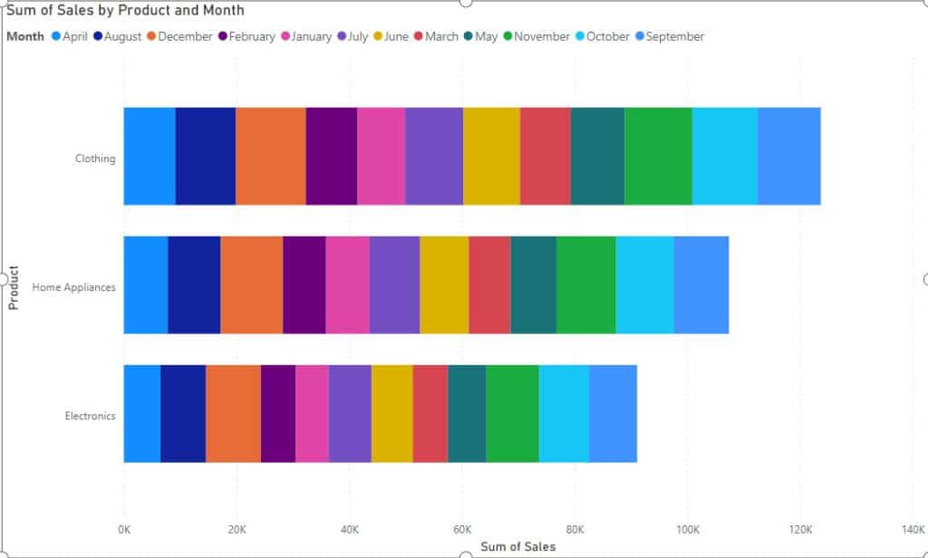
5. When you click drill down, you can see what a stacked bar chart with Multiple values looks like.
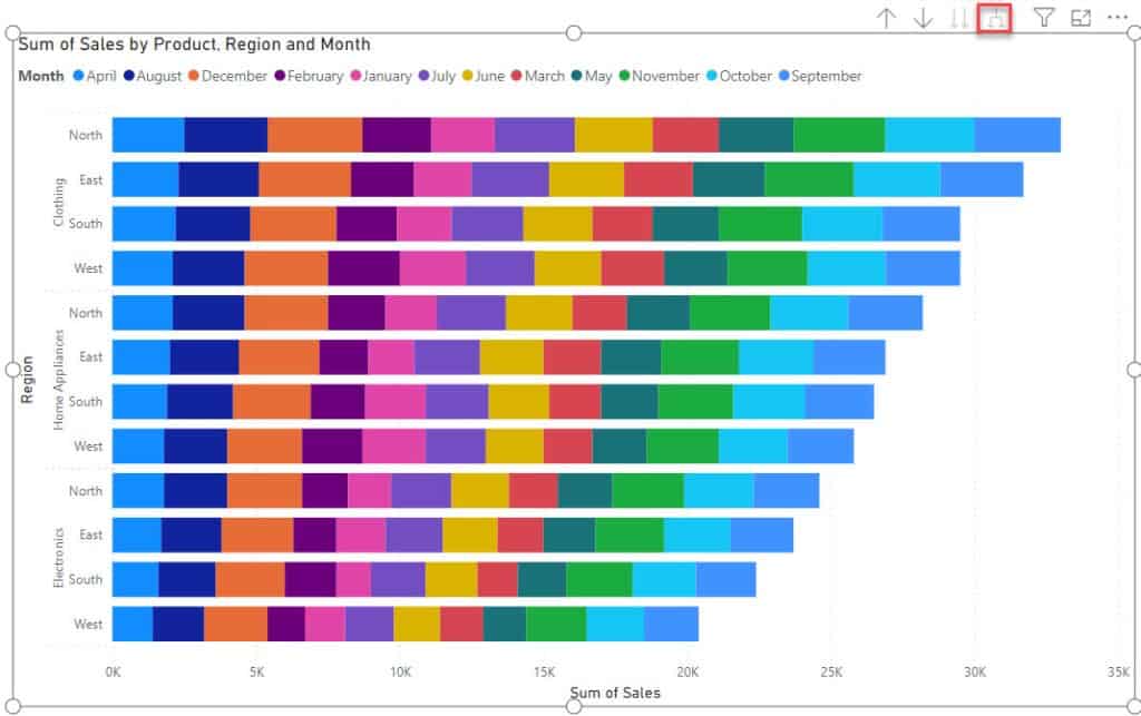
This way, you can display data in the stacked column chart with Multiple columns in Power BI.
Some more articles you may also like:
- Power BI Color Based On Value
- Bookmarks in Power BI
- How to Add Conditional Column in Power BI
- Create Date Hierarchy in Power BI
- Power BI Count Group by
- Power BI Split String
In this Power BI tutorial, we’ve explored stacked column chart and stacked bar chart, how to create a stacked column chart and stacked bar chart in Power BI Desktop.
We’ve also discussed advanced topics such as Power BI stacked column charts with multiple values, Power BI stacked bar charts with multiple values, and Power BI stacked bar charts with multiple columns.
I am Bijay a Microsoft MVP (10 times – My MVP Profile) in SharePoint and have more than 17 years of expertise in SharePoint Online Office 365, SharePoint subscription edition, and SharePoint 2019/2016/2013. Currently working in my own venture TSInfo Technologies a SharePoint development, consulting, and training company. I also run the popular SharePoint website EnjoySharePoint.com