In this Power Apps tutorial, we will discuss Power Apps slider control, its properties, and how to add a slider control in PowerApps.
As far as we know, Power Apps has various controls for working with canvas apps; apart from that, a PowerApps Slider is a user interface element used to select a value within a defined range by dragging a slider.
Also, we will see how to work with the PowerApps slider increment and PowerApps slider in the gallery. Moreover, I will let you know some more stuff like:
- Power Apps Date Slider
- Power Apps Slider Percentage
- Power Apps Double Sliders
- powerapps Set Slider Value
Slider Control in Power Apps
Power Apps Slider is a type of control where a user specifies a value by dragging a handle. It’s like a moving indicator with a horizontal style, where a user can specify a value between the minimum and maximum values.
In Power Apps, the slider control is often used in different scenarios. It is used when numerical values within a specified range need to be input, such as when setting a price range, selecting a quantity, or choosing a percentage.
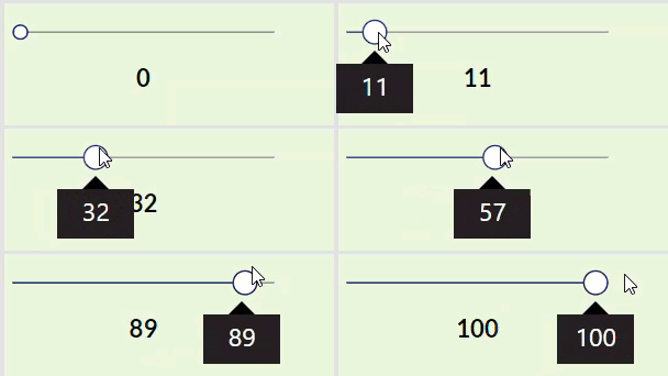
Power Apps Slider Control Properties
Next, we will see what are the Power Apps slider control properties. Such as:
| Property | Description |
| Default | It defines the initial value of a control before the user changes it |
| Max | It defines the color of the handle for a slider as the user changes its value. |
| Min | It specifies the minimum value to which the user can set a slider |
| Value | It specifies the value of an input control |
| HandleActiveFill | It defines the color of the handle (the element that changes position) in a toggle or slider control. |
| HandleFill | It provides the color of the handle in a slider when the user keeps the mouse pointer on it. |
| HandleHoverFill | It represents the background color of the rectangle in a toggle control when its value is false or the color of the line to the right of the handle in a slider control. |
| HandleSize | It defines the diameter of the handle |
| Layout | It represents whether the user scrolls through a gallery or adjusts a slider top to bottom (Vertical) or left to right (Horizontal) |
| RailFill | It specifies when you hover on a toggle control or a slider, the background color of the rectangle in a toggle control when its value is false, or the color of the line to the right of the handle in a slider control. |
| RailHoverFill | It defines whether a user can change the value of a slider or rating control. |
| ReadOnly | This defines whether a slider’s or rating’s value appears as the user changes that value or hovers over the control. |
| ShowValue | It provides the background color of the rectangle in a toggle control when its value is true or the color of the line to the left of the handle in a slider control. |
| ValueFill | It provides the background color of the rectangle in a toggle control when its value is true or the color of the line to the left of the handle in a slider control. |
| ValueHoverFill | It provides the background color of the rectangle in a toggle control when its value is true or the color of the line to the left of the handle in a slider control |
How to Use Slider in Power Apps
Here, I will show you how to add a slider control in Power Apps. To do so, follow the below steps. Such as:
1. On the Power Apps Screen, add a Slider control [Expand + Insert tab > Inputs > Slider], as shown below.
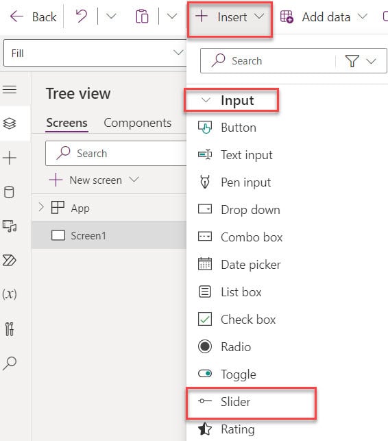
2. Once the slider is added by default, the Default sider value is 50 [Max value is 100], and you can also change the Layout [Horizontal or Vertical]

Power Apps Slider Increment
Let’s see how to work with the Power Apps slider increment with a simple example.
Example:
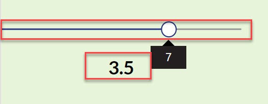
Suppose you want to increment the slider value by 0.5, and I would like to show the slider as [0.5, 1,1.5, 2,2.5, 3,3.5, 4,4.5, 5]. Have a look at the output below.
Output:
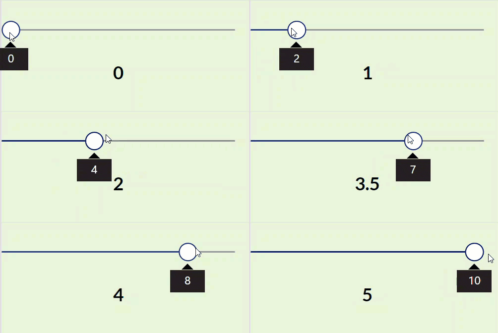
To achieve it, follow the below steps. Such as:
1. On the Power Apps Screen, insert a Slider control and set its Default, Max, and Min properties, as shown below.
Default = 100

Max = 10

Min = 0
2. Next, insert a Text label control for the slider caption purposes and apply the below code on its Text property:
Text = sld_Increment.Value/2Where,
- sld_Increment = Power Apps slider control name
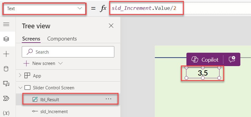
3. Once your app is ready, Save, Publish, and Preview the app. Once the user drags the slider, the text label displays the result [increment the slider value by 0.5], as shown below.
This is how we can increment the slider control in Power Apps.
Power Apps Slider in Gallery
In this section, I will explain how to work with the Power Apps slider in the gallery with a simple scenario.
Scenario:
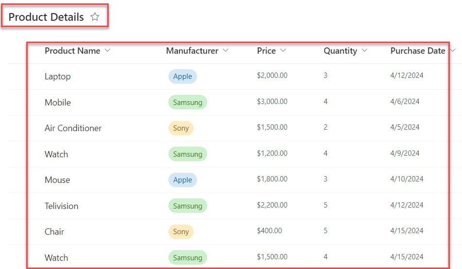
I have created a Power Apps collection [colProducts] from my SharePoint Online list named “Product details” which contained the below fields.
| Column Name | Data Type |
| Product Name | It is a default single line of text |
| Manufacturer | Choice |
| Price | Currency |
| Quantity | Number |
| Purchase Date | Date and time |
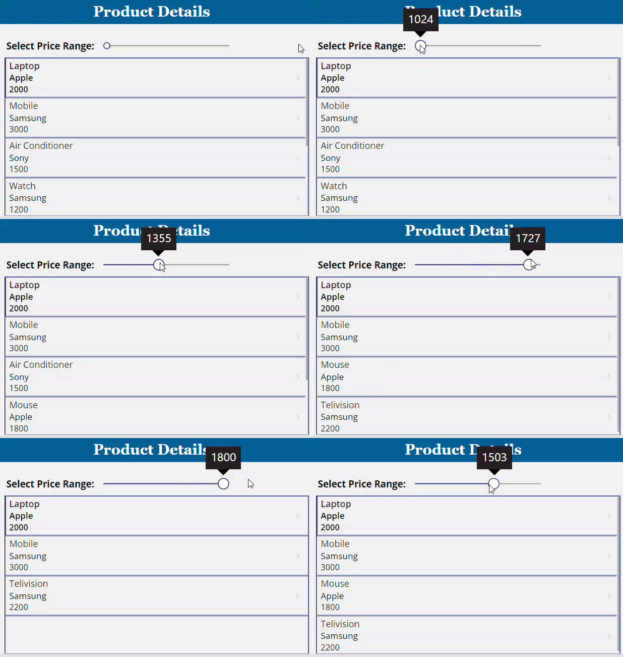
Now, I would like to filter and display the Power Apps collection records on the Gallery control based on the selected slider price range, as shown below.
Output:
To work around this, follow the below-mentioned steps. Such as:
1. To create a Power Apps collection, select the App object [From the left navigation] and set its OnStart property to the code below.
OnStart = ClearCollect(
    colProducts,
    'Product Details'
)
Where,
- colProducts = Power Apps collection name
- ‘Product Details’ = SharePoint Online list

2. On the Power Apps Screen, insert a Slider control and set its Max and Min properties, as shown below.
Max = 1800

Min = 1000
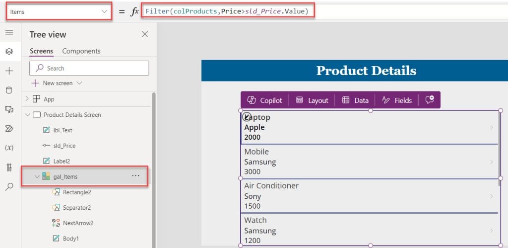
3. Now, insert a Gallery control and set its Items property as:
Items = Filter(
    colProducts,
    Price > sld_Price.Value
)
Where,
- colProducts = Power Apps collection name
- Price = Collection currency field
- sld_Price = Power Apps slider control name
4. Finally, Preview the app. Once the user selects the price range value from the slider control, the gallery filters and displays collection records based on the slider range value, as shown below.
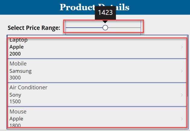
This way, you can use the Power Apps slider in gallery control.
Power Apps Date Slider
Suppose you want to use a slider control to select dates between January 1, 2024, and December 31, 2024, and display the selected date on a text label. To do so, follow the below steps.
1. On the Power Apps Screen -> Insert a Slider control and set its Min and Max properties.
Max = 365     -> Numerical value representing December 31, 2024

Min = 0           -> Numerical value representing January 1, 2024
2. Next, add the Text label control and set its Text property as:
Text = Text(
    DateAdd(
        Date(
            2024,
            1,
            1
        ),
        sld_Date.Value,
        TimeUnit.Days
    ),
    "[$-en-US]mm/dd/yyyy"
)
Where,
- sld_Date = Power Apps slider control name
- “[$-en-US]mm/dd/yyyy” = Date format

3. Finally, Preview the app. When the user selects any date value from the slider, the text label displays the result in a date format, as shown below.
Output:

Power Apps Slider Percentage
To create a Power Apps slider that represents a percentage value, you can follow these steps:
1. On the Power Apps Screen -> Insert a Slider control and set its Min and Max properties.
Max = 100   -> Representing 100%

Min = 0         -> Representing 0%
2. Next, add the Text label control and set its Text property as:
Text = "Selected Percentage: "&sld_Percentage.Value&"%"Where,
- sld_Percentage = Power Apps slider control name

3. Once it is done, Preview the app. Whenver the user selects the percentage value from the slider control, the text label displays the selected slider percentage value, as shown below.

Power Apps Double Sliders
Let’s see how to use two sliders or double sliders in the Power Apps with a simple example.
Example:
In this example, I have added two sliders for selecting time [Hour and Minutes], including the Date picker [To select date] and the Dropdown control [For selecting AM/PM]. Also, I have added a Text label to display the selected date and time.
Output:
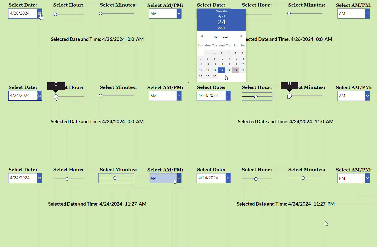
To do so, follow the below steps.
1. On the Power Apps Screen -> Insert a Date picker control -> Add a Slider control [sld_Hour] and set its Max and Min properties.
Max = 24
                                            //For Hours
Min = 0 
2. In the same way, insert another Slider control and set its Max and Min properties.
Max = 59
                                         //For Minutes
Min = 0
3. Next, insert a Dropdown control for AM/PM values, add a Text label, and set its Text property as:
Text = "Selected Date and Time: "&dte_SelectDate.SelectedDate&" "&sld_Hour.Value&":"&sld_Minutes.Value&" "&drp_Value.Selected.ValueWhere,
- dte_SelectDate = Power Apps dropdown control
- sld_Hour, sld_Minutes = Slider control names
- drp_Value = Dropdown control name

4. Finally, Preview the app. When the user selects the date and time, including the slider control’s values, the text label will display the result [Selecting date and time], as shown below.

This way, we can work with the Power Apps double slider controls.
Power Apps Set Slider Value
Suppose you want to set the specific value to the slider control to display the button control; follow the below steps.
1. On the Power Apps Screen, insert a Button control under the Slider control and set its Visible property to the code below.
Visible = sld_SetValue.Value = 75 //You can set another valueWhere,
- sld_SetValue.Value = 75 = Specific slider value
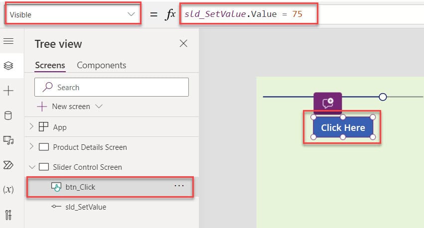
2. Now, Preview the app. Whenever the user selects a specific value [75], the button control will be visible to click. Otherwise, it will be in disable mode. Have a look at the below output.
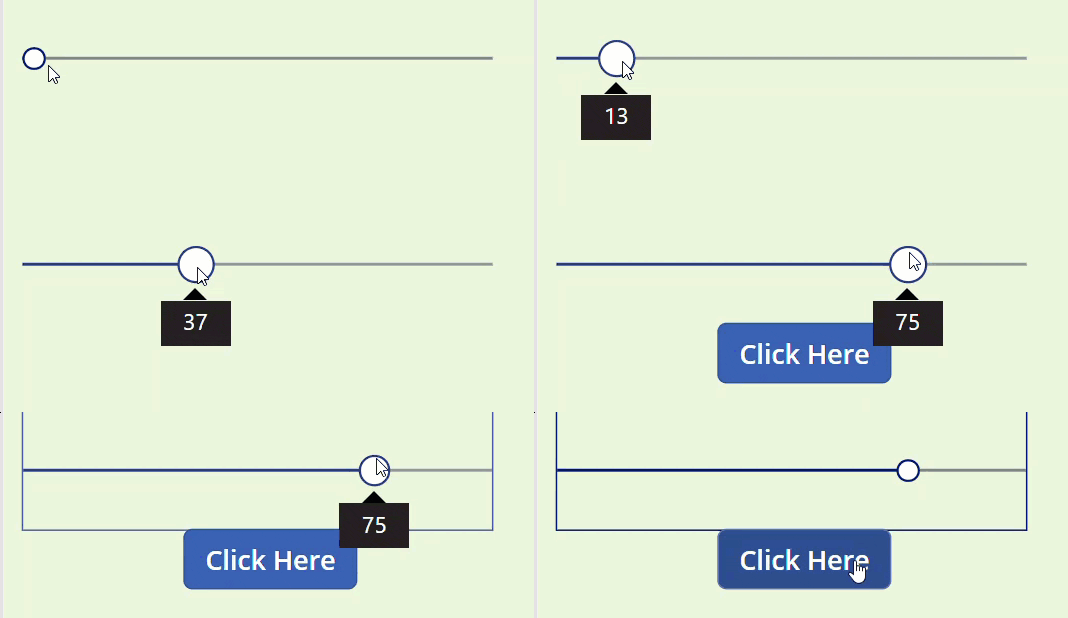
This way, you can set the value to the Power Apps slider control.
Some more Power Apps articles you may also like:
- Power Apps Loading Spinner
- Patch Function in Power Apps
- How to Use PowerApps Date and Time Picker
- Power Apps If Statement Examples
- Pagination in Power Apps Gallery
- Power Apps PDF Viewer Control
- Power Apps Remove First Character from String
I hope this Power Apps tutorial is helpful. This article explained everything about slider in Power Apps, PowerApps slider properties, how to use a slider in PowerApps, powerapps slider increment, set slider value Power Apps, etc.
Whenever you need to work with the Power Apps slider control, you can follow this tutorial until the end to get detailed information with simple, real-time examples.
I am Bijay a Microsoft MVP (10 times – My MVP Profile) in SharePoint and have more than 17 years of expertise in SharePoint Online Office 365, SharePoint subscription edition, and SharePoint 2019/2016/2013. Currently working in my own venture TSInfo Technologies a SharePoint development, consulting, and training company. I also run the popular SharePoint website EnjoySharePoint.com