When you think about clustered charts in Power BI, there are two main types: Clustered Column Chart and Clustered Bar Chart.
In this Power BI Tutorial, we will discuss What a clustered column chart in Power BI is and how to create clustered column chart in Power BI Desktop.
Also, we will learn what a Power BI Clustered Bar Chart is and how to create a clustered bar chart Power BI.
Additionally, we will discuss the topics below:
- Power BI clustered column chart multiple x-axis
- Power BI clustered column chart multiple y-axis
What is Clustered Column Chart in Power BI?
A clustered column chart in Power BI is a visual representation of data where bars are grouped together based on categories, and the height of each bar represents the value of a specific measure.
It’s like comparing multiple sets of data side by side, making it easy to see patterns, trends, and comparisons between different groups or categories.
In Power BI clustered column chart, the columns are displayed vertically.
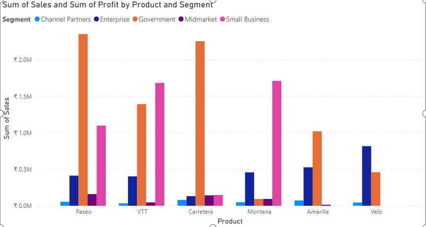
Clustered Column Chart Power BI
In this example, we will see how to create a clustered column chart in Power BI.
Here, we have a SharePoint list (Financial Sample) that contains below columns with various data types:
| Columns | Data Types |
|---|---|
| Product | Single line of text |
| Segment | Single line of text |
| Sales | Currency |
| Profit | Currency |
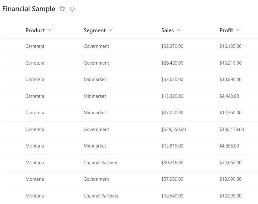
Now follow the below steps to create a clustered column chart in Power BI:
1. Open Power BI Desktop and load the data set. Then, in the Data pane, you can see your data set.
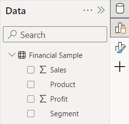
2. Under the Home tab, click “Visual gallery,” then click “Clustered column chart.”

3. Then, using the +Add data option, add Product to the X-axis, Sales to the Y-axis, and Segment to the Legend field.
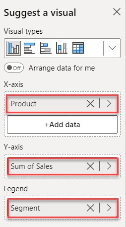
4. Then you can see in the report view the clustered column chart created.
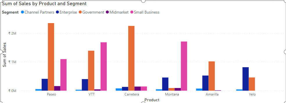
This way, you can create a Power BI clustered column chart.
What is Clustered Bar Chart in Power BI?
A clustered bar chart in Power BI is a type of visual representation that displays data using rectangular bars grouped together in clusters. Each cluster represents a category, and within each cluster, the bars represent different values or measures corresponding to that category.
It’s an effective way to compare multiple sets of data across different categories, allowing you to easily spot patterns, trends, or differences between the groups.
In the Power BI clustered bar chart, the bars are displayed horizontally.
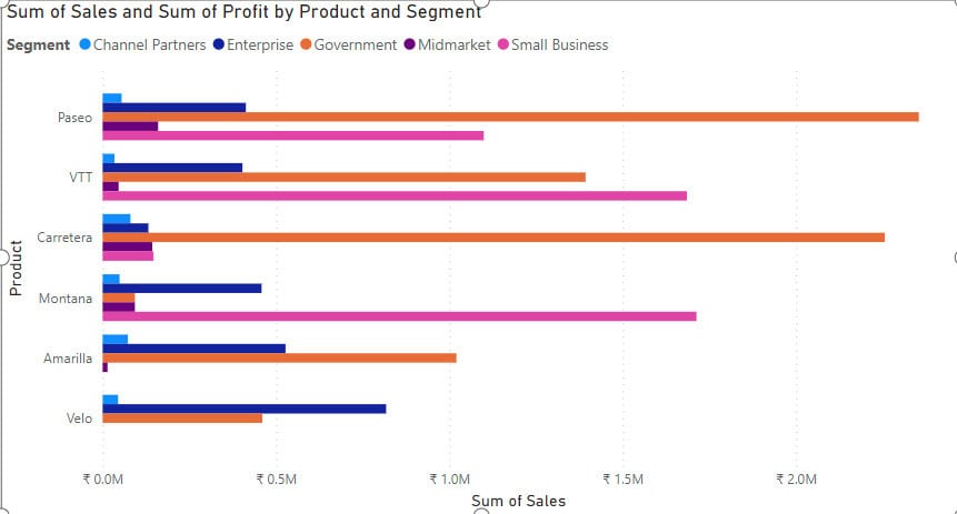
Clustered Bar Chart Power BI
In this example, we will see how to create a clustered bar chart in Power BI.
Now follow the below steps:
1. Open Power BI Desktop and load the data set. Then, in the Data pane, you can see your data set.
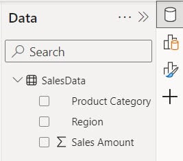
2. Under the Home tab, click “Visual gallery,” then click “Clustered bar chart.”

3. Then, using the +Add data option, add Product Category to the X-axis, Sales Amount to the Y-axis, and Region to the Legend field.
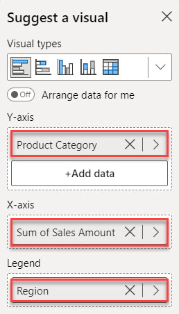
4. Then you can see in the report view the clustered bar chart created.
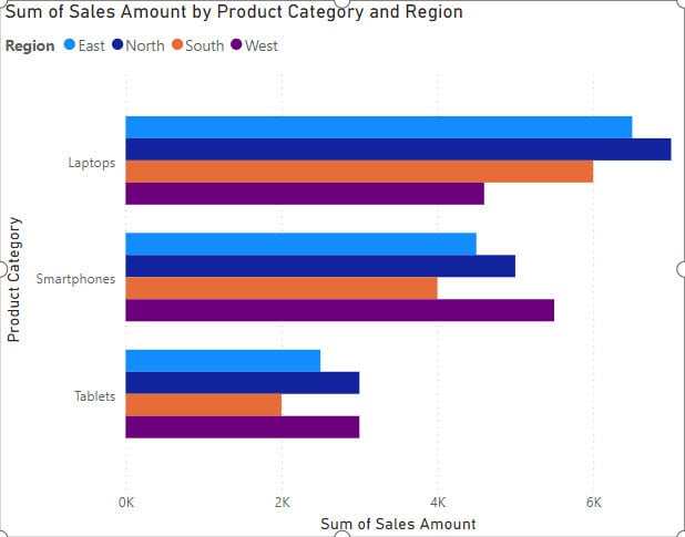
This way, you can create a Power BI clustered bar chart.
Power BI Clustered Column Chart Multiple X-axis
Let’s see how we can display data in the clustered column chart with Multiple X-axis.
If we add two fields to the x-axis directly, the column chart will display based on the first field’s data by default. Using the drill-down feature is an alternative method to display a clustered column chart with multiple x-axes.
For this example, we use below table:
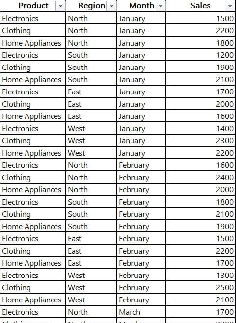
Now Follow the below steps to do this:
1. Open Power BI Desktop and load the data set. Then, in the Data pane, you can see your data set.
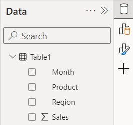
2. Under the Home tab, click “Visual gallery,” then click “Clustered column chart.”

3. Then, using the +Add data option, add Product and Region to the X-axis, Sales to the Y-axis, and Month to the Legend field.
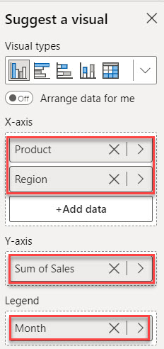
4. Then, you can see the column chart will display based on the first field.
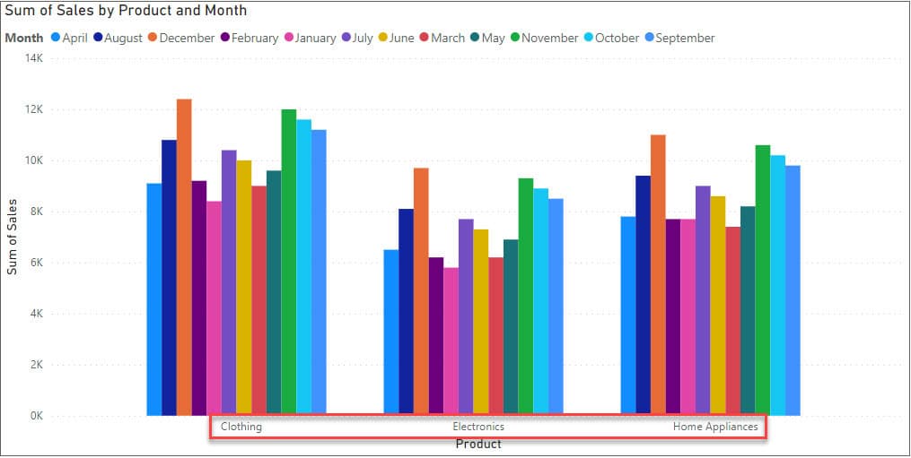
5. When you click drill down, you can see what a clustered column chart with Multiple X-axis looks like.
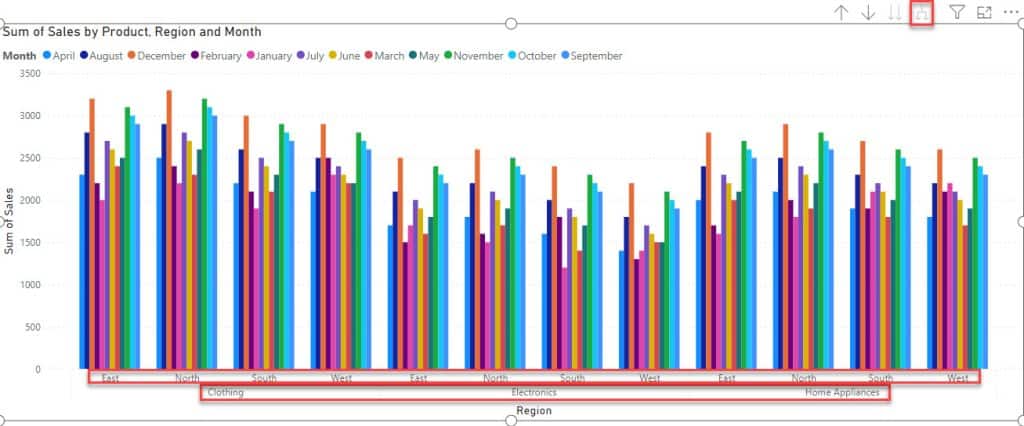
This way, you can display data in the clustered column chart with Multiple X-axis in Power BI.
Power BI Clustered Column Chart Multiple Y-axis
In this example we use Power BI clustered column chart multiple Y-axis.
Unfortunately, Power BI doesn’t support adding multiple Y-axes in a clustered column chart directly. However, you can achieve a similar effect using Tooltips.
Now follow the below steps:
1. Under the Home tab, click “Visual gallery,” then click “Clustered column chart.”

2. Then, using the +Add data option, add Product to the X-axis, Sales to the Y-axis, and Segment to the Legend field.
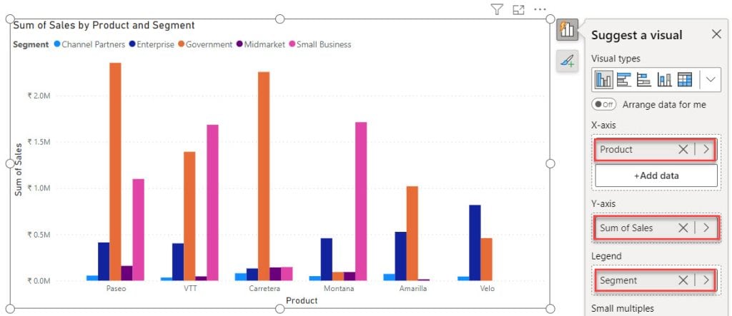
Now you can see you can not add another column in the Y-axis. For this, I am using tooltips.
3. Then, using the +Add data option, add Profit into the tooltips field.
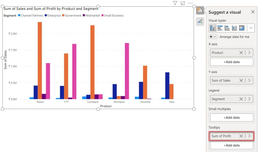
4. When you hover over any bar, you can see a profile for each product in a specific segment.

This method allows you to handle multiple Y-axes in a Power BI clustered column chart effectively.
Also, you may like:
- Stacked Bar Chart in Power BI
- Power BI Color Based On Value
- Power BI Group by
- Power Query Date Functions
- Power BI If Date is Greater than Specific Date
In this Power BI tutorial, we’ve explored clustered column chart and clustered bar chart, learning how to create a clustered column chart and clustered bar chart in Power BI Desktop. We’ve understood that clustered column chart display data in vertical column, while clustered bar chart show data in horizontal bars.
We’ve also covered some advanced topics like creating clustered column charts with multiple x-axes and multiple y-axes.
I am Bijay a Microsoft MVP (10 times – My MVP Profile) in SharePoint and have more than 17 years of expertise in SharePoint Online Office 365, SharePoint subscription edition, and SharePoint 2019/2016/2013. Currently working in my own venture TSInfo Technologies a SharePoint development, consulting, and training company. I also run the popular SharePoint website EnjoySharePoint.com