Power BI color based on value is like giving your data a makeover to make it easier to understand. Imagine you have a bunch of numbers representing sales for different products.
You can tell Power BI to change the color of those numbers depending on how high or low they are compared to a certain target or compared to each other.
In this tutorial, we will learn Power BI Change Color Based on Value and Power BI Line Chart Color Based on Value. Also, we will discuss the topics below:
- Power BI bar chart color based on value
- Change font color using DAX in Power BI
- Power BI card color based on value
- Power BI change slicer background color based on value
- Power BI change shape color based on value
- Power BI map change color based on value
Power BI Change Background Color Based on the Value
Let’s see how we can change the background color based on the value in Power BI.
Imagine you want to use Power BI to track your sales performance across different regions. You want to quickly identify areas where sales are exceeding expectations and areas where they’re falling behind.
I have a table with some information like Region, State, and Sales Amount columns.
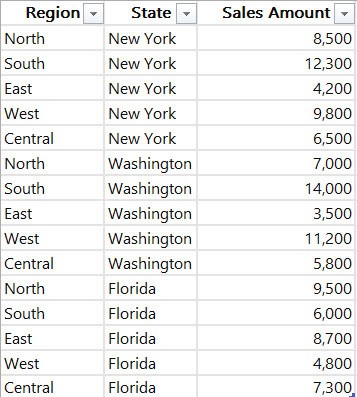
Follow the below steps to change the background color based on the value in Power BI:
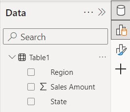
1. Open Power BI Desktop and load the data set. Then, in the Data pane, you can see your data set.
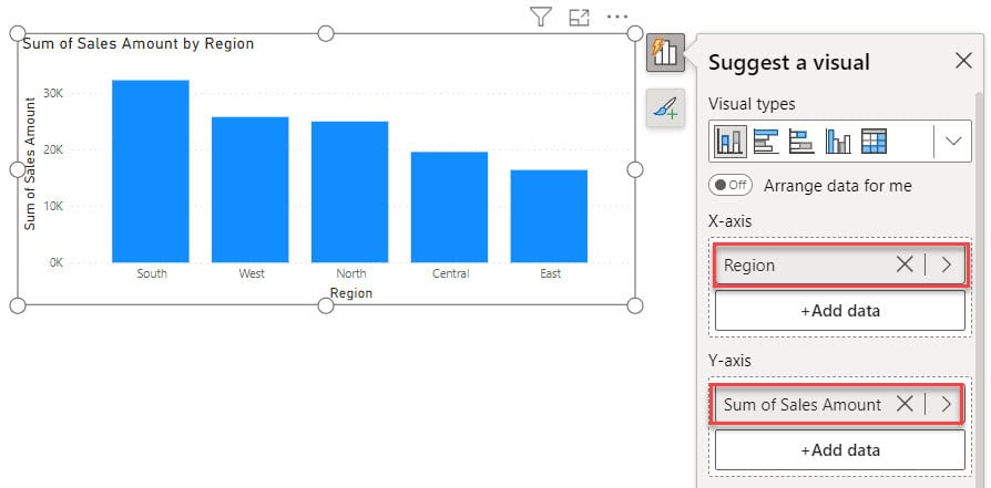
2. Under the Home tab, click Visual gallery, then click Stacked column chart.

3. Then, using the +Add data option, add Region into the X-axis and Sales Amount into the Y-axis.
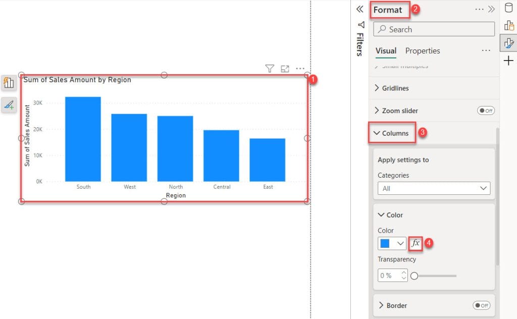
4. Select Stacked column chart -> expand Format pane -> expand Columns -> click fx button.
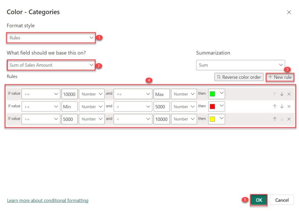
5. Then, the Color – Categories dialog box opens. In this box, select Format style -> Rules and What field should we base this on? -> Sales Amount. Next, add some Rules using the + New rule. After that, click OK.
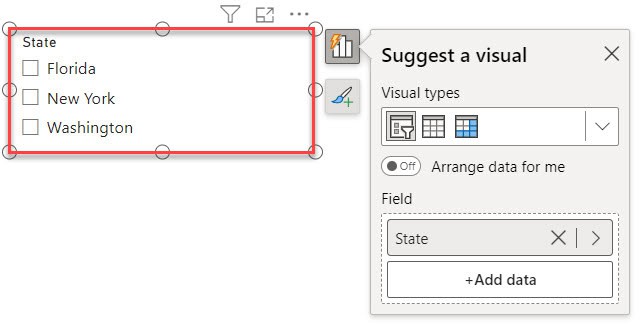
6. Then, create a slicer and add State into the Field.
7. You will notice that the color in the background changes depending on the values when we choose a slicer.
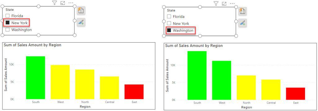
This way, you can change the background color based on the value in Power BI.
Power BI Line Chart Color Based on Value
Unfortunately, the Power BI line chart has one drawback. We can not find any option to change color based on value.
Not just the line chart but also the pie chart and donut chart don’t have a choice to adjust the color according to the value.
Alternatively, we can use Power BI to change the line color based on value for the line chart, pie chart, and donut chart.
To change the color of the line chart based on the value, start by making a bar chart in Power BI. Then, change the color of the bar chart. After that, convert the bar chart to a line chart.
To do this, follow the below steps:
1. Under the Home tab, click Visual gallery, then click Clustered column chart.

2. Then, using the +Add data option, add Region into the X-axis and Sales Amount into the Y-axis.
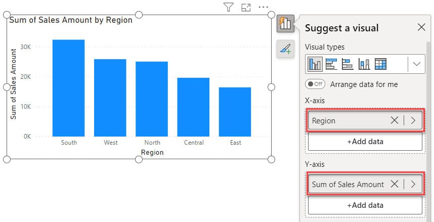
3. Select Clustered column chart -> expand Format pane -> expand Columns -> click fx button.
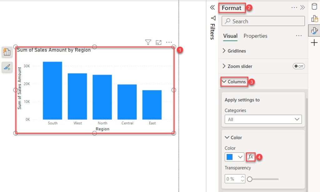
4. Next, the “Color – Categories” dialog box will appear. Here, choose “Format style” -> “Gradient,” and then select “What field should we base this on?” -> “Sales Amount.”
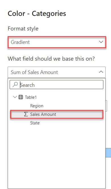
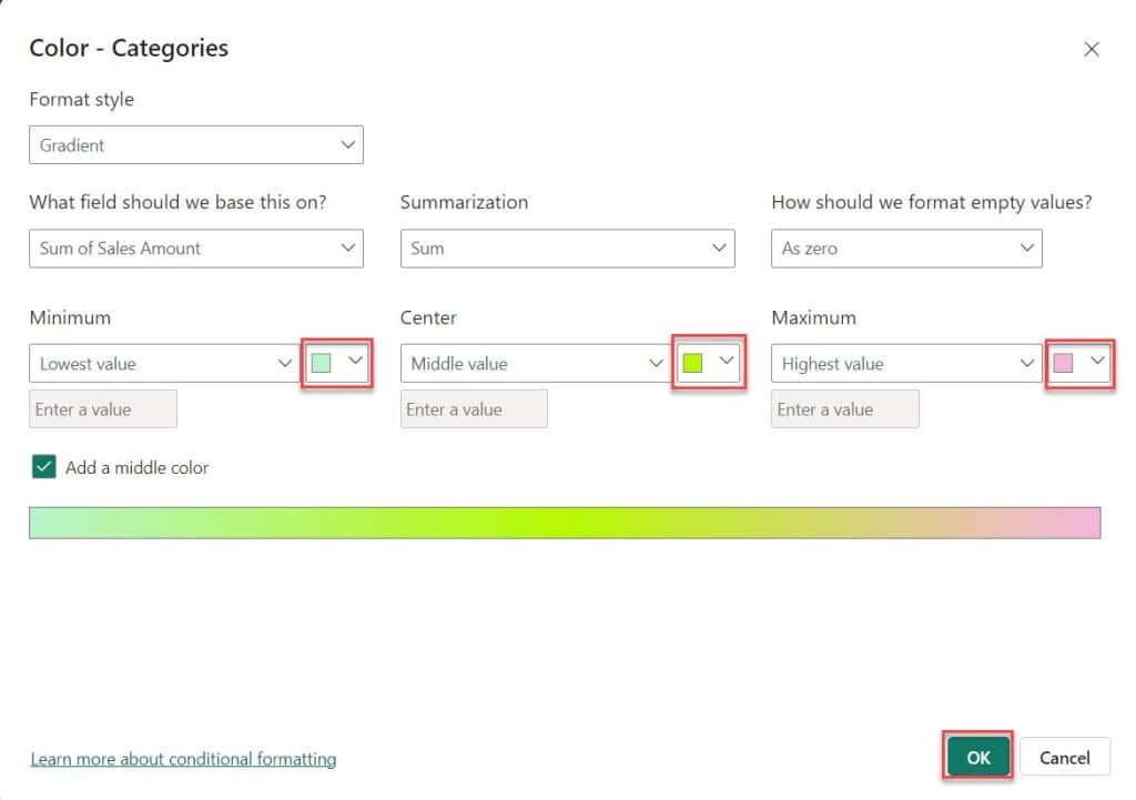
5. Then, choose a color from the highlight box dropdown below. Then click OK.
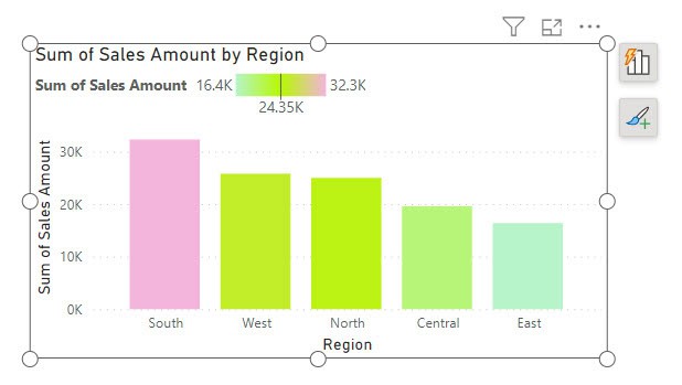
6. Then, you can see the column chart created.
7. Select the chart under the Home tab, click Visual gallery, then click Line chart.
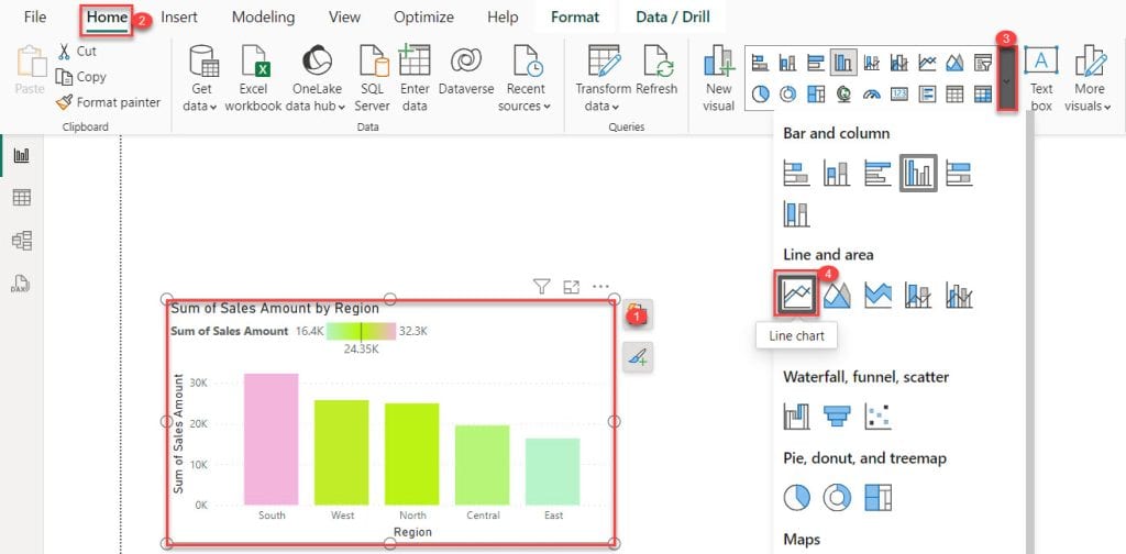
8. Then, you can see the Power BI line chart color based on the value.
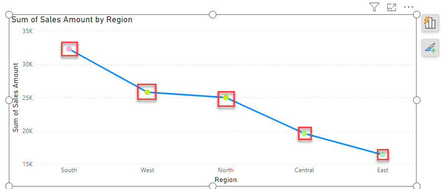
By following these steps, you can adjust the color based on the value in Power BI for the line chart, pie chart, and donut chart.
Power BI Bar Chart Color Based on Value
Let’s learn how to make the color of the bar chart in Power BI change depending on the value.
For this example, we will use the SharePoint list below with the Product and Price columns.

Follow the below steps to change the Power BI Bar chart color based on value:
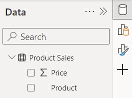
1. Load the SharePoint list into Power BI Desktop; then, you can see data in the data pane.
2. Under the Home tab, click Visual gallery, then click Stacked column chart.

3. Then, using the +Add data option, add Product into the X-axis and Price into the Y-axis.

4. Select Stacked column chart -> expand Format pane -> expand Columns -> click fx button.

5. Then, the Color – Categories dialog box opens. In this box, select Format style -> Rules and What field should we base this on? -> Price. Next, add some Rules using the + New rule. After that, click OK.
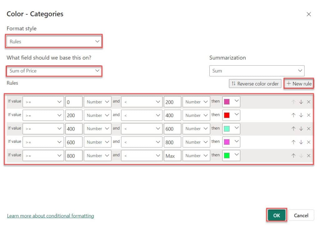
6. This way you can make the color of the bar chart in Power BI change depending on the value.

This is how to change the color based on the value in the bar chart Power BI.
Change Font Color Using DAX in Power BI
Let’s see how to change the font color using DAX in Power BI.
In this example, I’m using the dataset mentioned earlier. I assume you’ve loaded the data into Power BI Desktop.
Now follow the below steps:
1. Under the Home tab, click “New measure“.

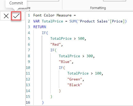
2. In the formula bar, put below the DAX expression. Then click the Commit button.
Font Color Measure =
VAR TotalPrice = SUM('Product Sales'[Price])
RETURN
    IF(
        TotalPrice > 500,
        "Red",
        IF(
            TotalPrice > 300,
            "Blue",
            IF(
                TotalPrice > 100,
                "Green",
                "Black"
            )
        )
)Where:
- Font Color Measure = This line defines the name of the DAX measure.
- VAR TotalPrice = SUM(‘Product Sales'[Price]) = This line calculates the total price of all product sales by summing up the ‘Price‘ column in the ‘Product Sales’ table and storing it in a variable called TotalPrice.
- RETURN = This indicates the start of the expression that will determine the font color based on the TotalPrice.
- IF(TotalPrice > 500, “Red”= If the TotalPrice is greater than 500, the font color should be “Red”.
- IF(TotalPrice > 300, “Blue” = If the TotalPrice is not greater than 500 but is greater than 300, the font color should be “Blue.”
- IF(TotalPrice > 100, “Green,” “Black” = If the TotalPrice is not greater than 500 or 300 but is greater than 100, the font color should be “Green”; otherwise, it should be “Black.”
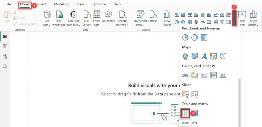
3. Under the Home tab, click Visual gallery, then click Table Visual.
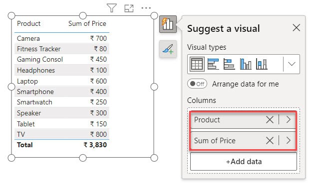
4. Then, using the +Add data option, add the Product and Price columns.
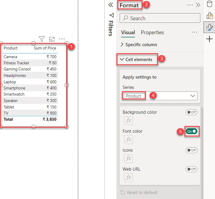
5. Select table visual -> expand Format pane -> expand Cell element -> choose Series as Product -> Then On Font color.
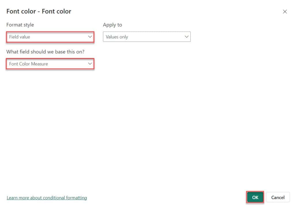
6. Then you can see Font color – Font color window opens Here, choose “Format style” -> “Field value,” and then select “What field should we base this on?” -> “Font Color Measure.” Then click OK.
7. In the below screenshot, you can see that the font color has been changed based on the value.
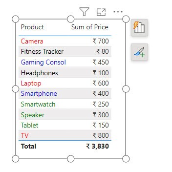
This is how to change the font color based on the value in Power BI.
Power BI Card Color Based on Value
Let’s learn how to change the color of a Power BI card visual based on its value.
I have a SharePoint list named Sales Data with two different columns:
- Date – Date and time
- Sales Amount – Currency
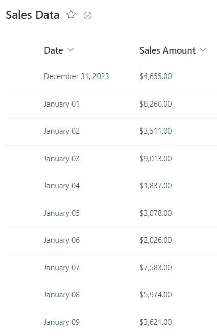
Now follow the below steps:
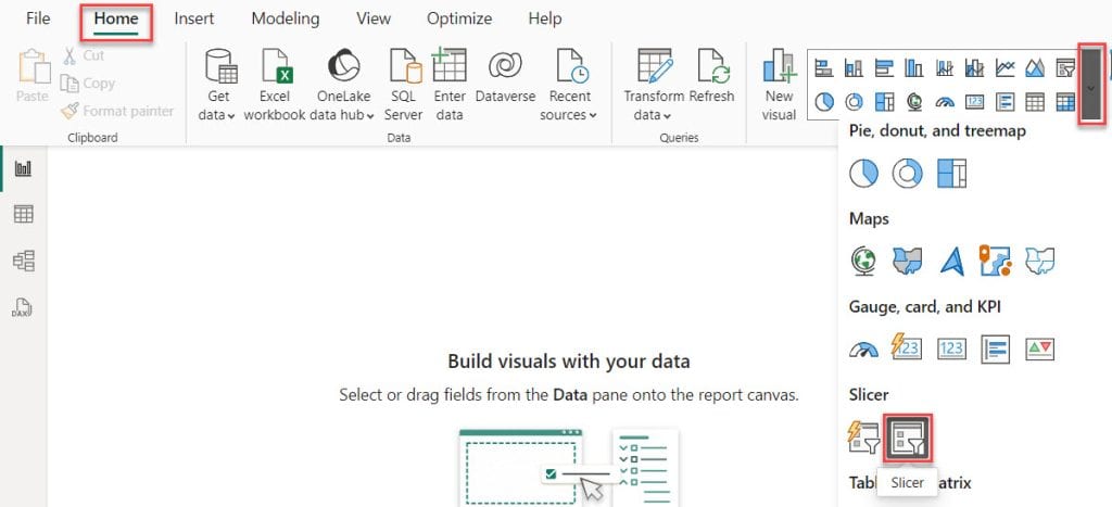
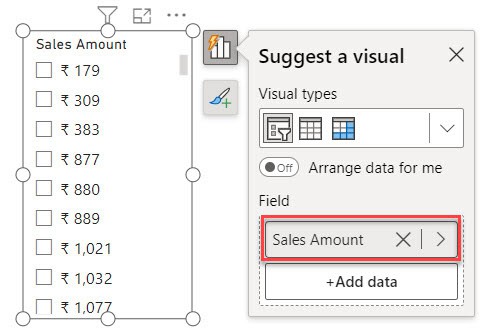
1. Open Power BI Desktop and load your data. Then, go to the “Home” tab, expand the “Visual gallery,” and click on the “Slicer” visual.
2. Then, using the +Add data option, add the Sales Amount into the Field.
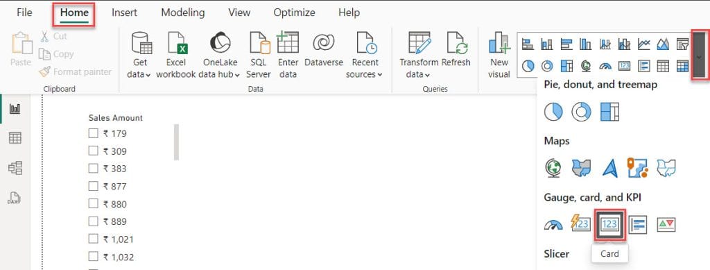
3. Then, go to the “Home” tab, expand the “Visual gallery,” and click on the “Card” visual.
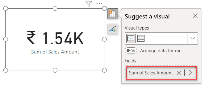
4. Then, using the +Add data option, add the Sales Amount into the Fields.
5. Select then card visual -> expand Format panel -> expand Callout value -> click fx button.
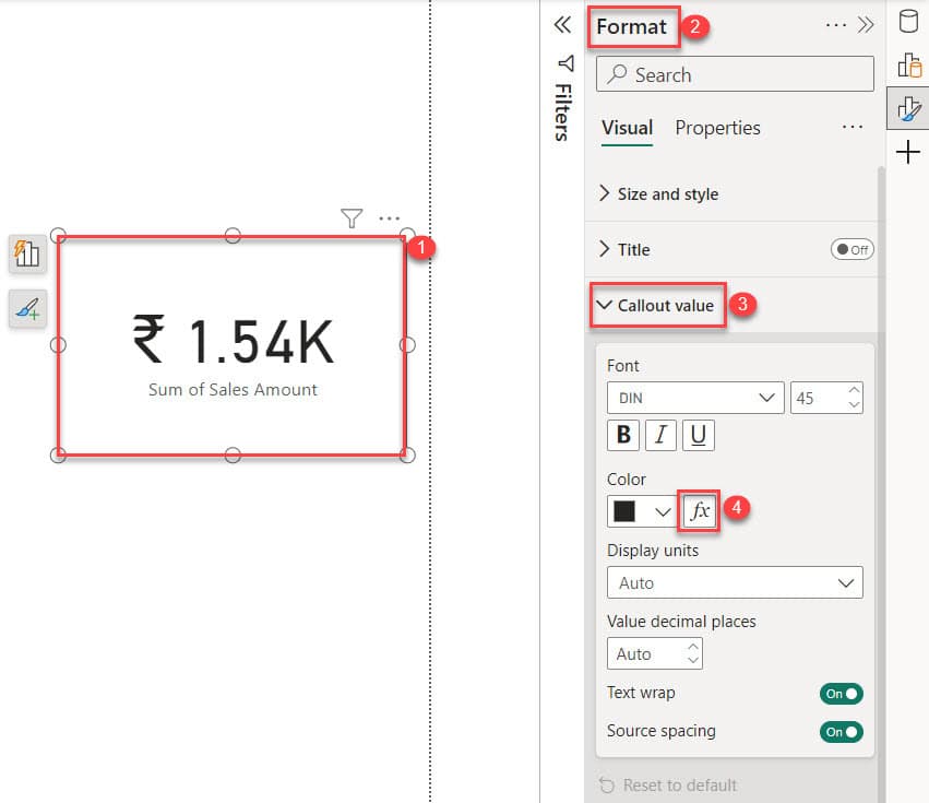
6. The Color—Callout value dialog box opens. In this box, select Format style -> Rules and What field should we base this on? -> Sales Amount. Next, add some Rules using the + New rule. After that, click OK.
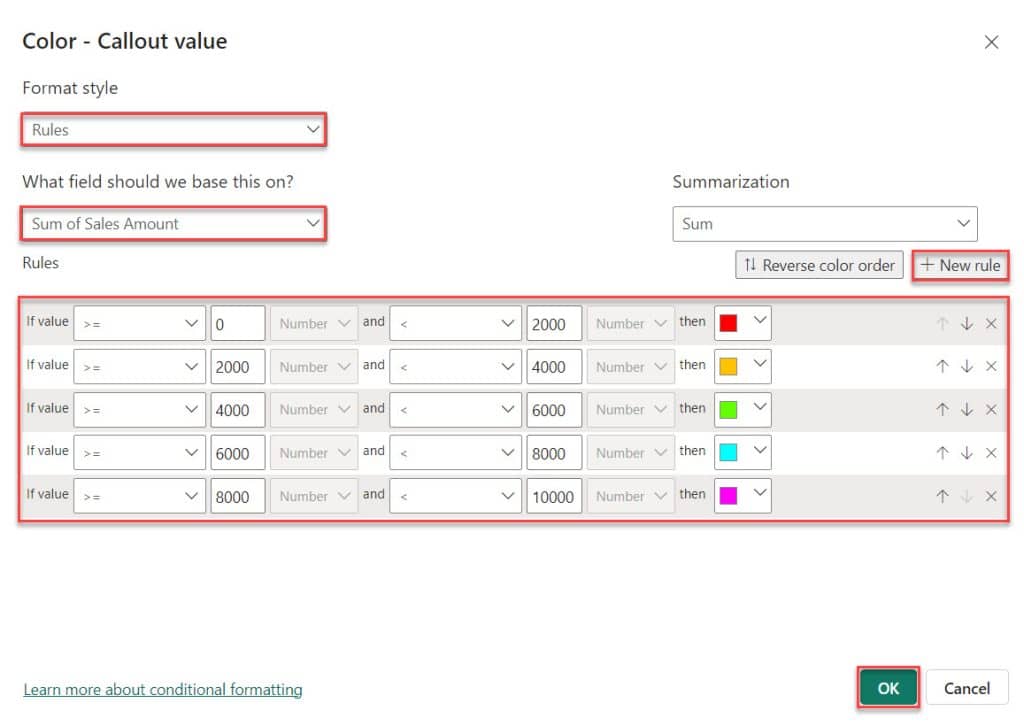
7. Now, we can see that the card visual data color changes according to the selected list slicer value.

This way, you can change the color of a Power BI card visual based on its value.
Power BI Change Slicer Background Color Based on Value
Unfortunately, the Power BI slicer visual has one drawback. We can not find any option to change color based on value.
Another way to achieve the same effect is by using the Power BI Treemap instead of the slicer.
For this example, I am using the below table:
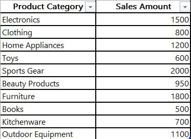
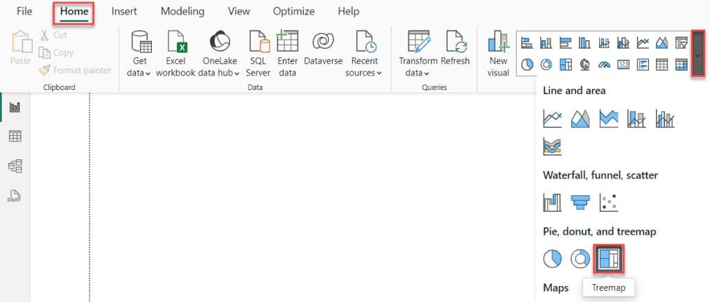
1. Open Power BI Desktop and load your data. Then, go to the “Home” tab, expand the “Visual gallery,” and click on the “Treemap.”
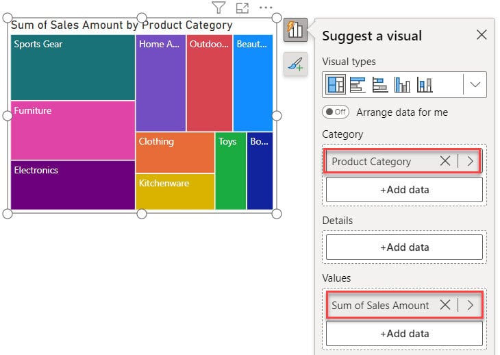
2. Then, using the +Add data option, add the Product Category into the Category and the Sales Amount into the Values field.
3. Select then Treemap visual -> expand Format panel -> expand Colors -> click fx.
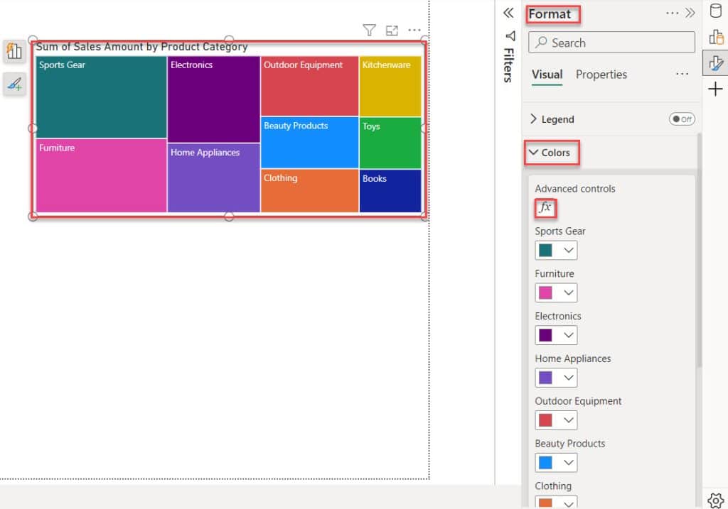
4. The Default color – Colors dialog box opens. In this box, select Format style -> Rules and What field should we base this on? -> Sales Amount. Next, add some Rules using the + New rule. After that, click OK.
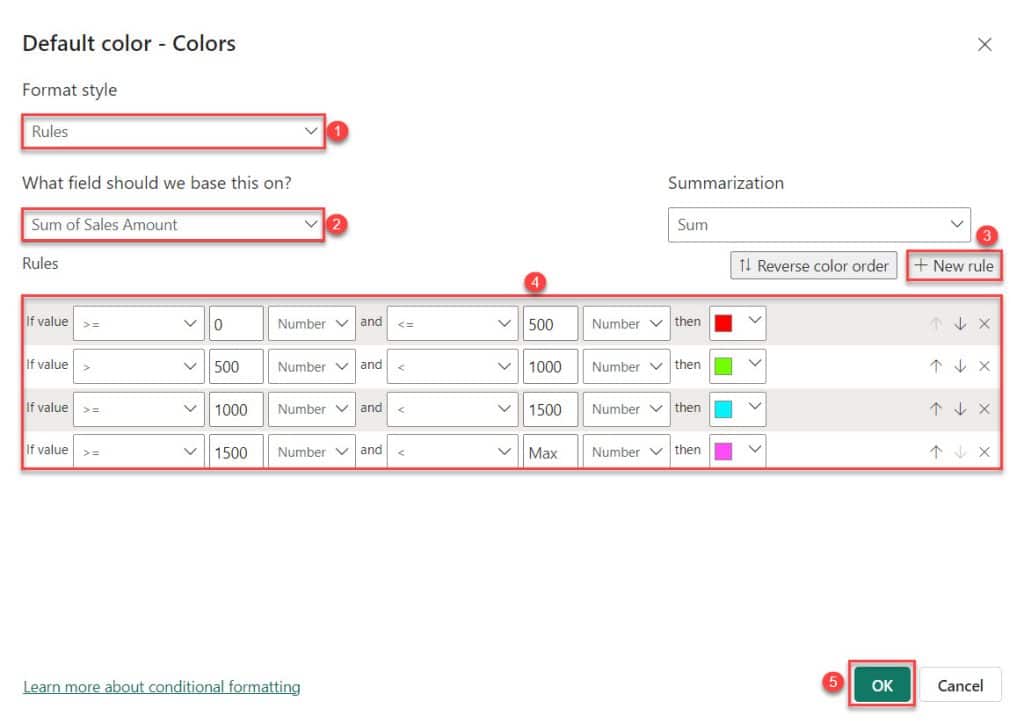
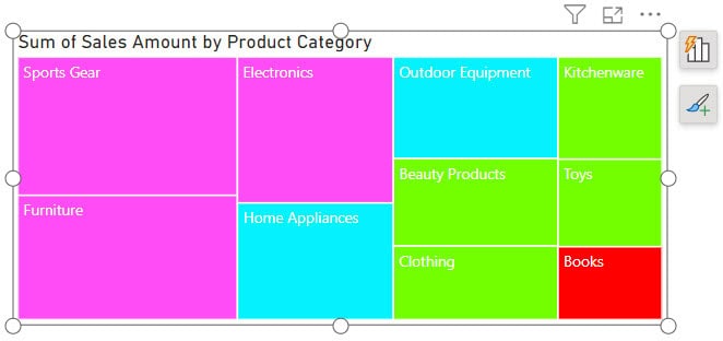
5. Then, you can see the Treemap color change based on value.
6. Then create a table Power BI Table visual with Product Category and Sales Amount columns.
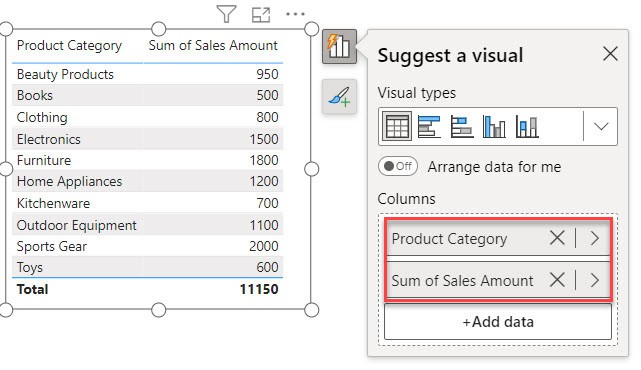
7. When you choose “Sports Gear,” the table visual will display only the “Sports Gear” category along with its Sales Amount.

This way, you can change the slicer background color based on the value in Power BI.
Power BI Change Shape Color Based on Value
Let us see how we can change the shape and color based on the Value.
1. Under the Home tab, click New measure.

2. In the formula bar, put below the DAX expression. Then click the Commit button.
Measure = SWITCH ( TRUE (),
SUM(Table1[Sales Amount])<=500,"yellow",
SUM(Table1[Sales Amount])<=1000,"Blue",
SUM(Table1[Sales Amount])<=1500,"Red",
SUM(Table1[Sales Amount])<=2000,"Green","Pink" )
Where:
- Measure = SWITCH ( TRUE ()) = This initiates a SWITCH function, which evaluates conditions and returns corresponding results based on the conditions being met.
- SUM(Table1[Sales Amount])<=500, “yellow” = This checks if the total sales amount in Table1 is less than or equal to 500; if true, it returns “yellow.”
- SUM(Table1[Sales Amount])<=1000, “Blue,” = This checks if the total sales amount in Table1 is less than or equal to 1000; if true, it returns “Blue.”
- SUM(Table1[Sales Amount])<=1500, “Red,” = This checks if the total sales amount in Table1 is less than or equal to 1500; if true, it returns “Red.”
- SUM(Table1[Sales Amount])<=2000, “Green” = This checks if the total sales amount in Table1 is less than or equal to 2000; if true, it returns “Green.”
- “Pink” = If none of the previous conditions are met (meaning the total sales amount is greater than 2000), it returns “Pink.”

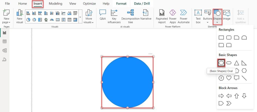
3. Click on the “Insert” tab, then expand “Shapes,” and choose any shape. For example, I’ll select “(Basic Shapes) Oval.
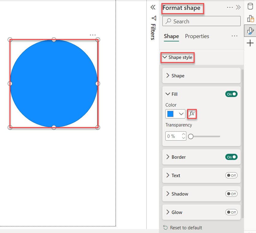
4. Select the Shape -> expand Format shape -> expand Shape style -> click fx button.
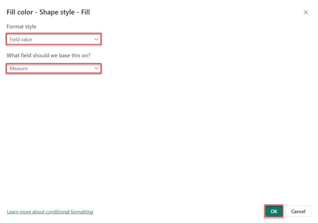
5. Then you can see Font color – Font color window opens Here, choose “Format style” -> “Field value,” and then select “What field should we base this on?” -> “Measure.” Then click OK.
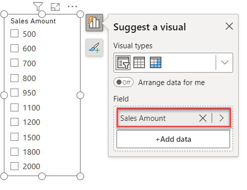
6. Next, create a slicer based on the “Sales Amount” field.
7. When you select any sales value in the slicer, the shape’s color changes based on the measure.

This way, you can change the shape and color based on the Value in Power BI.
Power BI Map Change Color Based on Value
In this example, we see how to change color based on value in Power BI.
Here, we have a SharePoint list (Orders) that contains below columns with various data types:
| Columns | Data Types |
|---|---|
| Category | Single line of text |
| Sub-Category | Single line of text |
| Segment | Single line of text |
| City | Single line of text |
| State | Single line of text |
| Sales | Currency |
| Profit | Currency |
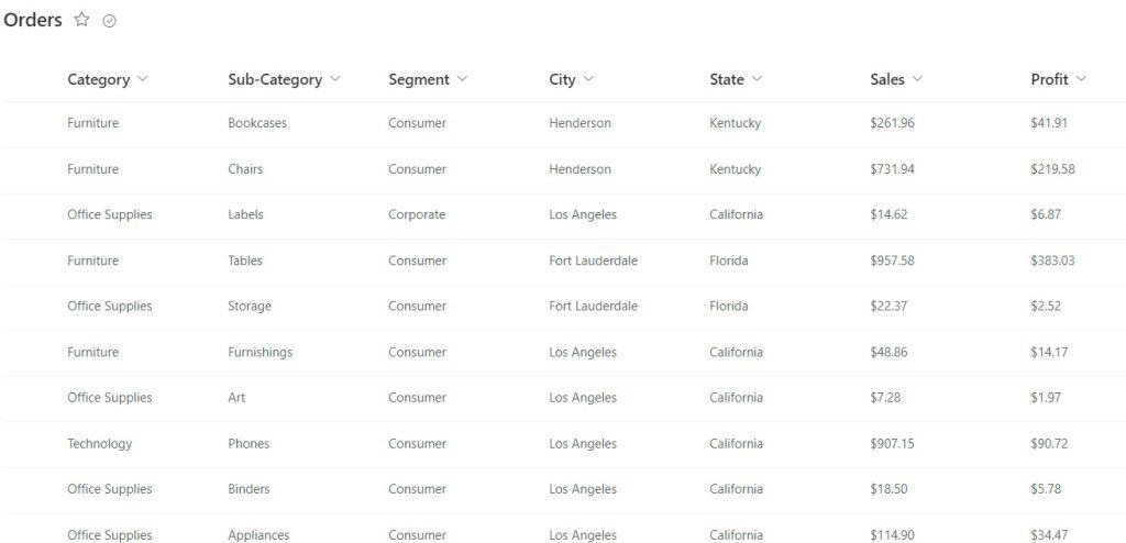
To change color based on value in Power BI, follow the below steps:
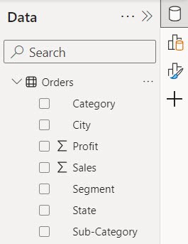
1. Open Power BI Desktop and load the data set. Then, in the Data pane, you can see your data set.
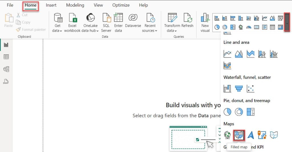
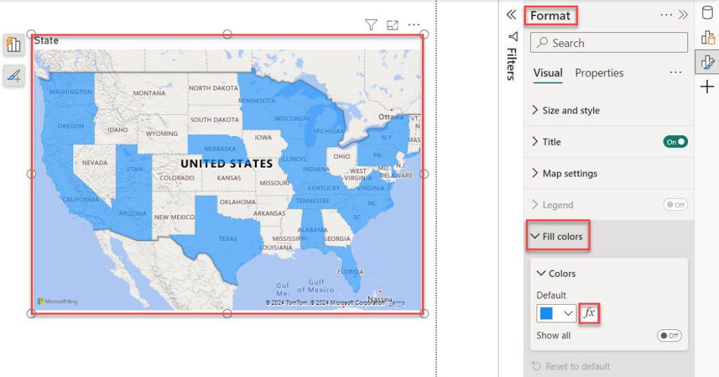
2. Under the Home tab, expand “Visual gallery.” Then click the Filled map.
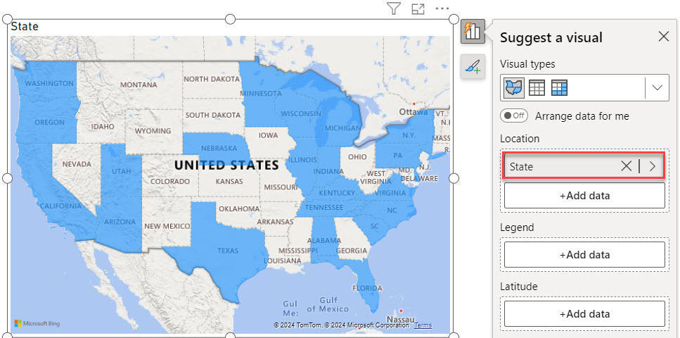
3. Then, using the +Add data option, add the State into the Location.
4. Select Filled map -> expand Format panel -> expand Fill colors -> click fx button.
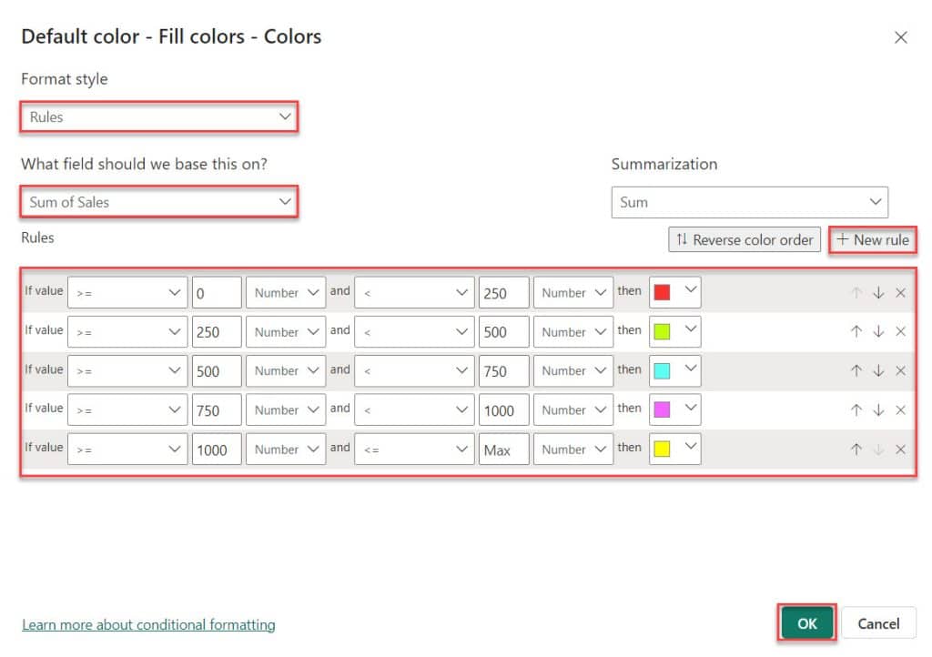
5. The Default color – Fill colors – Colors dialog box opens. In this box, select Format style -> Rules and What field should we base this on? -> Sales. Next, add some Rules using the + New rule. After that, click OK.
6. Then you can see the Power BI map change color based on value.
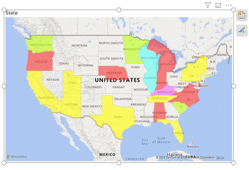
This way, you can change color based on the value in the Power BI map visual.
Some more Power BI articles you may also like:
- Add Conditional Column in Power BI
- Power BI Clustered Column Chart
- Create Date Hierarchy in Power BI
- Power BI Group by
- Power BI Split Column by Text Contains
I hope this tutorial gave you all the information about Power BI Change Color Based on Value, Power BI line chart color based on value, and many more:
- Power BI bar chart color based on value
- Change font color using DAX in Power BI
- Power BI card color based on value
- Power BI change slicer background color based on value
- Power BI change shape color based on value
- Power BI map change color based on value
I am Bijay a Microsoft MVP (10 times – My MVP Profile) in SharePoint and have more than 17 years of expertise in SharePoint Online Office 365, SharePoint subscription edition, and SharePoint 2019/2016/2013. Currently working in my own venture TSInfo Technologies a SharePoint development, consulting, and training company. I also run the popular SharePoint website EnjoySharePoint.com