Pie charts in Power BI are typically used to represent the composition or distribution of a single categorical variable in your data.
In other words, we would use a pie chart when we want to show how parts of a whole relate to each other.
In this tutorial, we’ll learn how to create a Pie chart in Power BI Desktop. We’ll also explore how to work with Power BI Pie chart multiple values, and many more like:
- Power BI Pie chart group small values
- Power BI Pie chart percentage of total
- Power BI Pie chart details
Power BI Pie Chart
To create a Power BI Pie chart, follow the example below.
Scenario:
Suppose you work for an IT company. You have a dataset indicating the status of various projects, such as whether they have started, are in progress, are Completed, or have not started yet. You want to create a Pie chart to visualize this data.
According to this scenario, we have a SharePoint list named ProjectPortfolio that contains the following columns with various data types:
| Columns | Data Types |
|---|---|
| Project Name | Single line of text |
| Project Description | Multiple line of text |
| Project Manager | Single line of text |
| Status | Single line of text |
| Priority | Single line of text |
| Start Date | Date and time |
| End Date | Date and time |
| Budget | Currency |
| Actual Cost | Currency |
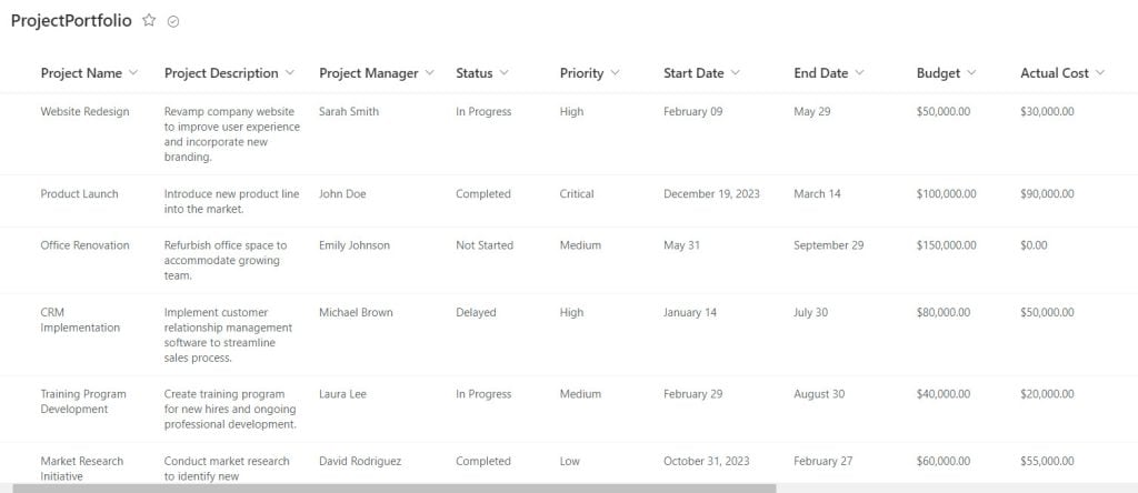
Follow the below steps to create a Power BI Pie:
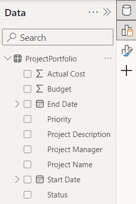
1. Open Power BI Desktop and load the data. Then, in the Data Panel, you can see the data set.
2. Under the Home tab, expand Visual gallery -> Click the Pie chart.

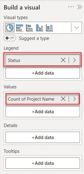
3. Then, using the +Add data option, add Status into Legend and Project Name into Values.
4. Now you see our Pie chart successfully created.
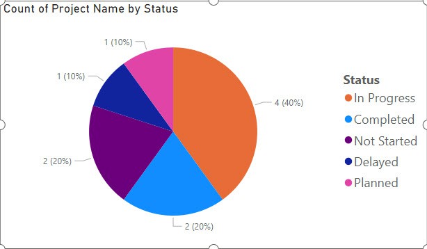
With this pie chart, we can quickly see the distribution of project statuses, such as the number of projects in progress, completed, delayed, or not started.
Power BI Pie Chart Multiple Values
To display multiple values in the Power BI Pie chart, refer to the scenario below:
In Power BI, a Pie chart usually displays a single data value. However, if you need to show multiple values, you can use multiple Pie charts. Alternatively, you can add the values to the tooltip to display multiple values.
I know you thought that we could add multiple values to the values field, but adding multiple values to the values field can make it difficult to understand, especially if there are many values.
Let’s see in the Power BI Desktop:
1. Under the Home tab, expand Visual gallery -> Click the Pie chart.

2. Then, using the +Add data option, add Project Name into Legend and Actual cost and Budget into Values.
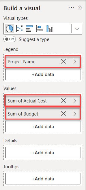
3. Now, you see the Power BI Pie chart.
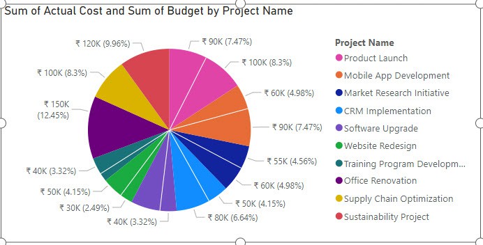
As you can see, it understands when there are only two values; it’s easier to understand when there are more values, but it can become confusing if there are more values.
To solve this issue, we will add the Budget column to the Tooltips field. Follow the below steps:
- In a Build a visual section remove Budget and add into the tooltips field.
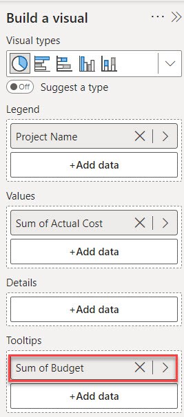
- Once you’ve added multiple values to the tooltip, you can hover over any of the pie slices to see the budget information in the tooltips.
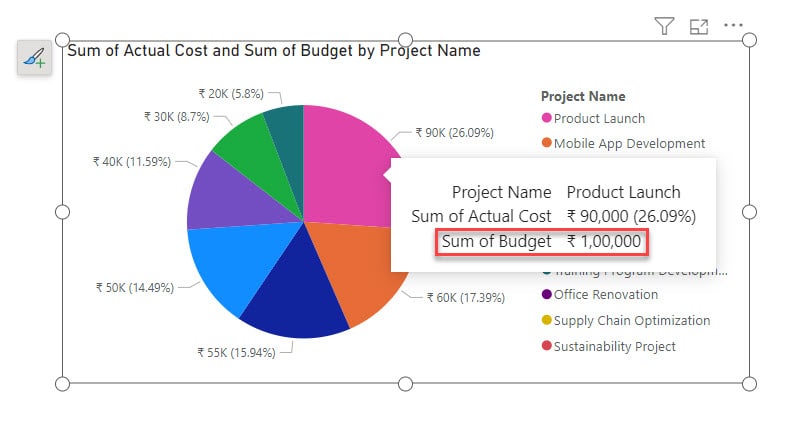
This way, you can display multiple values in the Power BI Pie chart and see its details using tooltips.
Power BI Pie Chart Percentage of Total
Let’s see how to show the percentage of the total in the Power BI pie chart.
In this example, I created a Pie chart that shows the budget by project name. Check the screenshot below.
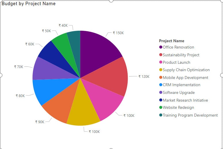
Now follow the below steps to show the percentage of the total in the Power BI pie chart:
1. Sele the visual and expand the Format pane.
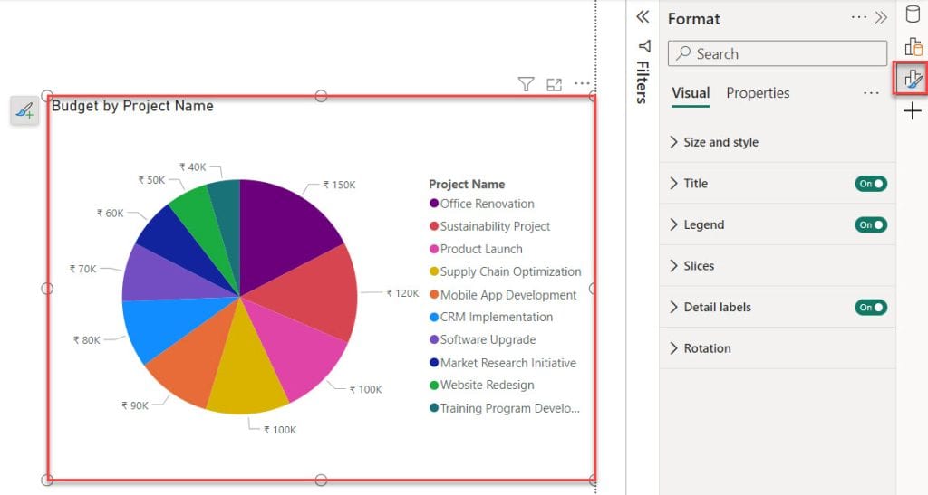
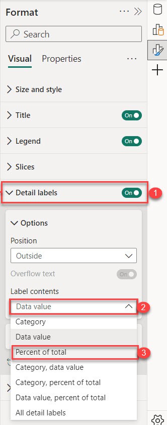
2. After that, expand Detail labels -> select Lable contents drop-down -> select Percent of total.
3. Now, you can see the percentage of the total in the Power BI Pie chart.
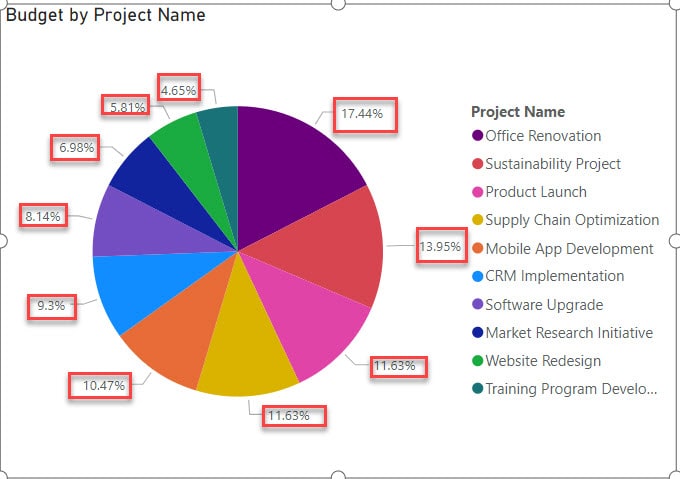
This way, we can show the percentage of the total in the Power BI pie chart.
Power BI Pie Chart Details
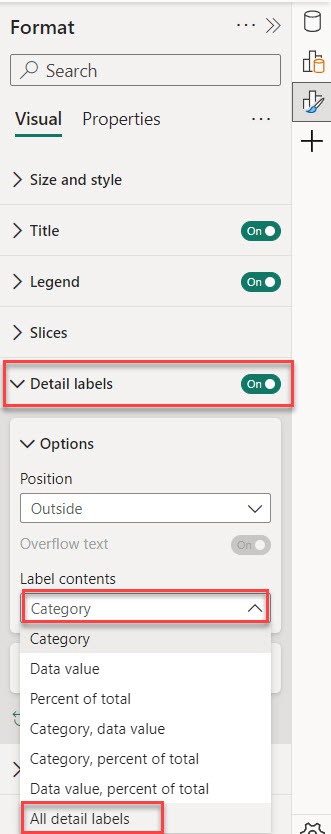
If you want to see all the details labels in a pie chart, follow these steps:
1. Sele the visual and expand the Format pane.

2. After that, expand Detail labels -> select Lable contents drop-down -> select All detail labels.
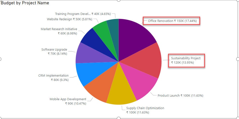
3. After that, you can see the pie chart showing all the details of the slices.
Power BI Pie Chart Group Small Values
Let’s see how to group small values in the Power BI pie chart.
In this example, I created a Pie chart that shows the budget by project name. Check the screenshot below.

In this Pie chart, the small values are 50k for “Website Redesign” and 40k for “Training Program Development”.
Follow the below steps to group it:
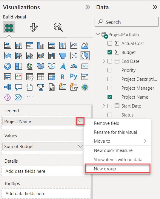
1. In the ‘Legend’ field, “Product Name” is present; click the right-side down arrow. Then, a dialog box is opened. In this box, click the “New group” option. Check out the screenshot below.
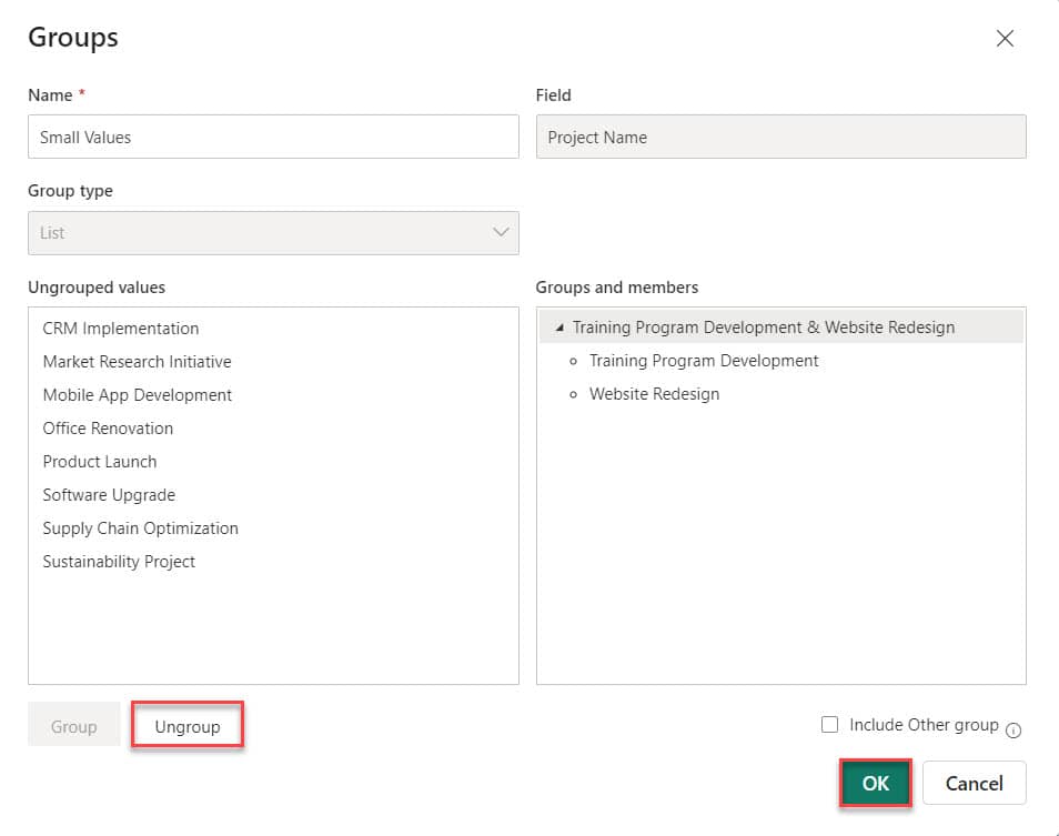
2. Then another dialog box, “Groups,” opened. Here, you can create a group. Let’s create a group. Enter the group name, like ‘Small Values,’ Then select the item by “ctrl + click” like ‘Website Redesign,’ and ‘Training Program Development.’ Click the Group option
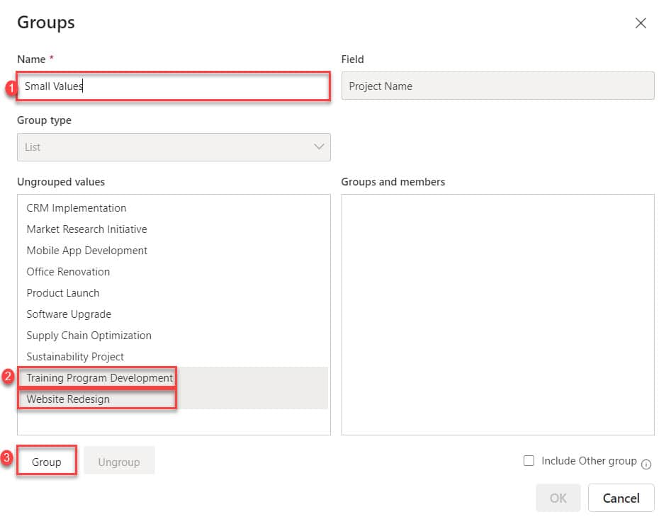
3. Then, in the “Groups and members” section, group members are displayed. Click “OK” to create a group. If you remove the member, click on the member and click the Ungroup option.
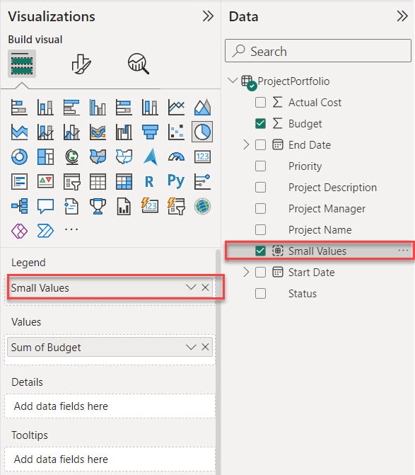
4. Our group is created in the “Data” pane, “Small Values.” Now drag the “Small Values” into the Legend field. Check out the screenshot below.
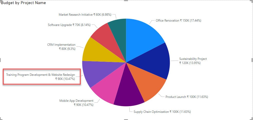
5. In the pie chart, “Website Redesign” and “Training Program Development” are combined into one slice.
Also, you may like:
- Power BI pie chart conditional formatting
- Line Chart in Power BI
- Power BI If Statement
- Sync Slicers in Power BI
- Power BI Weekday Function
Conclusion
We learned the basic steps for making a Pie chart in Power BI Desktop. We also learned how to group small values in the Pie chart and how to show many values at once in the Power BI pie chart.
Additionally, we covered two important topics: understanding the percentage of total features and exploring the pie chart showing all the details of the slices with various examples.
I am Bijay a Microsoft MVP (10 times – My MVP Profile) in SharePoint and have more than 17 years of expertise in SharePoint Online Office 365, SharePoint subscription edition, and SharePoint 2019/2016/2013. Currently working in my own venture TSInfo Technologies a SharePoint development, consulting, and training company. I also run the popular SharePoint website EnjoySharePoint.com