The Power BI Pie chart has one drawback. We can not find any conditional formatting option because it is unavailable in the chart.
However, we have an alternative way to apply conditional formatting to the Power BI Pie chart.
In this tutorial, I will explain how to apply conditional formatting in Power BI pie chart based on gradient and Power BI conditional formatting using DAX [Field value].
Also, we will see how to apply conditional formatting in the Power BI Pie chart based on the rule with examples.
Power BI Pie Chart Conditional Formatting
Conditional formatting in Power BI Pie chart allows you to highlight specific data points based on certain conditions. It’s like giving your data slices different colors depending on their values.
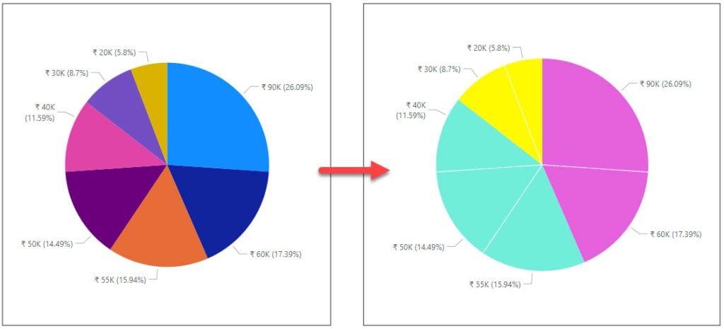
In the first picture below, the Pie chart in Power BI shows the default colors for each slice. I want to change these colors based on certain conditions.
After I apply the conditional formatting, the Pie chart will show different colors for each slice, as seen in the second picture.
How to Apply Conditional Formatting in Power BI Pie Chart?
Let’s see how we can apply Power BI Conditional formatting in the Power BI Pie chart.
Another method to apply conditional formatting to a Pie chart is by creating a Power BI Bar chart. After applying the conditional formatting to the Bar chart, you can then convert it into a Pie chart.
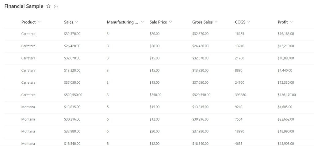
For this example, I have a SharePoint list called “Financial Sample” with different types of data.
| Columns | Data Types |
|---|---|
| Product | Single line of text |
| Sales | Currency |
| Manufacturing Price | Number |
| Sale Price | Currency |
| Gross Sales | Currency |
| COGS | Number |
| Profit | Currency |
Follow the below steps:
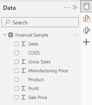
1. Open Power BI Desktop and load the data set. Then, in the Data pane, you can see your data set.
2. Under the Home tab, expand Visual gallery -> Click the Stacked column chart.

3. Then, using the +Add data option, add Status into Legend and Project Name into Values.
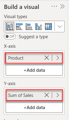
4. Now you see our Stacked column chart successfully created.

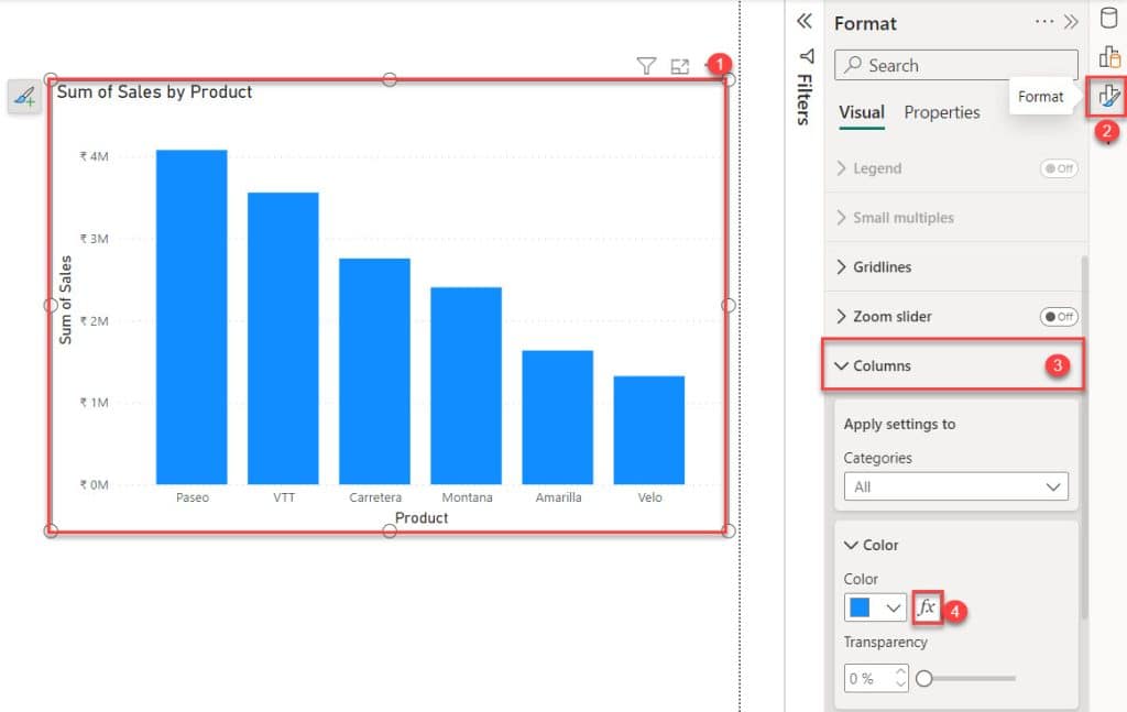
5. Select the visual -> expand Format pane -> click Columns ->click fx. Check out the screenshot below.
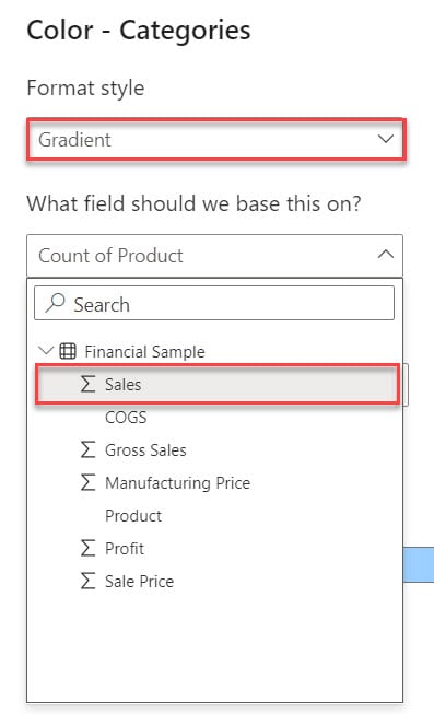
6. Then, the Color – Categories dialog box opens. In this box, select Format style -> Rules and What field should we base this on? -> Sales.
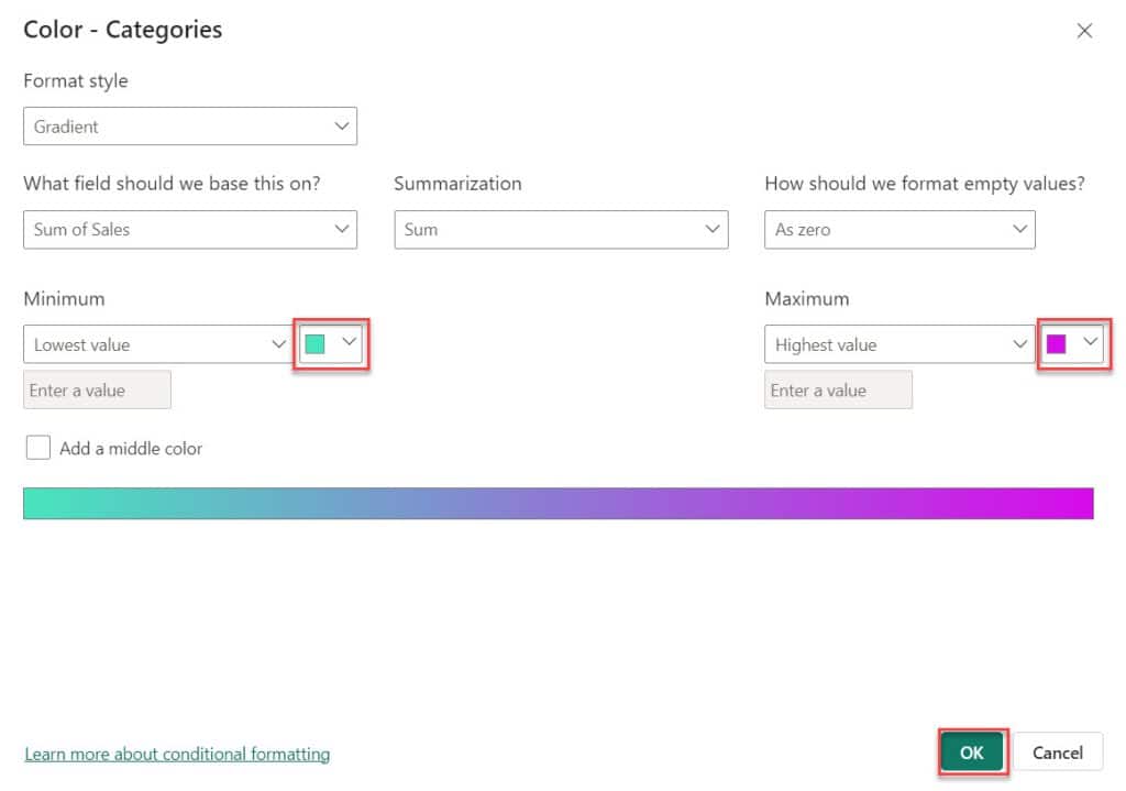
7. Then, choose a color from the highlight box dropdown below. Then click OK.
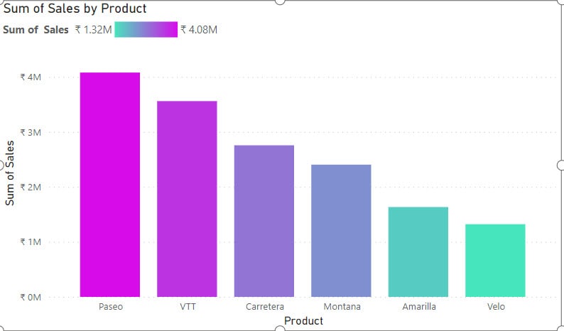
8. Finally, conditional formatting is applied in the Stacked column chart.
9. Select the Stacked column chart -> Under the Home tab, expand Visual gallery -> Click the Pie chart.
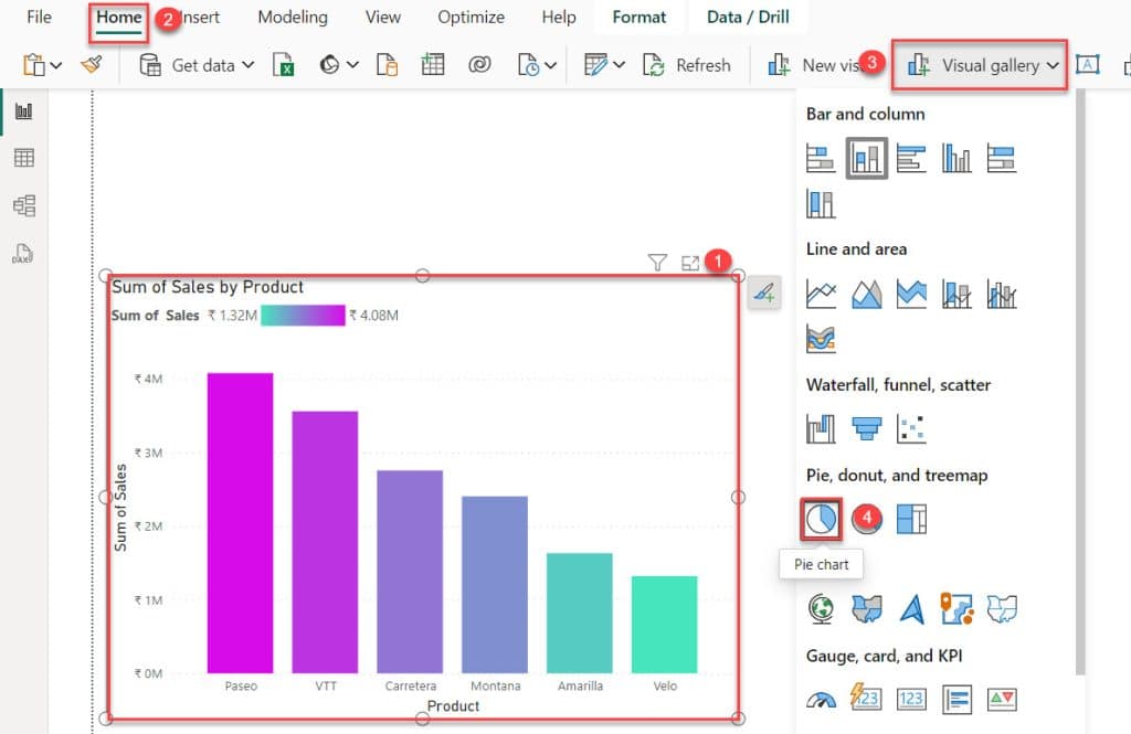
10. The Power BI Pie chart will appear with the conditional formatting below.
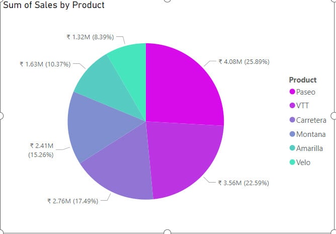
This way, you can apply conditional formatting to the slices of a Pie Chart in Power BI.
Power BI Pie Chart Conditional Coloring Based on the Rules
Let’s see how we can apply conditional formatting in the Power BI Pie chart based on the rule.
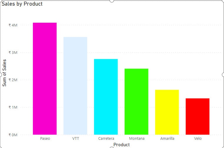
For that, I already created a stacked column char, which shows Sales by Product.
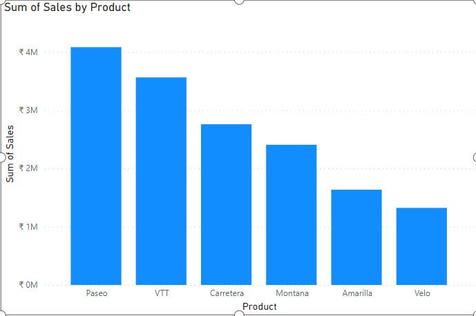
Now follow the below steps:
1. Select the visual -> expand Format pane -> click Columns ->click fx. Check out the screenshot below.
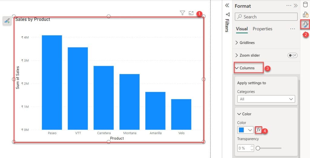
2. Then, the Color – Categories dialog box opens. In this box, select Format style -> Rules and What field should we base this on? -> Sales. Next, add some Rules using the + New rule. After that, click OK.
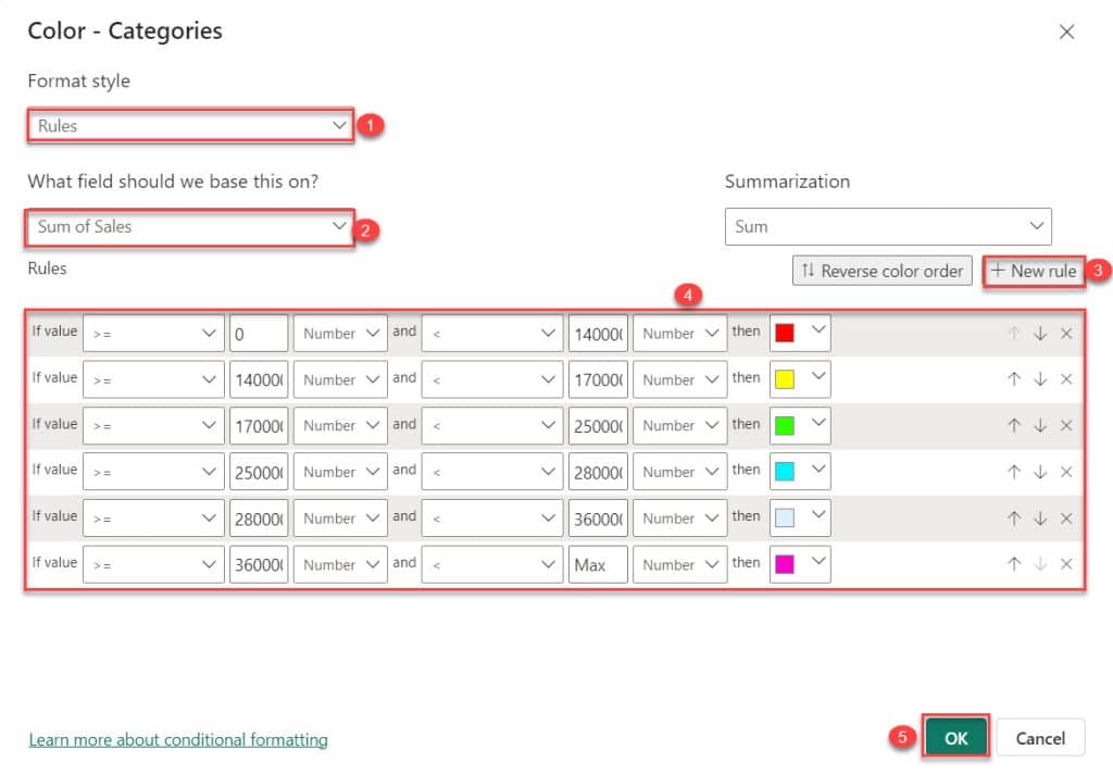
3. Finally, conditional formatting is applied in the Stacked column chart based on rules.
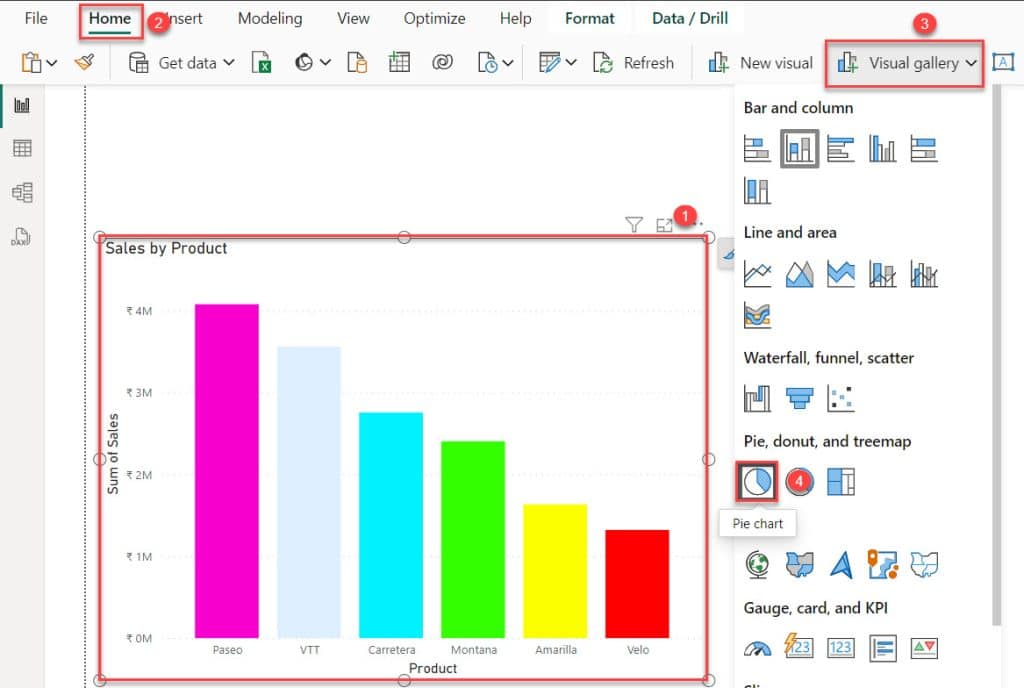
4. Select the Stacked column chart -> Under the Home tab, expand Visual gallery -> Click the Pie chart.
5. Now, you can see Pie chart color changes based on the rule provided.
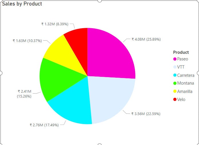
This way, we can apply Power BI pie chart conditional coloring based on the rules.
Power BI Pie Chart Conditional Formatting Using DAX
Let’s see how we can apply Power BI pie chart conditional formatting using DAX.
First, we need to create a measure to do this by following the below steps:
1. Click the Modeling tab, and click the “New measure.”

2. In the Formula bar, put below the DAX expression. Then click commit.
Total Sales = SUM('Financial Sample'[ Sales])Where:
- Total Sales = Name of the Measure
- SUM = DAX Function
- Financial Sample = Name of the Table
- Sales = Name of the Column

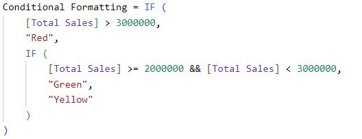
3. I create another measure. Then, in the Formula bar, put it below the DAX expression. Then click commit.
Conditional Formatting = IF (
    [Total Sales] > 3000000,
    "Red",
    IF (
        [Total Sales] >= 2000000 && [Total Sales] < 3000000,
        "Green",
        "Yellow"
    )
)
Where:
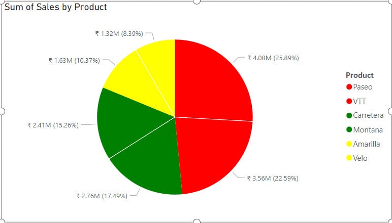
- If the total sales are greater than 3,000,000, then the cell should be formatted as red.
- If the total sales are greater than or equal to 2,000,000 and less than 3,000,000, then the cell should be formatted as green.
- If the total sales do not meet the above conditions, then the cell should be formatted as yellow.
4. I already created a stacked column char, which shows Sales by Product.

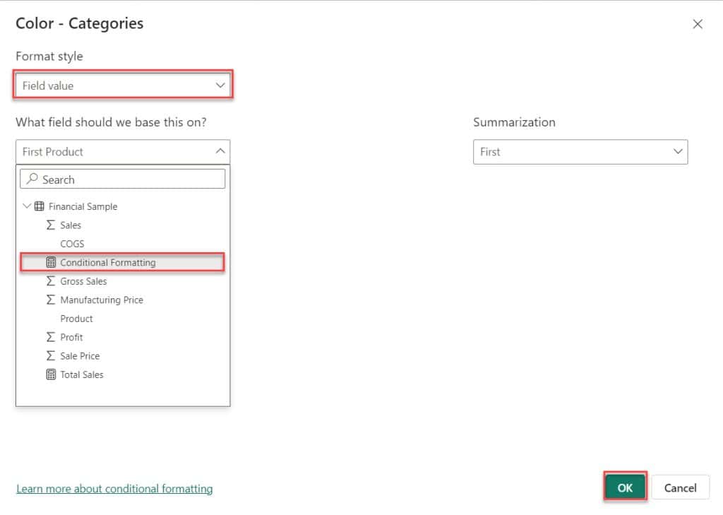
5. Select the visual -> expand Format pane -> click Columns ->click fx. Check out the screenshot below.

6. Then, the Color – Categories dialog box opens. In this box, select Format style -> Find value. Then, select What field should we base this on? -> Conditional Formatting. Then click OK.
7. Select the Stacked column chart -> Under the Home tab, expand Visual gallery -> Click the Pie chart. Then you see the Pie chart conditional formatting applied.
Also, you may like:
- Switch in Power BI
- Power BI If Statement
- Stacked Bar Chart in Power BI
- Line Chart in Power BI
- Power BI Slicer Sort Descending
- This content isn’t available in Power BI
This tutorial covered everything about Power BI Pie chart conditional formatting like how to format Power BI Pie visual based on gradient and using DAX. Also, we saw how to work with Power BI Pie chart conditional formatting based on the rules.
I am Bijay a Microsoft MVP (10 times – My MVP Profile) in SharePoint and have more than 17 years of expertise in SharePoint Online Office 365, SharePoint subscription edition, and SharePoint 2019/2016/2013. Currently working in my own venture TSInfo Technologies a SharePoint development, consulting, and training company. I also run the popular SharePoint website EnjoySharePoint.com