Power BI offers many built-in charts to visualize data; creating them is easy with just a few clicks. Among these charts, the Power BI line chart is great for showing data trends over time.
In this tutorial, I will explain line charts in Power BI and how to create a line chart in Power BI step by step.
Also, we will see the following topic:
- Power BI line chart not showing lines
- Power BI line chart multiple lines
- Power BI line chart secondary axis
- Power BI multiple line chart
Power BI Line Chart
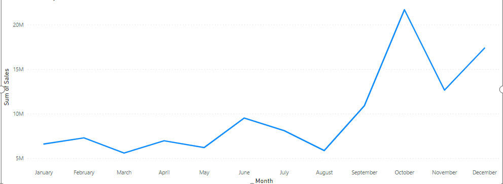
A Power BI line chart is a visual representation of data that shows how a value changes over time.
Imagine you have a list of numbers, like sales figures for each month. A line chart would plot those numbers on a graph, with time (like months) on the horizontal axis and the values (like sales) on the vertical axis.
Check the screenshot below:
How to Create a Line Chart in Power BI?
Let’s learn how to make a line chart in Power BI.
Scenario:
Let’s say you run a small retail business selling clothing, and you want to visualize your monthly sales over the past year to identify trends and patterns.
According to this scenario, we have an Excel file named Retail Sales that contains the Date, Product Category, and Revenue columns.
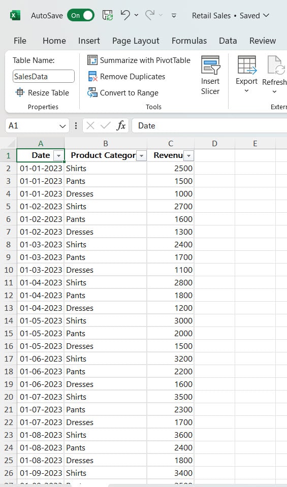
Follow the below-mentioned steps:
1. Open Power BI Desktop and load the data. Then, in the Data Panel, you can see the data set.
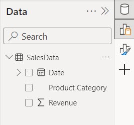
2. Under the Home tab, expand Visual gallery -> Click the Line chart.

3. Then, using the +Add data option, add Month into the X-axis and Revenue into the Y-axis.
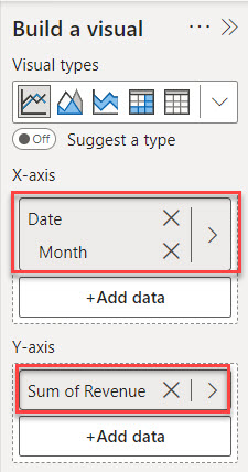
4. Now we see our line chart successfully created.

This way, you can create a line chart in Power BI.
Power BI Line Chart Not Showing Lines
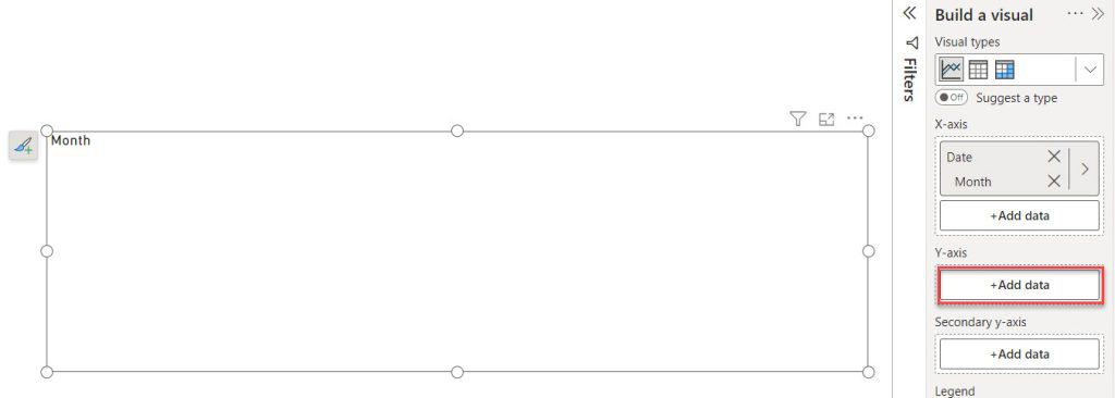
If you create a line chart in Power BI and can’t see the lines, it’s essential to check the Y-axis field. Ideally, the Y-axis field should not be blank; it must contain a value for the chart to display correctly.
In the screenshot below, you can observe that I left the Y-axis field empty.
After I added the Revenue to the Y-axis, the line chart appeared as expected.
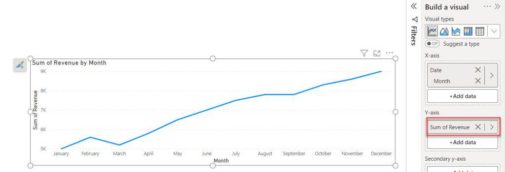
When you’re making a line chart, make sure to put your value in the Y-axis field so the chart shows up correctly.
Power BI Line Chart Multiple Lines
Let’s learn how to show multiple lines on a Line Chart in Power BI.
In order to create a Line chart with multiple lines in Power BI, you typically need at least two categorical data.
Note:
Categorical data: This type of data represents categories or groups. It could be dates, months, product names, regions, or any other distinct categories you want to visualize in your Line chart.
I hope you have loaded the required data source to the Power BI desktop.
To achieve a Power BI multiple-line chart, follow the below steps:
1. Under the Home tab, expand Visual gallery -> Click the Line chart.
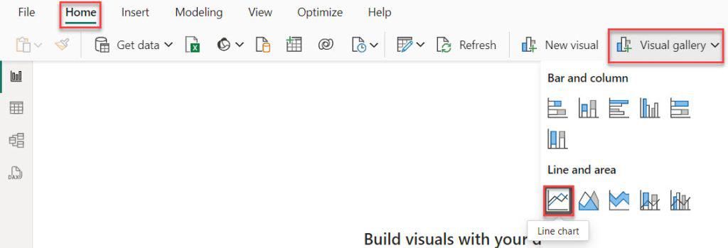
2. Then, using the +Add data option, add Month to the X-axis, Revenue to the Y-axis, and Product Category to the Legend field.
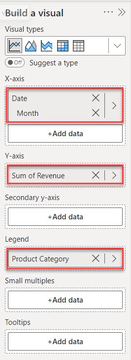
3. Now you see our line chart has multiple lines.
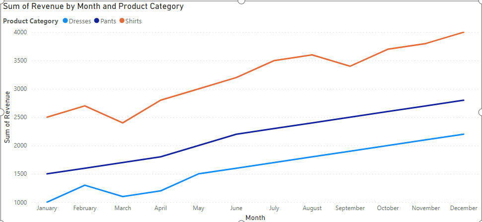
This way, you can create Power BI line chart multiple values with legend.
Power BI Line chart Secondary axis
Now, see how to add the Secondary axis to the line chart in Power BI.
Here, I included another column in the dataset called Profit.
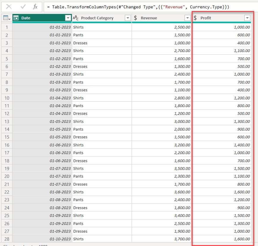
Follow the below steps to add the Power BI secondary axis:
1. Under the Home tab, expand Visual gallery -> Click the Line chart.
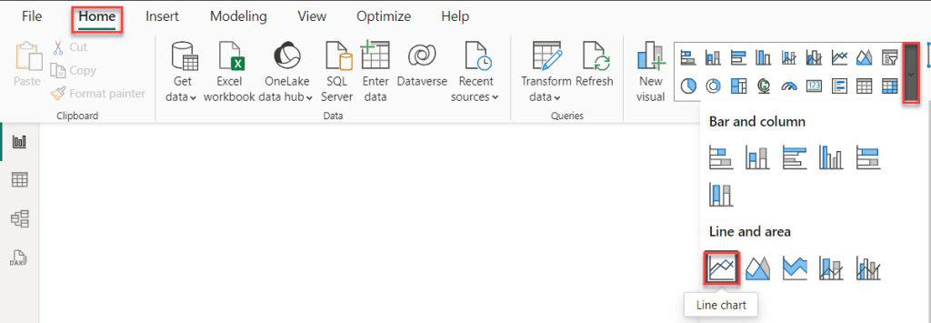
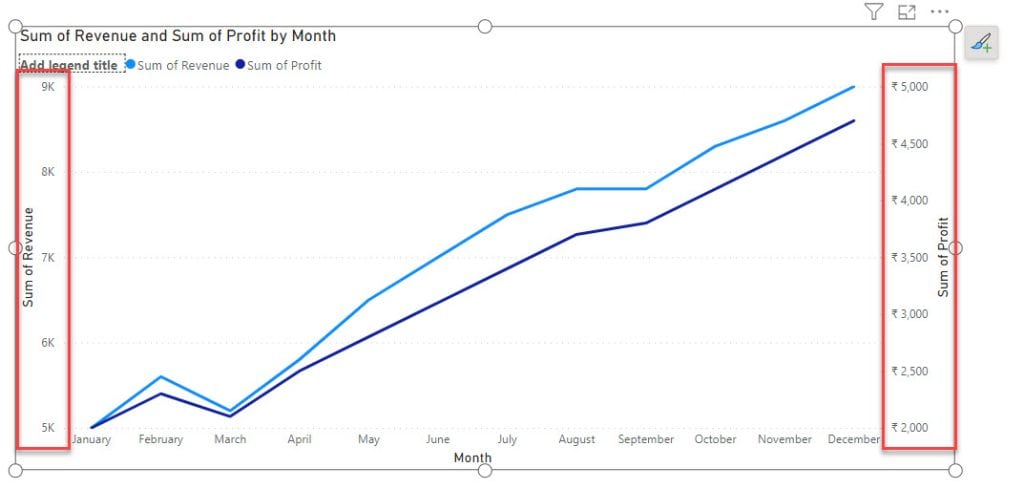
2. Then, using the +Add data option, add Month to the X-axis, Revenue to the Y-axis, and Profit to the Secondary Y-axis.
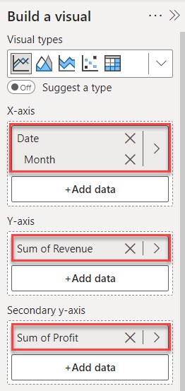
3. Then you see our line chart has a Secondary axis.
Power BI Multiple Line Chart
Let’s create multiple line charts in Power BI.
1. Under the Home tab, expand Visual gallery -> Click the Line chart.

2. Then, using the +Add data option, add Month to the X-axis, Revenue to the Y-axis, and Product Category to the Legend field.
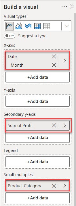
3. You can see in the report view multiple line char created in Power BI.
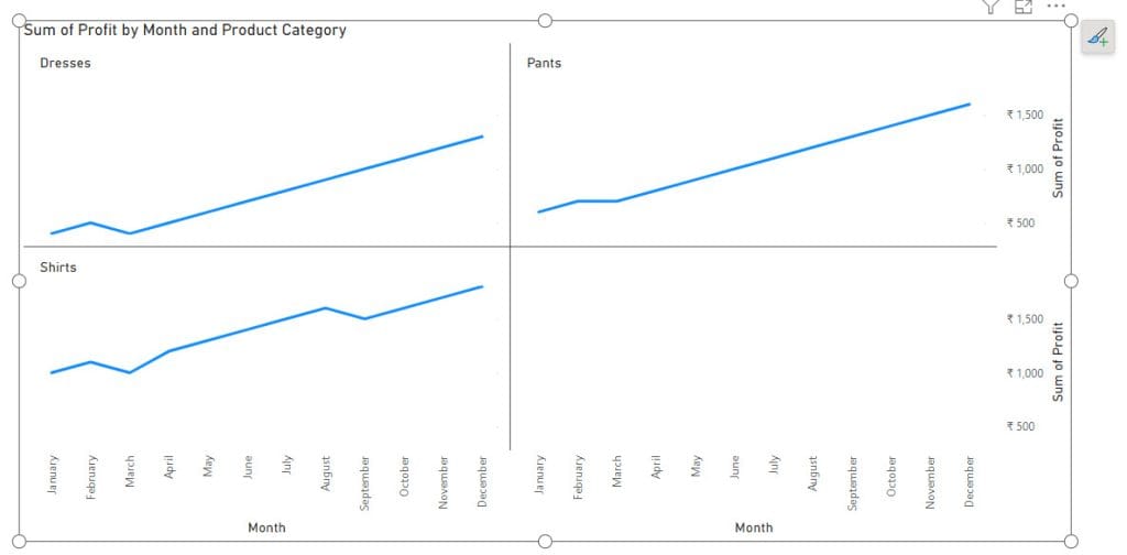
I hope this tutorial helps you to understand the basic idea about line chart in Power BI, create line chart in Power BI, and many more like:
- Power BI Line chart not showing lines
- Working with Power BI line chart multiple lines
- What is Power BI Line chart secondary axis
- How to create a Power BI multiple line chart
- Create a Power BI Pie Chart
- Power BI Table Conditional Formatting
- Card Visual in Power BI
- Sync Slicers in Power BI
- How to Use Power BI Weekday Function
- Power BI If Statement
I am Bijay a Microsoft MVP (10 times – My MVP Profile) in SharePoint and have more than 17 years of expertise in SharePoint Online Office 365, SharePoint subscription edition, and SharePoint 2019/2016/2013. Currently working in my own venture TSInfo Technologies a SharePoint development, consulting, and training company. I also run the popular SharePoint website EnjoySharePoint.com