In this spfx tutorial, we will see what is office UI fabric, how to integrate the office UI fabric in spfx web part. So, you can see the below points:
- What office UI fabric is?
- How do I use Office UI fabric in SPFx?
- Create an spfx solution
- Integrate Office UI Fabric in spfx webapart
What office UI fabric is?
The office UI fabric is nowadays also known as Fluent UI. Fluent UI is a set of UX frameworks that may be used to design Fluent experiences that integrate smoothly into a wide range of Microsoft products, according to Microsoft.
- Fluent UI React and Fabric core are the two versions of Office UI fabric, often known as Fluent UI.
- Fluent UI/Office UI fabric is an official open-source React front-end framework designed to create experiences that integrate easily into a wide range of Microsoft products.
- Fabric Core is an open-source set of CSS classes and Sass mixins that provide access to icons, colors, fonts, animation, and grids.
- You should check at styles and controls. If you are constructing your spfx web part in react, you may use controls that are built in react.
Read How to Configure Web Part Icon in SPFx
How do I use Office UI fabric in SPFx?
Here we will see how we can integrate office UI fabric/Fluent UI in the spfx web part.
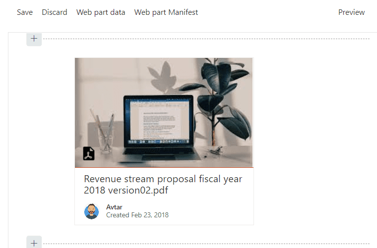
For example, we create a document card web part with Office UI Fabric in SharePoint Framework.

Create an spfx solution
First, we will create an spfx solution in a directory, by running the below command.
yo @microsoft/sharepointA sequence of questions will be presented to you by the Yeoman SharePoint Generator. Accept the default answers to all questions except the following:
- Which type of client-side component to create? WebPart
- What is your Web part name? docCard
- Which template would you like to use? React
So here you can use the below command to run the spfx solution, next we will see how to integrate office UI Fabric in the spfx web part.
Integrate Office UI Fabric in spfx webapart
The new contemporary experiences in SharePoint are built with Office UI Fabric and Office UI Fabric React as the default front-end framework.
As a result, SharePoint Framework includes a default version of Office UI Fabric and Fabric React that corresponds to the version found in SharePoint.
This guarantees that when the web element is deployed to SharePoint, it utilizes the correct version of the Fabric styles and components.
Because we used React as our framework for developing the solution, the generator also installed the correct version of Office UI Fabric React. You may directly import the Fabric components into your react components without any further work.
Now let’s see how we can integrate office Ui fabric in the spfx web part.
- Open DocumentCardExample.TSX from the src\webparts\documentCard\components folder.
- To utilize Fabric React components, add the following import declaration to the start of the project.
import {
  DocumentCard,
  DocumentCardPreview,
  DocumentCardTitle,
  DocumentCardActivity,
  IDocumentCardPreviewProps
} from 'office-ui-fabric-react/lib/DocumentCard';- In the same file replace the existing
render()method with the following:
export default class DocCard extends React.Component<IDocCardProps, {}> {
  public render(): JSX.Element {
    const previewProps: IDocumentCardPreviewProps = {
      previewImages: [
        {
          previewImageSrc: String(require('./document.jpg')),
          iconSrc: String(require('./pdf.png')),
          width: 318,
          height: 196,
          accentColor: '#ce4b1f'
        }
      ],
    };

    return (
      <DocumentCard onClickHref='http://bing.com'>
        <DocumentCardPreview { ...previewProps } />
        <DocumentCardTitle title='Revenue stream proposal fiscal year 2018 version02.pdf' />
        <DocumentCardActivity
          activity='Created Feb 23, 2018'
          people={
            [
              { name: 'Avtar', profileImageSrc: String(require('./avtar.png')) }
            ]
          }
        />
      </DocumentCard>
    );
  }
}
The DocumentCard component in this code comprises the following additional sections:
- DocumentCardPreview
- DocumentCardActivity
- DocumentCardTitle
Some attributes of the DocumentCardPreview component are included in the preview pops property.
Copy the picture assets
Copy the following pictures to your src\webparts\documentCard\components folder:
Now run the application by the below command to test the solution.
gulp serve
This is how we can integrate the Office UI fabric in the spfx web part.
Read How to use SPFx preconfiguredentries with examples
Download SPFx Solution
To use this spfx solution on your side, download the solution file, unzip it and run it with the below command:
npm iConclusion
In this spfx tutorial, we learned how to integrate office Ui fabric into the spfx web part. Here you can see the points we covered:
- What is office UI fabric?
- How do I use Office UI fabric in SPFx?
- Create an spfx solution
- Integrate Office UI Fabric in spfx webapart
You may like the following spfx tutorials:
- Create SPFx Web Part with jQuery Accordion
- How to add custom controls in SPFx property pane
- Can’t load the application on this page. Use the browser Back button to retry while adding SPFx web part into Microsoft Teams
- The entry point for component has a dependency on “@microsoft/sp-http” that is not declared in the manifest react spfx
- SharePoint Framework (SPFx) Extensions Application Customizer Example
I am Bijay a Microsoft MVP (10 times – My MVP Profile) in SharePoint and have more than 17 years of expertise in SharePoint Online Office 365, SharePoint subscription edition, and SharePoint 2019/2016/2013. Currently working in my own venture TSInfo Technologies a SharePoint development, consulting, and training company. I also run the popular SharePoint website EnjoySharePoint.com