To create a table visual in Power BI, navigate to the visual gallery, click ‘table visual,’ and then add data. This method allows you to create a table visualization in Power BI.
Recently, I was working on a Power BI report. The table visual helps me organize and understand our data easily; it presents our information in a clear and structured format, making it simple to spot patterns, trends, and outliers.
This Power BI tutorial will cover the basics of the Power BI Table, including its purpose and functionality. We’ll then walk through the steps to create a table visual in Power BI.
Also, we will see some formatting like:
- Format Size and style of a Table in Power BI
- Format Title of a Table in Power BI
- Format Specific Column of a Table in Power BI
- Format the Header Icons of a Table in Power BI
What is Power BI Table Visual?
In Power BI, a table visual is like a spreadsheet table that shows the data in rows and columns. It’s a simple and effective way to see your data in a structured format. You can customize it by adding or removing columns, sorting data, and applying filters to focus on specific information in Power BI.
For example:
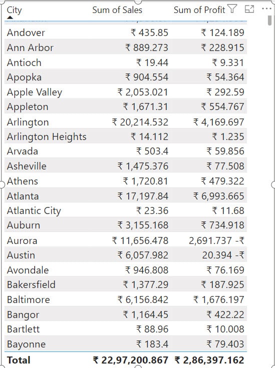
Imagine you have a dataset containing sales information with columns like city, sales, and profit. You can use a table visual in Power BI to display this data neatly. This makes it easy to scan and analyze your sales data quickly. Check out the screenshot below.
How to Create a Power BI Table Visual
Now we see step by step how to create a Power BI table.
Here, we have a SharePoint list that contains below columns with various data types:
| Columns | Data Types |
|---|---|
| Order Date | Date and time |
| City | Single line of text |
| Category | Single line of text |
| Sub-Category | Single line of text |
| Product Name | Single line of text |
| Sales | Currency |
| Quantity | Number |
| Profit | Currency |
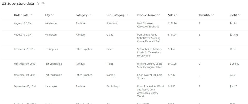
Follow the below steps to create a table visual:
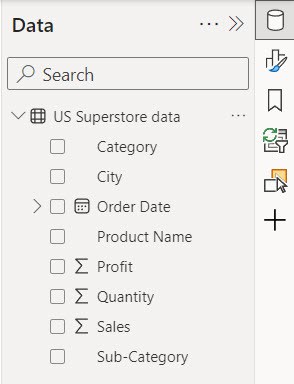
1. Open Power BI Desktop and load the data. Then, you see data in the Data pane.
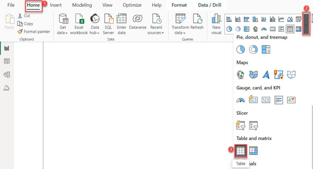
2. Under the Home tab, expand Visual gallery(black box) -> Click the Table visual.
3. Then, use the +Add data option to add City, Sales, and Profit into the Columns field.
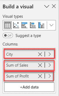
4. After that, you can see the Power BI table visual. Check the screenshot below.

You can easily create a Power BI table visual using the above steps.
Power BI Table Visual Formatting
Now we see how to add basic formatting to the Power BI table visual.
Two types of formatting are available in the table visualizations: Visual formatting and Properties formatting.
- In Visual formatting, there are 12 available formats: Size and style, Title, Style presets, Grid, Values, Column headers, Totals, Specific column, cell elements, URL icon, Image size, and Accessibility.
- In Properties formatting, there are four available formats: Header icons, Tooltips, Alt text, and Advanced options.
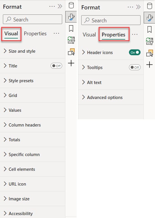
Now we see one by one how it works:
Format Size and style of a Table in Power BI
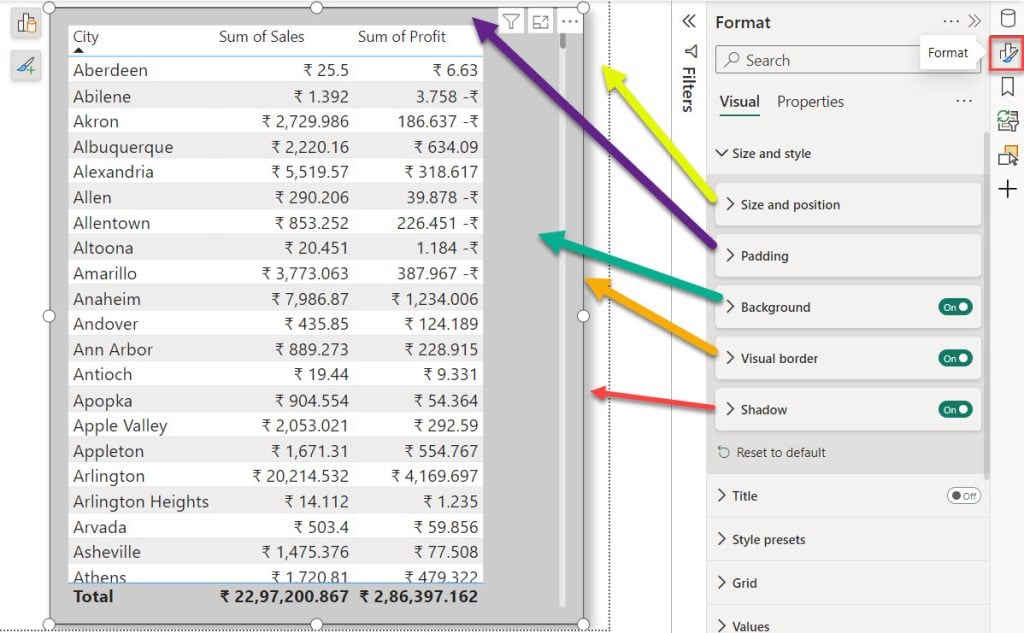
By utilizing the Size and Style format, we can adjust the size and position of the Power BI table visual. This includes modifying the padding, adding background color, inserting a visual border, and adding a shadow effect. You can check the screenshot below.
Format Title of a Table in Power BI
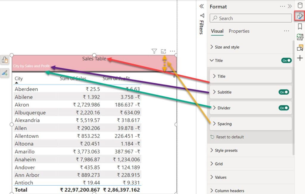
Title formatting in Power BI allows us to provide a name to our table visual using both Title and Subtitle formatting options. Additionally, we can insert a Divider and adjust the Spacing between the divider and the header. Check the screenshot below.
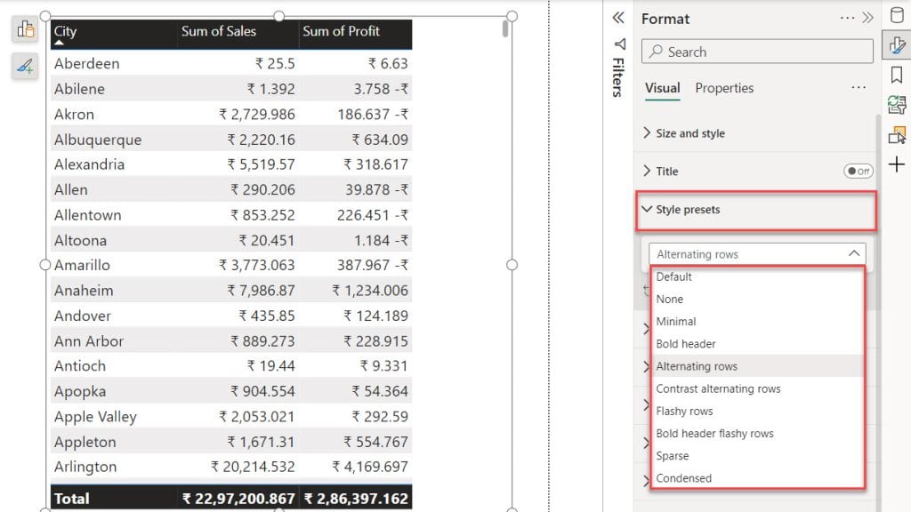
Format Style presets of a Table in Power BI
With the Style presets format option, you can modify the Power BI table visual appearance by selecting different style presets.
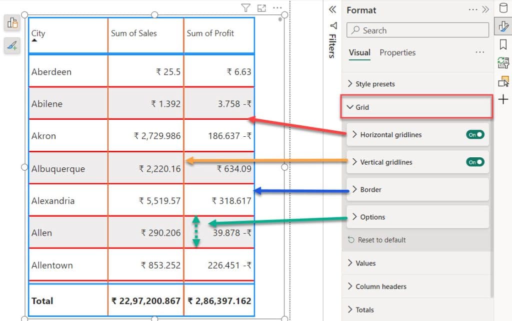
Format Grid of a Table in Power BI
Grid formatting in Power BI tables enables the addition of horizontal and vertical gridlines, providing an outer border and adjusting cell padding. Check out the screenshot below.
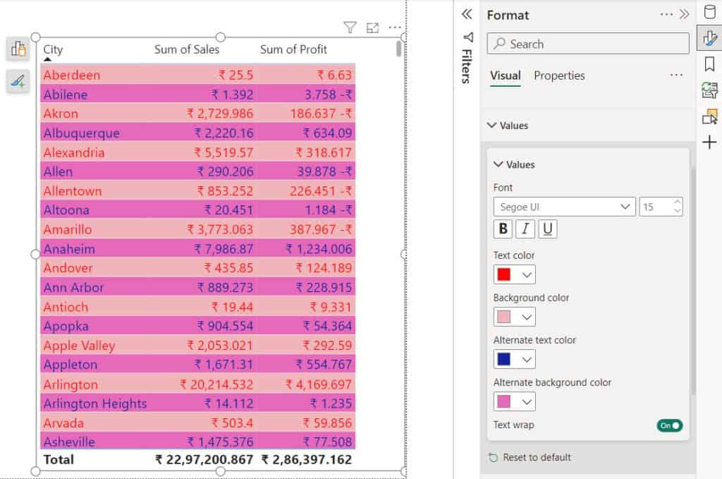
Format Values of a Table in Power BI
With the Power BI value formatting option, you can customize the text color and background color, as well as alternate text color and alternate background color, and increase the font size of all column values in the Power BI tables visual.
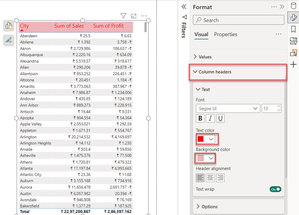
Format Column Headers of a Table in Power BI
With column headers formatting in Power BI, you can adjust the font size, text color, and background color of the column headers.
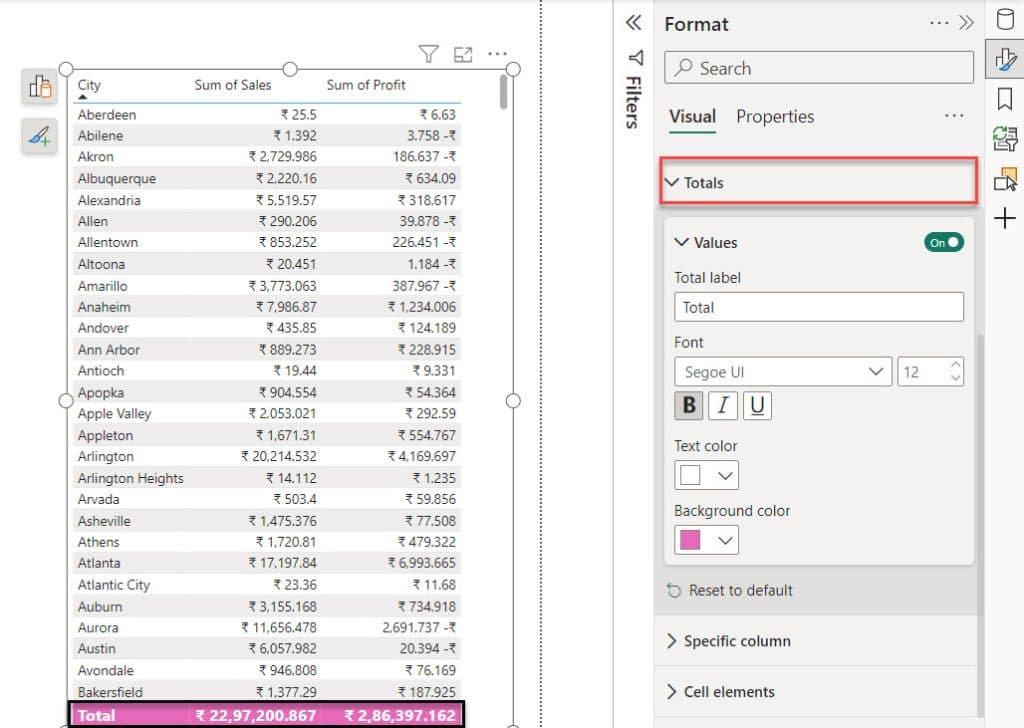
Format Totals of a Table in Power BI
For the total formatting options, we can increase the font size and customize the total value’s text color and background color.
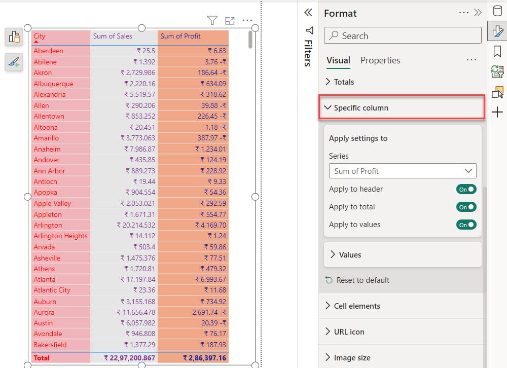
Format Specific Column of a Table in Power BI
For specific column formatting options, you can modify the text color, background color, and alignment of individual columns. Check the screenshot below.
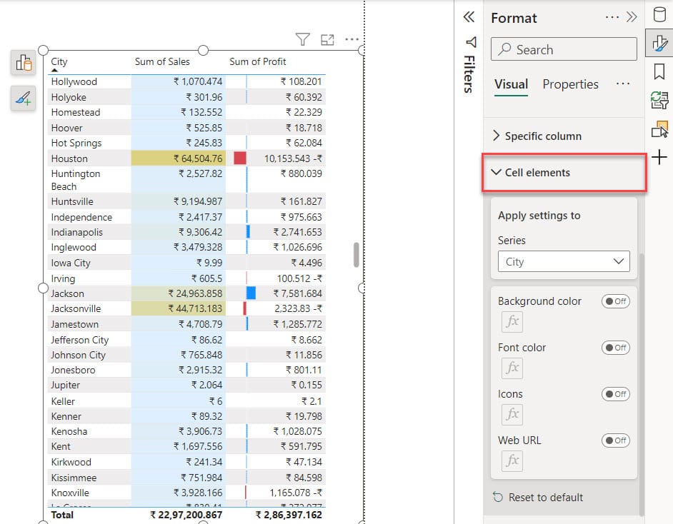
Format Cell Element of a Table in Power BI
We can apply the conditional formatting in the Power BI table visual using the cell element format option.
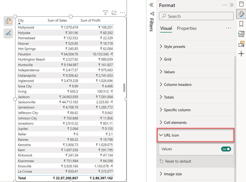
Format the URL Icon of a Table in Power BI
With URL icon formatting, you can replace long URLs with a hyperlink icon, which helps to simplify the table visualization and provides a cleaner display.
Format the Header Icons of a Table in Power BI
We can customize the background, border, and icon colors in the header icon formatting. Also, we can adjust the transparency of the header icons and choose how many icons are presented in the Power BI table visual header section.
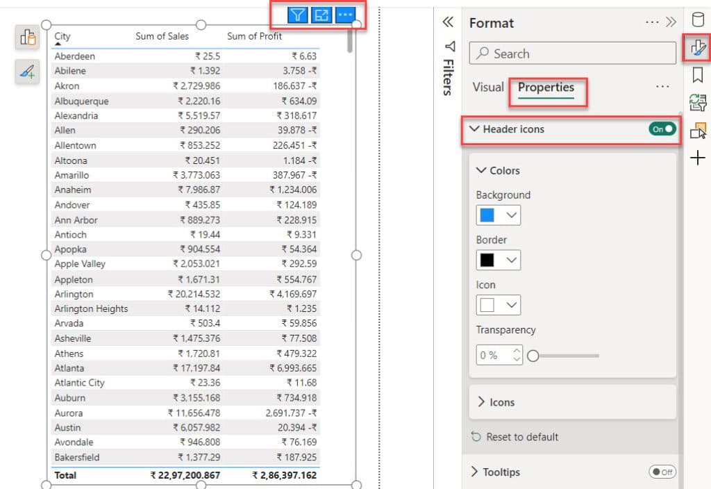
These are the important formats presented in the Power BI Table visual.
Conclusion
Now, I hope you know the basics of Power BI table visualization.
In this tutorial, we learned what a Power BI table visual is, how to create a Power BI table visual, Power BI Table Visual Formatting like format style presets of a table in Power BI, format grid of a table in Power BI, format values of a table in Power BI, format totals of a table in Power BI.
You may also like:
- How to Export Power BI Reports to PDF?
- How to Export Power BI Report to Excel?
- Power BI Table Conditional Formatting
- How to Center Values in Power BI Table?
I am Bijay a Microsoft MVP (10 times – My MVP Profile) in SharePoint and have more than 17 years of expertise in SharePoint Online Office 365, SharePoint subscription edition, and SharePoint 2019/2016/2013. Currently working in my own venture TSInfo Technologies a SharePoint development, consulting, and training company. I also run the popular SharePoint website EnjoySharePoint.com
With the help of Power BI visualization makes it easy to understand the story behind every process and data; and eases things for everyone in the organization to make effective use of such visually compelling data. Leveraging such visualized analytics and reports help businesses to understand where to improve, how to sustain things in the organization, and steps to be taken to eventually improve business outcomes in an easy manner.
please share data sets for us to practice