Are you interested to learn about Power Apps Modern Progress Bar? Well, in this Power Apps tutorial, we will learn everything about the Modern Progress Bar in Power Apps, its properties, and how to work with Power Apps Modern Progress Bar including a real example.
Additionally, we will see how to enable Power Apps Modern Controls in the Canvas app.
Also, Read: Power Apps Modern Dropdown Control [Complete Tutorial]
Power Apps Modern Progress Bar
Power Apps Progress Bar can be set up to display different levels of progress. This flexible control can be used to indicate to update users on their progress as they use the app.
A task or process’s progress is indicated visually by a Progress Bar control. Its function is to inform the user of how the task is coming along and how much time is still remaining to finish it.
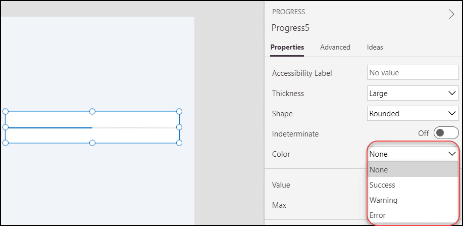
The below screenshot represents that how a Power Apps Modern Progress Bar looks like:

This is the overview of Modern Progress Bar Control in Power Apps.
Check out: Power Apps Modern Button Control [Complete Guide]
Power Apps Modern Progress Bar Properties
The below list represents some of the important key properties of Power Apps Modern Progress Bar:
- Accessibility Label = When a user chooses the control, screen readers will read this text out.
- Thickness = It specifies the thickness of the modern progress bar.
- Shape = It defines how the bar and track are shaped. The corners of the bar are impacted by the shape property. There are two types of shapes:
- Rounded – The bar appears to be a round shape.
- Square – The bar appears to be a square shape.

- Indeterminate = To indicate an unknowable loading progress, this displays a continuous loop (if it is ON).

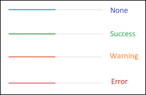
- Color = There are four different types of progress colors. Such as:
- None – This is the default color of the Modern Progress Bar i.e. Blue.
- Success – If you will select this, then the progress bar will appear with Green color.
- Warning – The progress bar will appear with an Orange color if you will select this option.
- Error – It will appear in Red color once the user selects this option.
The below image is for your reference.
- Value = A numeric value indicating the percentage of the task that has been finished, ranging from 0 to “max”. This is only applicable in determinate states.
- Max = The highest value, which denotes that the task is finished. When the value equals max, the ProgressBar bar will be completely full. This is helpful when you want to display capacity or the amount of a sum that has been uploaded or downloaded.
- Position = There are two types of positions:
- X – Distance between the control’s left side and the screen’s left edge.
- Y – Distance between the top of the control and the top edge of the screen.
- Size = There are two types of sizes:
- Width – The gap between the control’s left and right sides.
- Height – Distance between the control’s top and bottom.
- ContentLanguage = Defines the audience’s language (for example, “en-US”).
- DisplayMode = There are three modes:
- Edit – The user can enter the data.
- View – Allows only to display data.
- Disabled – The control is greyed out with disabled mode.
- OnChange = Actions that will be carried out when the progress bar’s Value property changes.
- Visible = It defines whether to display or hide the Modern Progress Bar control.
These are all about Power Apps Modern Progress Bar Properties.
Learn: How to Delete Power Apps Customize Form from SharePoint List
How to Add Modern Progress Bar in Power Apps
Next, we will see how to add a Modern Progress Bar Control in Power Apps.
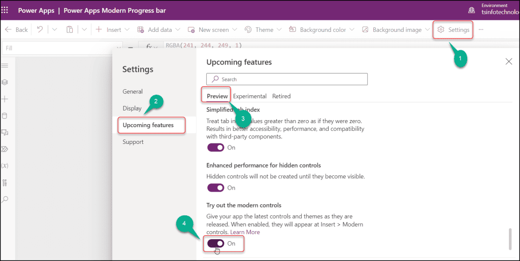
But first, we have to turn on the option to “Try out the modern controls” on the Power Apps Canvas app settings page.
You won’t be able to see the Modern controls in Power Apps if you don’t enable this option.
To activate Power Apps Modern Controls, follow these steps:
- Open Power Apps and sign in with your Microsoft credentials.
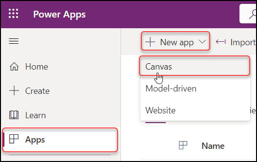
- Create a New Blank Canvas app (Apps -> + New App -> Canvas).
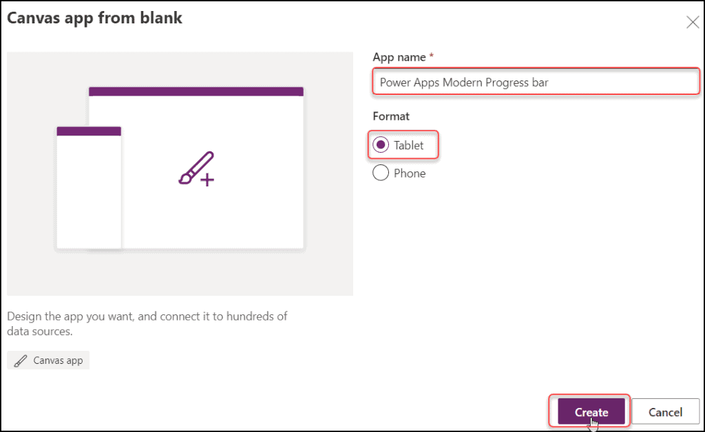
- Specify a unique name for the app (Power Apps Modern Progress bar) -> Choose the Format as Tablet -> Click on Create.
- On the Power Apps Screen, Go to Settings (from the top) -> Select Upcoming features -> Click on the Preview tab -> Enable Try out the modern controls as shown below.
- Save and Publish the Power Apps canvas app once.
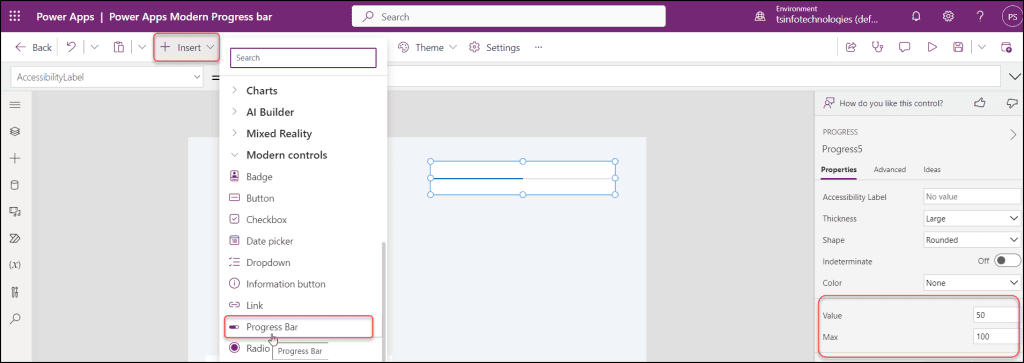
- Then go back to the Power Apps Screen, expand the + Insert tab (from the top) -> Scroll down, and expand Modern controls -> Select Progress Bar as below.
- You can specify the Value and Max value to the modern progress bar as per your need.
- Let’s say, I have set the Max as 100 and the Value as 50. So in the Modern Progress Bar, it’s displaying 50 out of 100. It won’t show the value on the progress bar.
This is how to add a Modern Progress Bar Control in Power Apps.
Check: How to Visualize Model Driven Data in Power BI
How to Use Power Apps Modern Progress Bar
Next, we will see how to use the Power Apps Modern Progress Bar Control with a sample use case.
Power Apps Modern Progress Bar examples
- The below GIF file represents a Power Apps Modern Progress Bar, a Text label control, and a Modern Button control.
- Now I want to set the Progress bar value using a Modern Button control in Power Apps. Additionally, I want to use a label control to show the progress bar value.
- Here, I have set a value of 130 in the Power Apps modern button control. The progress bar will be adjusted as necessary when a user hits the button (Click Here!), and the label will show the progress bar value.

Follow the instructions below to achieve this:
Step – 1:
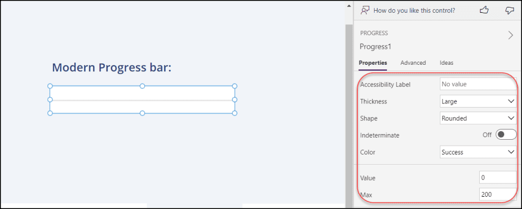
- On the Power Apps screen, insert a Modern Progress Bar control and set some properties like:
- Thickness = Large
- Shape = Rounded
- Color = Success
- Value = 0
- Max = 200
Step – 2:
- Next, add a Modern Button control and set its Text property to “Click Here!“.
- Select the button (Click Here!) and apply the code below on its OnSelect property as:
OnSelect = Set(
    varProgressValue,
    130
)
Where,
- varProgressValue = Variable name
- 130 = Set the value as you want to set in the modern progress bar

Step – 3:
- To display the progress bar value, add a Text label control and set the variable on its Text property as:
Text = "Progress Bar Value: " & varProgressValueWhere,
- “Progress Bar Value: “ = The text that will display in the label control
- varProgressValue = Created variable name

Step – 4:
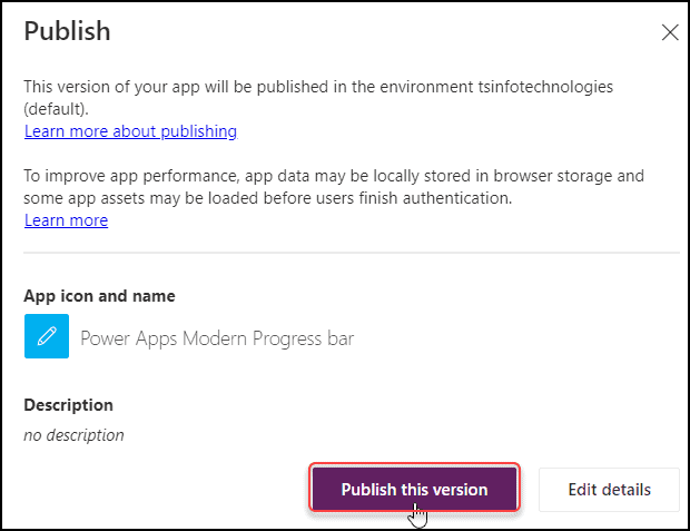
- Finally, Save and Publish the app from the top right corner.

- Click on the Publish this version button. Then close the Canvas app and reopen it once again in Play mode.
Step – 5:
- When you click the button (Click Here!), the progress unit will change according to the value you have selected. The Power Apps label control will also show the value (130), as shown in the screenshot below.

This is how to work with Modern Progress Bar Control in Power Apps.
Moreover, you may like some more Power Apps and Dataverse tutorials:
- Power Apps Modern Badge Control [Complete Guide]
- Power Apps Modern Link Control [Detailed Tutorial]
- Power Apps Button OnSelect [Complete Tutorial]
- Power Apps radio button [With real examples]
- How to Patch Dataverse Number Field in Power Apps
- Power Apps Rich text editor control – How to use
In this Power Apps tutorial, we learned everything about the Modern Progress Bar in Power Apps, its all-important key properties, and how to work with Power Apps Modern Progress Bar including a real simple example.
Also, we saw how to enable Power Apps Modern Controls in the Canvas app.
I am Bijay a Microsoft MVP (10 times – My MVP Profile) in SharePoint and have more than 17 years of expertise in SharePoint Online Office 365, SharePoint subscription edition, and SharePoint 2019/2016/2013. Currently working in my own venture TSInfo Technologies a SharePoint development, consulting, and training company. I also run the popular SharePoint website EnjoySharePoint.com