SPFx Property Pane Controls is a SharePoint Framework (SPFx) feature that allows developers to create custom settings panels for their web parts. These controls make it easy for users to configure a web part’s properties directly within the SharePoint interface.
In this tutorial, we will learn how to create configurable properties in the Property Pane using SPFx with TypeScript in SharePoint Online. You can also download the SPFx solution and try it out.
SharePoint client-side Web Part Configurable Properties in Property Pane using SPFx with Typescript
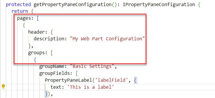
In SharePoint Framework (SPFx), property panes manage settings for web parts. These panes give users an easy way to change how a web part behaves and looks. Property panes are important for making web parts customizable and easy to use. They have three key metadata: Page, Header, and Group.
- Page: The page component holds the header and groups in the property pane.
- Header: The header of the property pane shows a title that tells users what settings they are changing.
- Group: The group component organizes settings into sections, helping users find and understand the settings they want to change more easily.
pages: [
        {
          header: {

          },
          groups: [
                            {   }
          ]
       }
]
Below the table is a list of property fields supported by SPFx; we used:
| Property field | SPFx Typed Object | Description |
|---|---|---|
| Button | PropertyPaneButton | A button that can trigger an event when clicked. |
| Checkbox | PropertyPaneCheckbox | A checkbox for boolean input (true/false). |
| Choice Group | PropertyPaneChoiceGroup | A set of radio buttons for selecting a single option from a group. |
| Dropdown | PropertyPaneDropdown | A dropdown list for selecting a value from a list of options. |
| Horizontal rule | PropertyPaneHorizontalRule | A horizontal rule for separating sections. |
| Label | PropertyPaneLabel | A static text label for displaying non-editable text. |
| Link | PropertyPaneLink | A hyperlink that redirects the user to a specified URL. |
| Slider | PropertyPaneSlider | A slider for numeric input within a defined range. |
| Textbox | PropertyPaneTextField | A text box for single-line input. |
| Multi-line Textbox | PropertyPaneTextField | A text box for Multi-line input. |
| Toggle | PropertyPaneToggle | A toggle switch for boolean input. |
For additional property fields, you can check out this link.
Create Property Pane Using SPFx
Now, we will create a web part and add all the property fields mentioned above.
Follow the below steps:
Open the Node.js command prompt and create a directory using the following command:
md PropertyPaneNavigate to that directory using the following command:
cd PropertyPane
To create a web part, we need to run Yeoman SharePoint Generator using the following command:
yo @microsoft/sharepoint
The Yeoman generator will guide you through a series of questions about the solution you want to create. Like below:
- What is the name of your solution? You can enter your solution name here. For example, I am naming mine ‘Configurable Content Web Part.’
- Which type of client-side component to create? You must give WebPart.
- What is your Web part name? For example, I am naming mine ‘Configurable Content Web Part.’
- Which template would you like to use? You must give No framework.

Now, it will create and import all the files into the folder we created. After it’s done, it will look like this:
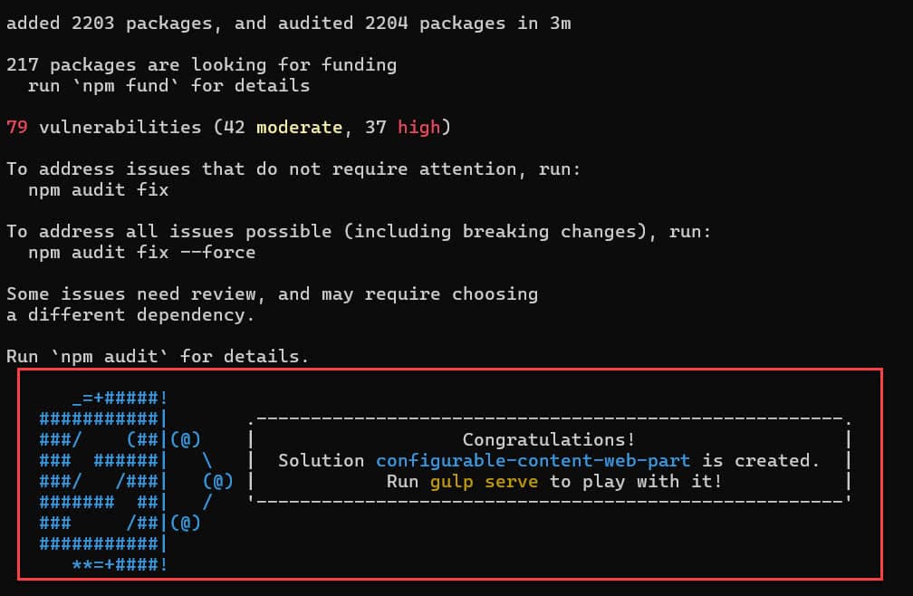
Next, you need to open this folder in VS code using the below command:
Code .Then, the VS Code automatically opens with these files.
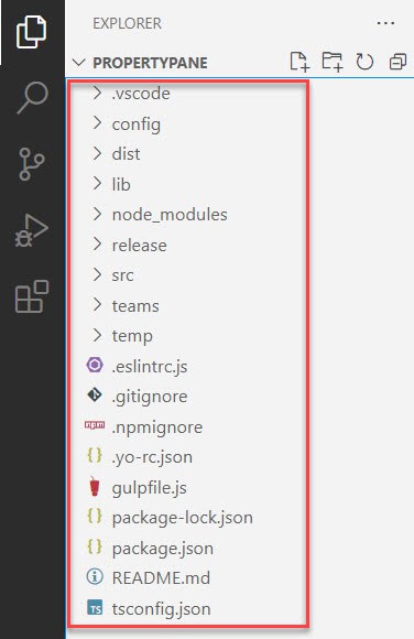
Go to the ‘Scr/webpart/ConfigurableContentWebPartWebPart.ts’ file and import the property pane field types before using them in your code:
import {
  type IPropertyPaneConfiguration,
  PropertyPaneTextField,
  PropertyPaneCheckbox,
  PropertyPaneDropdown,
  PropertyPaneToggle,
  PropertyPaneSlider,
  PropertyPaneLink,
  PropertyPaneButton,
  PropertyPaneChoiceGroup,
  PropertyPaneLabel,
  PropertyPaneHorizontalRule,
} from '@microsoft/sp-property-pane';
You can keep the existing import code as it is. However, you must import the above code, as shown in the screenshot below.
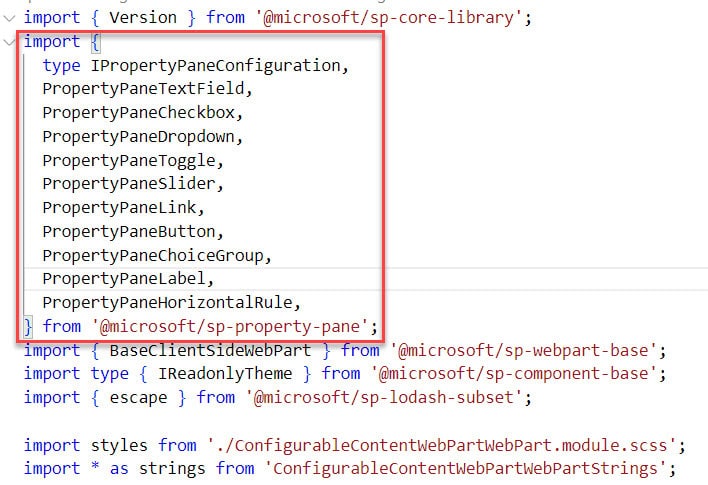
These lines import essential libraries and components from the SharePoint Framework (SPFx). These libraries help create user interface elements and access SharePoint data.
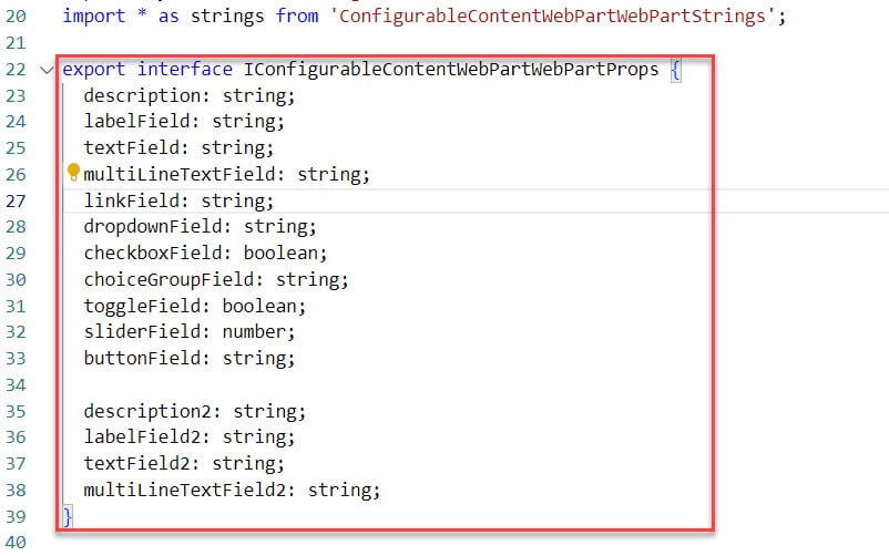
Then, we need to define the Interface and Properties using the below code:
export interface IConfigurableContentWebPartWebPartProps {
  description: string;
  labelField: string;
  textField: string;
  multiLineTextField: string;
  linkField: string;
  dropdownField: string;
  checkboxField: boolean;
  choiceGroupField: string;
  toggleField: boolean;
  sliderField: number;
  buttonField: string;

  description2: string;
  labelField2: string;
  textField2: string;
  multiLineTextField2: string;
}
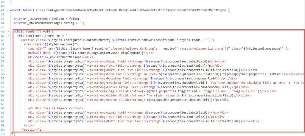
Next, we need to modify the Render method to construct the HTML structure of the web part. It inserts values dynamically from the properties defined in the interface.
public render(): void {
    this.domElement.innerHTML = `
      <section class="${styles.configurableContentWebPart} ${!!this.context.sdks.microsoftTeams ? styles.teams : ''}">
        <div class="${styles.welcome}">
          <img alt="" src="${this._isDarkTheme ? require('./assets/welcome-dark.png') : require('./assets/welcome-light.png')}" class="${styles.welcomeImage}" />
          <h2>Well done, ${escape(this.context.pageContext.user.displayName)}!</h2>
          <div>${this._environmentMessage}</div>
          <div class="${styles.propertyBox}"><p><strong>Label Field:</strong> ${escape(this.properties.labelField)}</p></div>
          <div class="${styles.propertyBox}"><p><strong>Text Field:</strong> ${escape(this.properties.textField)}</p></div>
          <div class="${styles.propertyBox}"><p><strong>Multi-line Text Field:</strong> ${escape(this.properties.multiLineTextField)}</p></div>
          <div class="${styles.propertyBox}"><p><strong>Link Field:</strong> <a href="${escape(this.properties.linkField)}">${escape(this.properties.linkField)}</a></p></div>
          <div class="${styles.propertyBox}"><p><strong>Dropdown Field:</strong> ${escape(this.properties.dropdownField)}</p></div>
          <div class="${styles.propertyBox}"><p><strong>Checkbox Field:</strong> ${this.properties.checkboxField ? 'You have checked the checkbox field as true' : 'You have checked the checkbox field as false'}</p></div>
          <div class="${styles.propertyBox}"><p><strong>Choice Group Field:</strong> ${escape(this.properties.choiceGroupField)}</p></div>
          <div class="${styles.propertyBox}"><p><strong>Toggle Field:</strong> ${this.properties.toggleField ? 'Toggle is on' : 'Toggle is off'}</p></div>
          <div class="${styles.propertyBox}"><p><strong>Slider Field:</strong> The slider value is ${this.properties.sliderField}</p></div>
          <div class="${styles.propertyBox}"><p><strong>Button Field:</strong> ${escape(this.properties.buttonField)}</p></div>

          <p> <h1> This is Page 2 </h1><p>
          <div class="${styles.propertyBox}"><p><strong>Label Field:</strong> ${escape(this.properties.labelField2)}</p></div>
          <div class="${styles.propertyBox}"><p><strong>Text Field:</strong> ${escape(this.properties.textField2)}</p></div>
          <div class="${styles.propertyBox}"><p><strong>Multi-line Text Field:</strong> ${escape(this.properties.multiLineTextField2)}</p></div>
        </div>
      </section>`;
  }
Next, we need to add the Property Pane Configuration code. Before that, you should know the property pane has two interaction modes:
- Reactive: The web part automatically updates with new values when we enter them in the Property Pane.
- Non-reactive: The Property Pane displays an ‘Apply’ button when using non-reactive code. You need to click this button for changes to take effect on the web page.
Here is the non-reactive code. You can add it if you want:
protected get disableReactivePropertyChanges(): boolean {
    return true;
  }
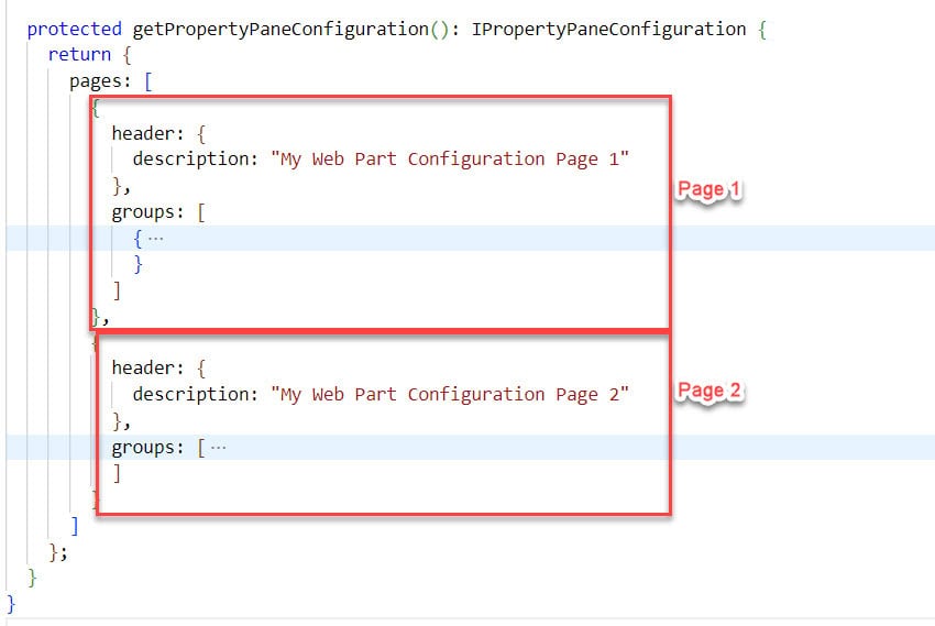
We can create multiple pages in the property pane. Here’s how we can do it in the getPropertyPaneConfiguration method.
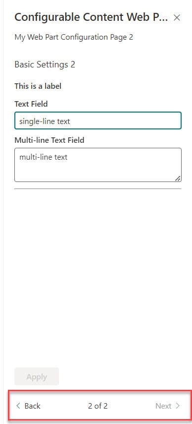
If you create pages in your web part, you will see the ‘Back’ and ‘Next’ buttons in the Property Pane.
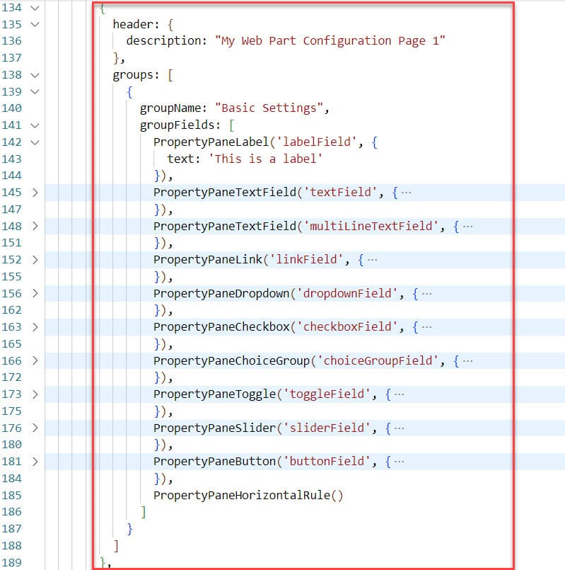
Here is the below code for page 1 :
{
          header: {
            description: "My Web Part Configuration Page 1"
          },
          groups: [
            {
              groupName: "Basic Settings",
              groupFields: [
                PropertyPaneLabel('labelField', {
                  text: 'This is a label'
                }),
                PropertyPaneTextField('textField', {
                  label: 'Text Field'
                }),
                PropertyPaneTextField('multiLineTextField', {
                  label: 'Multi-line Text Field',
                  multiline: true
                }),
                PropertyPaneLink('linkField', {
                  text: 'Example Link',
                  href: 'https://www.example.com'
                }),
                PropertyPaneDropdown('dropdownField', {
                  label: 'Dropdown',
                  options: [
                    { key: 'Option1', text: 'Option 1' },
                    { key: 'Option2', text: 'Option 2' }
                  ]
                }),
                PropertyPaneCheckbox('checkboxField', {
                  text: 'Checkbox'
                }),
                PropertyPaneChoiceGroup('choiceGroupField', {
                  label: 'Choice Group',
                  options: [
                    { key: 'A', text: 'Option A' },
                    { key: 'B', text: 'Option B' }
                  ]
                }),
                PropertyPaneToggle('toggleField', {
                  label: 'Toggle'
                }),
                PropertyPaneSlider('sliderField', {
                  label: 'Slider',
                  min: 0,
                  max: 100
                }),
                PropertyPaneButton('buttonField', {
                  text: 'Button',
                  onClick: () => alert('Button clicked!')
                }),
                PropertyPaneHorizontalRule()
              ]
            }
          ]
        },
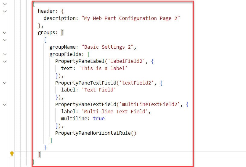
Here is the below code for page 2 :
{
          header: {
            description: "My Web Part Configuration Page 2"
          },
          groups: [
            {
              groupName: "Basic Settings 2",
              groupFields: [
                PropertyPaneLabel('labelField2', {
                  text: 'This is a label'
                }),
                PropertyPaneTextField('textField2', {
                  label: 'Text Field'
                }),
                PropertyPaneTextField('multiLineTextField2', {
                  label: 'Multi-line Text Field',
                  multiline: true
                }),
                PropertyPaneHorizontalRule()
              ]
            }
          ]
        }
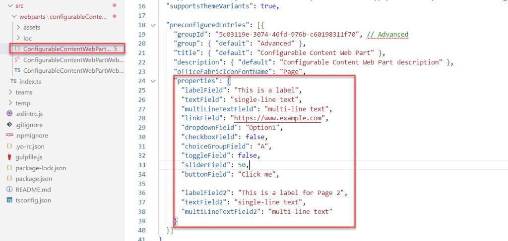
After that, we need to add some default value in the ConfigurableContentWebPartWebPart.json file like below:
"properties": {
      "labelField": "This is a label",
      "textField": "single-line text",
      "multiLineTextField": "multi-line text",
      "linkField": "https://www.example.com",
      "dropdownField": "Option1",
      "checkboxField": false,
      "choiceGroupField": "A",
      "toggleField": false,
      "sliderField": 50,
      "buttonField": "Click me",

      "labelField2": "This is a label for Page 2",
      "textField2": "single-line text",
      "multiLineTextField2": "multi-line text"
    }
Then, in the VS Code, open a new terminal and run the below command:
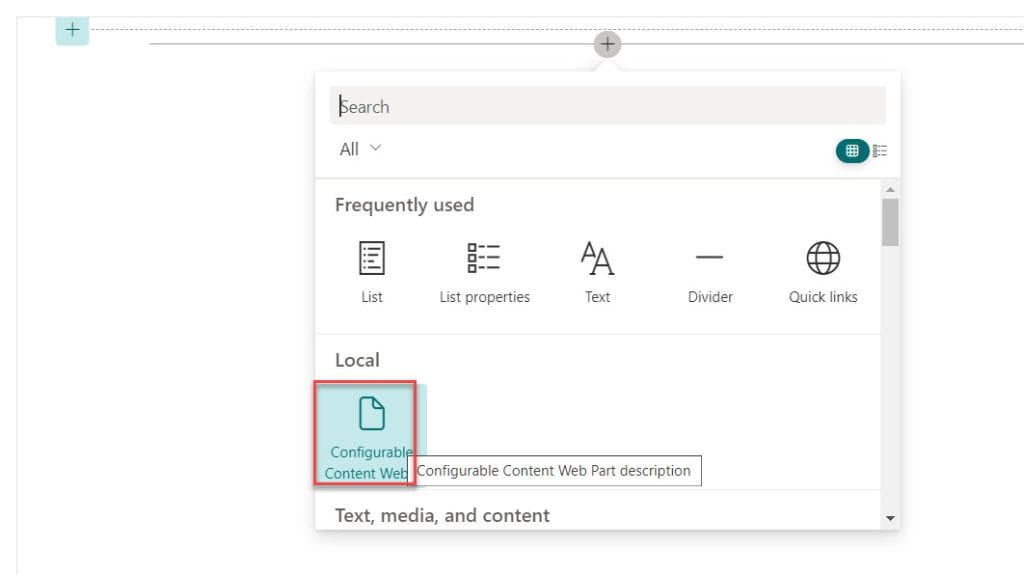
gulp serveIt will automatically open SharePoint Workbench on our site and add our Configurable Content Web Part.
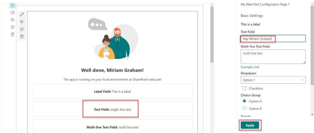
Edit the web part to change property fields on page one.
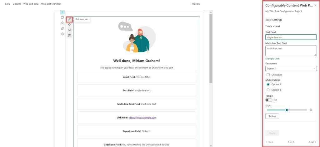
When you add text in the Text Field, it won’t show in the web part until you click the Apply button.
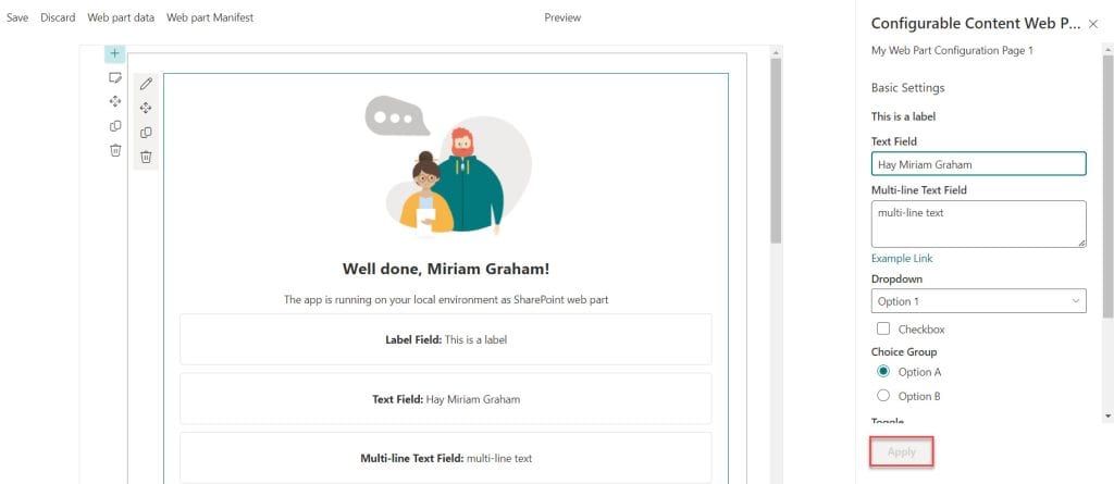
After clicking the Apply button, you’ll see the Text Field change in the web part. This is because we used a Non-reactive code.
Here also, you will notice we have two pages of Property Pane.
I hope you followed all the steps to create customizable settings in the Property Pane for your web part using SPFx.
Download the full solution as a zip file. Unzip the SPFx solution file. Open a command prompt and navigate to the root directory of the extracted SPFx solution. Then, run the following command:
npm install && gulp buildThen, you can run it on your machine using the gulp serve command.
Conclusion
In this tutorial, I have explained in detail how to work with SPFx property pane controls.
You may also like:
- Display SharePoint list items using SPFx
- SharePoint Framework CRUD Operations using React
- Create and deploy SharePoint Framework (SPFx) listview command set extension
- SPFx Upload File to SharePoint Document Library With Metadata
I am Bijay a Microsoft MVP (10 times – My MVP Profile) in SharePoint and have more than 17 years of expertise in SharePoint Online Office 365, SharePoint subscription edition, and SharePoint 2019/2016/2013. Currently working in my own venture TSInfo Technologies a SharePoint development, consulting, and training company. I also run the popular SharePoint website EnjoySharePoint.com
Hi are we able to create a property pane once and share it across multiple web parts? I want the user to be able to set a border property for each web part but I don’t want to repeat that code multiple tmes…any idea?
Great article! No discussion of Property Pane is complete without mentioning the the open source PnP community has created several advanced controls for the property pane. e.g., PeoplePicker, List Selector, etc. Completely free. Just install, import, and use. https://pnp.github.io/sp-dev-fx-property-controls/