In this SPFx tutorial, we will discuss how to use fluent UI react choicegroup or radio button and checkbox control in SharePoint framework client side web part.
In this example, we will create an SPFx web part and then we will add the fluent UI choice group and fluent UI react checkbox react control, and then finally, we will use how to save the values to a SharePoint Online list using PnP.
Also, I will explain, how to fix error, Error TS2307: Cannot find module ‘@fluentui/react’.
If you are new to fluent UI, check out What is Microsoft Fluent UI (with React) as well as I have you already have been set up your SPFx development environment.
For this particular example, I have created a SharePoint Online list having below columns.
- Title
- SingleValueCheckbox
- MultiValueCheckbox
And the list looks like below:
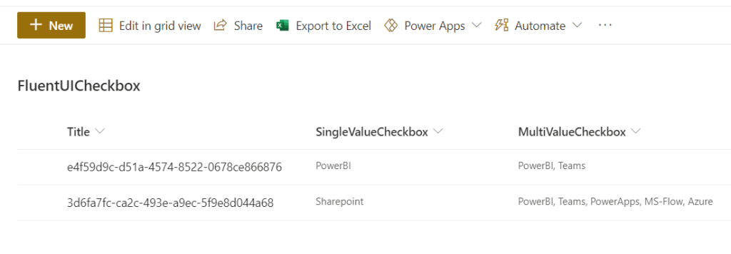
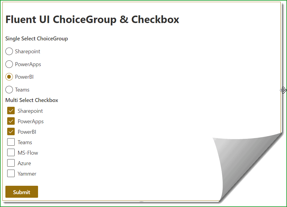
And here we are going to create a form like below:
Want to Learn SPFx development? Check out SharePoint Framework training course: https://www.spguides.com/sharepoint-framework-training/
A few things happening here:
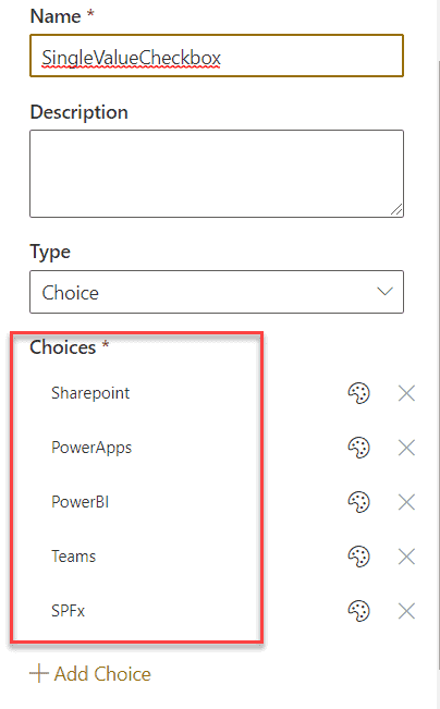
- First, the radio button values are populating from the SingleValueCheckbox column choice values, you can see the choices like below:
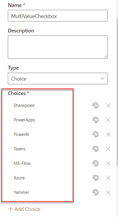
- And, the spfx fluent ui checkbox values were populating from the MultiValueCheckbox column choice options.
- Then finally on the button click the fluent ui radio button and fluent ui checkbox value will be saved to the SharePoint Online list using PnP.
SPFx fluent UI choice group and spfx fluent UI checkbox example
Here we will first create an SPFx react client side web part.
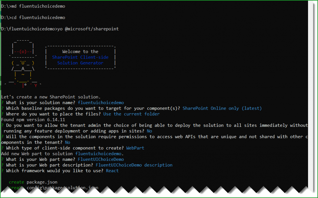
Open the nodejs command prompt and then create a directory in a location where you want to save the files.
md fluentuichoicedmo

cd fluentuichoicedmo
Then run the below command to start creating the spfx client side web part.
yo @microsoft/sharepointIt will ask you the below things:
- What is your solution name? Click on Enter to take the default name.
- Which baseline packages do you want to target for your component (s)? Here choose one from the below options:
- SharePoint Online only (latest)
- SharePoint 2016 onwards, including 2019 and SharePoint Online
- SharePoint 2019 onwards, including SharePoint Online
Here select SharePoint Online only (latest).
- Where do you want to place the files? Choose one from the following:
- Use the current folder
- Create a subfolder with solution name
Here choose Use the current folder.
- Do you to allow the tenant admin the choice of being able to deploy the solution to all sites immediately without running any feature deployment or adding apps in sites? Choose N.
- Will the components in the solution require permissions to access web APIs that are unique and not shared with other components in the tenant? Choose N.
- Which type of client-side component to create? Choose WebPart from the below options:
- WebPart
- Extension
- Library
- What is your web part name? Give FluentUIChoiceDemo as the web part name
- What is your web part description? Click on Enter to take the default name.
- Which framework would you like to use? Choose React from the below options:
- No JavaScript framework
- React
- Knockout
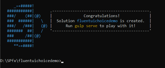
Then it will take sometime and then you can see a successful message like below:
Once we created the SPFx web part, we need to install fluentui/react. Below is the command:
npm install @fluentui/react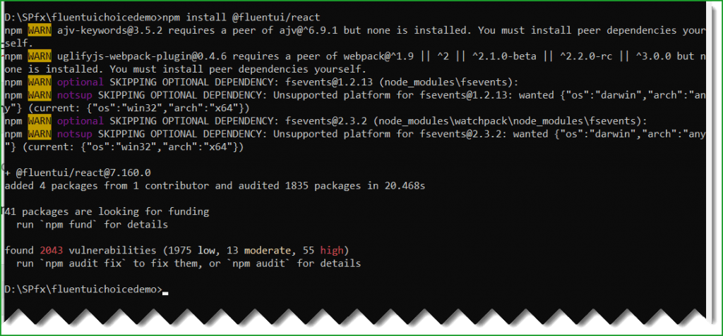
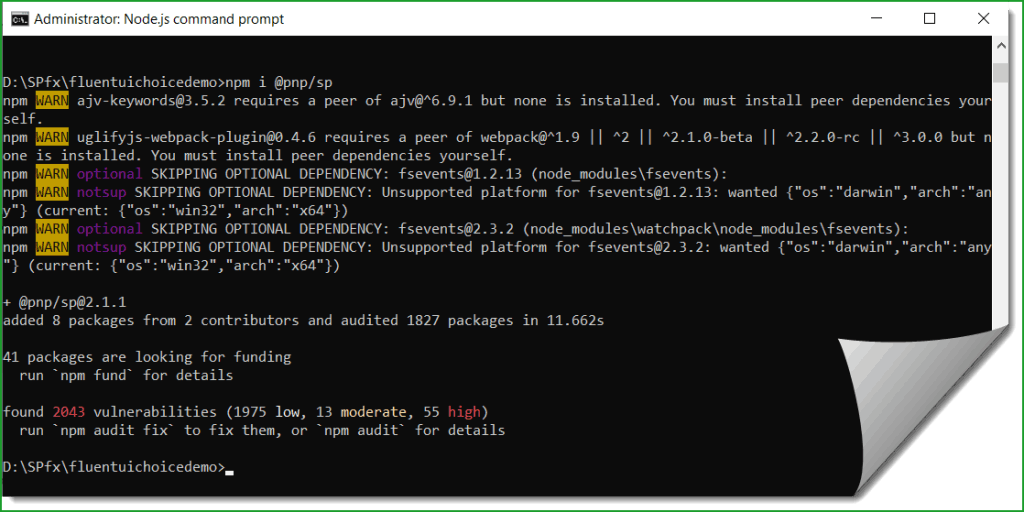
Then run the below command to install pnp, because here we are using PnP to save data to the SharePoint list.
npm i @pnp/spIt will take some time and install pnp.
Next, run the below command to open the solution using visual studio code.
code .Now, the solution looks like below:
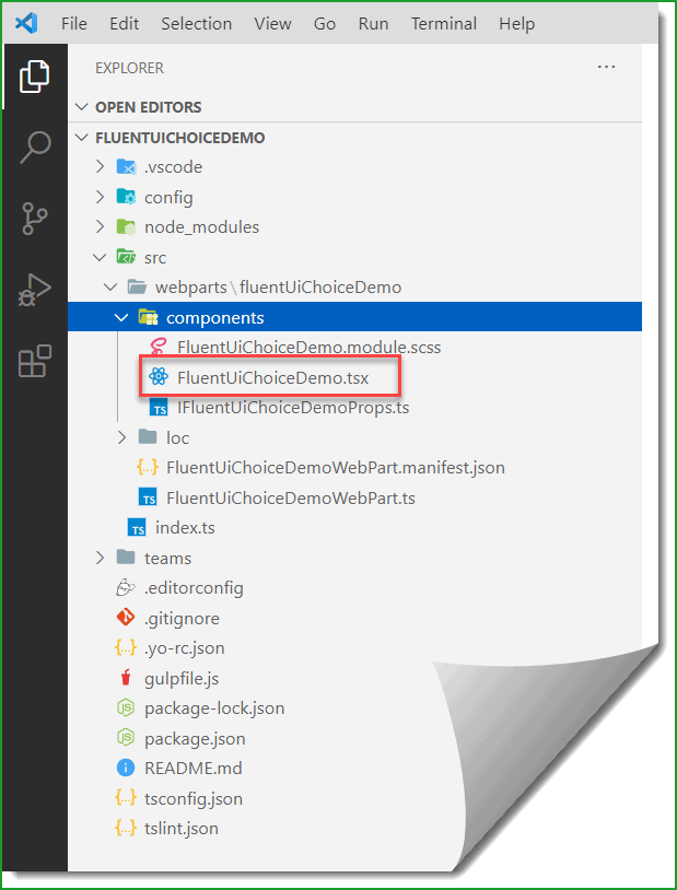
Here, since the framework we are using a react framework, we will write mostly the code in the FluentUiChoiceDemo.tsx file.
Here, first we need to declare a variable that will hold the site URL. So I have added webURL properties in the IFluentUiChoiceDemoProps.ts file and the code looks like below:
export interface IFluentUiChoiceDemoProps {
  description: string;
  webURL:string;
}
And then in the web part file, FluentUiChoiceDemoWebPart.ts assign the value like below:
webURL:this.context.pageContext.web.absoluteUrlThe full code looks like below:
public render(): void {
    const element: React.ReactElement<IFluentUiChoiceDemoProps> = React.createElement(
      FluentUiChoiceDemo,
      {
        description: this.properties.description,
        webURL:this.context.pageContext.web.absoluteUrl
      }
    );

    ReactDom.render(element, this.domElement);
  }
And now open the FluentUiChoiceDemo.tsx react component file and here we need to add the code to use the fluent ui choice group and fluent ui checkbox controls.
First add all the below import statements:
import { Guid } from '@microsoft/sp-core-library';
import { sp, Web, IWeb } from "@pnp/sp/presets/all";
import "@pnp/sp/lists";
import "@pnp/sp/items";
import {Checkbox, Label, PrimaryButton, ChoiceGroup, IChoiceGroupOption} from '@fluentui/react';
Then add an interface like below:
export interface ICheckboxStates
{
  singleValueChoiceGroup:string;
  multiValueCheckbox:any;
  singleValueOptions:any;
  multiValueOptions:any;
}
Then add the constructor like below:
constructor(props)
  {
    super(props);
    this.state = {
      singleValueChoiceGroup:"",
      multiValueCheckbox:[],
      singleValueOptions:[],
      multiValueOptions:[]
    };

  }
In the state we are setting up the default values to either empty or empty array:
Now, modify the render() method like below:
public render(): React.ReactElement<IFluentUiChoiceDemoProps> {
    return (
      <div className={ styles.fluentUiChoiceDemo }>
        <h1>Fluent UI ChoiceGroup & Checkbox</h1>
        <div>
        <Label>Single Select ChoiceGroup</Label>
        <ChoiceGroup onChange={this._onChange} options={this.state.singleValueOptions} />
        </div>
        <div>
        <Label>Multi Select Checkbox</Label>
        {this.state.multiValueOptions.map((item) => {
          return (
            <div style={{margin:"2px",padding:"3px"}}>
              <Checkbox style={{margin:"2px",padding:"3px"}} label={item.label} onChange={this.onCheckboxMultiChecked} />
              </div>
            );
          }
        )}
        </div>
        <br />
          <PrimaryButton onClick={e => this.Save(e)}>Submit</PrimaryButton>
      </div>
    );
  }
Here you can see the ChoiceGroup and the Checkbox control.
The fluent ui ChoiceGroup options are populating on this.state.singleValueOptions. And we are adding the fluent UI checkboxes based on the values in the this.state.multiValueOptions.
Here in the componentDidMount() method we are doing setState for the ChoiceGroup as well as for the Checkbox.
public async componentDidMount(){
    var singleValue=await this.getCheckboxChoices("SingleValueCheckbox","singlevalue");
   this.setState({singleValueOptions:singleValue});
    var multiValue=await this.getCheckboxChoices("MultiValueCheckbox","multivalue");
   this.setState({multiValueOptions:multiValue});
  }

  public async getCheckboxChoices(fieldname,value) {
    if(value=="singlevalue")
    {
      var singlevaluechoices = [];
    let web = Web(this.props.webURL);
    await web.lists.getByTitle("FluentUICheckbox").fields.getByInternalNameOrTitle(fieldname).select('Choices').get().then((field) => {
      console.log(field);
      for (var i = 0; i < field["Choices"].length; i++) {
        singlevaluechoices.push({
          key: field["Choices"][i],
          text: field["Choices"][i]
        });
      }

    });
     return  singlevaluechoices;
    }
    else if(value=="multivalue")
    {
      var multivaluechoices = [];
    let web = Web(this.props.webURL);
    await web.lists.getByTitle("FluentUICheckbox").fields.getByInternalNameOrTitle(fieldname).select('Choices').get().then((field) => {
      console.log(field);
      for (var i = 0; i < field["Choices"].length; i++) {
        multivaluechoices.push({
          label: field["Choices"][i]
        });
      }
    });
     return  multivaluechoices;
    }
  }
Then once user select the a radio button value or select multiple choices from the checkboxes, we are adding the values to the array.
public _onChange = async (ev: React.FormEvent<HTMLInputElement>, option: IChoiceGroupOption): Promise<void> => {
    console.log(option);
    this.setState({ singleValueChoiceGroup: option.key });
  }

  public onCheckboxMultiChecked = async (ev: React.FormEvent<HTMLElement>, isChecked: boolean): Promise<void> => {
    if (arr.indexOf(ev.currentTarget["ariaLabel"]) !== -1) {
      arr.splice(arr.indexOf(ev.currentTarget["ariaLabel"]), 1);
    }
    else {
      await arr.push(ev.currentTarget["ariaLabel"]);
    }
    await this.setState({ multiValueCheckbox: arr });
  }
The below method we are calling when user click on the Submit button.
private async Save(e) {
    let web = Web(this.props.webURL);
    await web.lists.getByTitle("FluentUICheckbox").items.add({
      Title: Guid.newGuid().toString(),
      SingleValueCheckbox: this.state.singleValueChoiceGroup,
      MultiValueCheckbox: { results: this.state.multiValueCheckbox }

    }).then(i => {
      console.log(i);
    });
    alert("Submitted Successfully");
  }
The complete code looks like below: (FluentUiChoiceDemo.tsx)
import * as React from 'react';
import styles from './FluentUiChoiceDemo.module.scss';
import { IFluentUiChoiceDemoProps } from './IFluentUiChoiceDemoProps';
import { escape } from '@microsoft/sp-lodash-subset';
import { Guid } from '@microsoft/sp-core-library';
import { sp, Web, IWeb } from "@pnp/sp/presets/all";
import "@pnp/sp/lists";
import "@pnp/sp/items";
import {Checkbox, Label, PrimaryButton, ChoiceGroup, IChoiceGroupOption} from '@fluentui/react';

var arr = [];
export interface ICheckboxStates
{
  singleValueChoiceGroup:string;
  multiValueCheckbox:any;
  singleValueOptions:any;
  multiValueOptions:any;
}

export default class FluentUiChoiceDemo extends React.Component<IFluentUiChoiceDemoProps, ICheckboxStates> {
  constructor(props)
  {
    super(props);
    this.state = {
      singleValueChoiceGroup:"",
      multiValueCheckbox:[],
      singleValueOptions:[],
      multiValueOptions:[]
    };

  }
  public async componentDidMount(){
    var singleValue=await this.getCheckboxChoices("SingleValueCheckbox","singlevalue");
   this.setState({singleValueOptions:singleValue});
    var multiValue=await this.getCheckboxChoices("MultiValueCheckbox","multivalue");
   this.setState({multiValueOptions:multiValue});
  }

  public async getCheckboxChoices(fieldname,value) {
    if(value=="singlevalue")
    {
      var singlevaluechoices = [];
    let web = Web(this.props.webURL);
    await web.lists.getByTitle("FluentUICheckbox").fields.getByInternalNameOrTitle(fieldname).select('Choices').get().then((field) => {
      console.log(field);
      for (var i = 0; i < field["Choices"].length; i++) {
        singlevaluechoices.push({
          key: field["Choices"][i],
          text: field["Choices"][i]
        });
      }

    });
     return  singlevaluechoices;
    }
    else if(value=="multivalue")
    {
      var multivaluechoices = [];
    let web = Web(this.props.webURL);
    await web.lists.getByTitle("FluentUICheckbox").fields.getByInternalNameOrTitle(fieldname).select('Choices').get().then((field) => {
      console.log(field);
      for (var i = 0; i < field["Choices"].length; i++) {
        multivaluechoices.push({
          label: field["Choices"][i]
        });
      }
    });
     return  multivaluechoices;
    }
  }
  public _onChange = async (ev: React.FormEvent<HTMLInputElement>, option: IChoiceGroupOption): Promise<void> => {
    console.log(option);
    this.setState({ singleValueChoiceGroup: option.key });
  }

  public onCheckboxMultiChecked = async (ev: React.FormEvent<HTMLElement>, isChecked: boolean): Promise<void> => {
    if (arr.indexOf(ev.currentTarget["ariaLabel"]) !== -1) {
      arr.splice(arr.indexOf(ev.currentTarget["ariaLabel"]), 1);
    }
    else {
      await arr.push(ev.currentTarget["ariaLabel"]);
    }
    await this.setState({ multiValueCheckbox: arr });
  }

  private async Save(e) {
    let web = Web(this.props.webURL);
    await web.lists.getByTitle("FluentUICheckbox").items.add({
      Title: Guid.newGuid().toString(),
      SingleValueCheckbox: this.state.singleValueChoiceGroup,
      MultiValueCheckbox: { results: this.state.multiValueCheckbox }

    }).then(i => {
      console.log(i);
    });
    alert("Submitted Successfully");
  }

  public render(): React.ReactElement<IFluentUiChoiceDemoProps> {
    return (
      <div className={ styles.fluentUiChoiceDemo }>
        <h1>Fluent UI ChoiceGroup & Checkbox</h1>
        <div>
        <Label>Single Select ChoiceGroup</Label>
        <ChoiceGroup onChange={this._onChange} options={this.state.singleValueOptions} />
        </div>
        <div>
        <Label>Multi Select Checkbox</Label>
        {this.state.multiValueOptions.map((item) => {
          return (
            <div style={{margin:"2px",padding:"3px"}}>
              <Checkbox style={{margin:"2px",padding:"3px"}} label={item.label} onChange={this.onCheckboxMultiChecked} />
              </div>
            );
          }
        )}
        </div>
        <br />
          <PrimaryButton onClick={e => this.Save(e)}>Submit</PrimaryButton>
      </div>
    );
  }
}
Now, it is the time to run the below command and start the local workbench.
gulp serveIn the local workbench you can see the web part will appear like below:
But we can not test this spfx client side web part in the local workbench.
Test SPFx web part locally
Now, to test the SPFx web part locally, while the local workbench is running, open the SharePoint Online site workbench. The URL will be like below:
https://tsinfotechnologies.sharepoint.com/sites/SPFxForBlog/_layouts/15/workbench.aspxNote: The list should be there in this site.
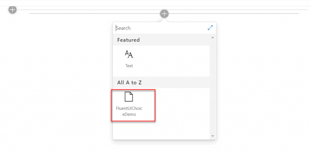
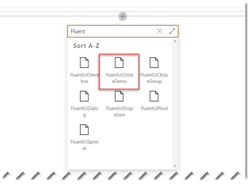
Now, click on Add web part and you can see the web part.
Once you add the web part, you can see the web part added to the SharePoint workbench.
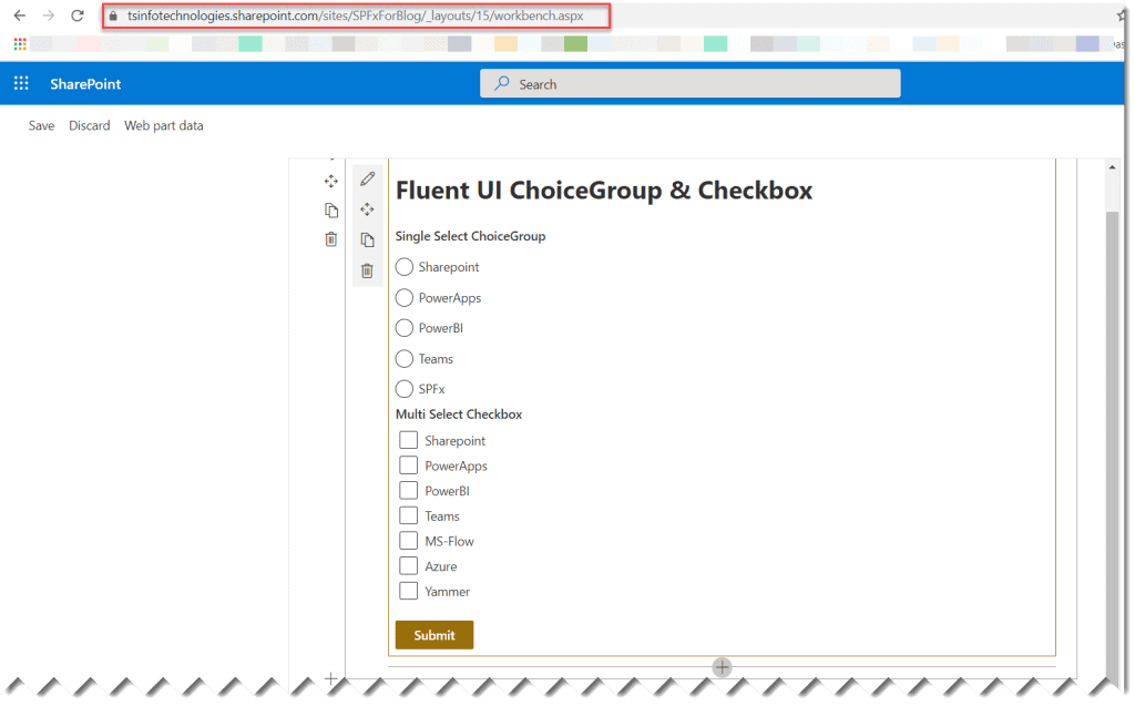
Here, you can select the option from the radio button and then select the checkbox options like below and click on the Submit button.
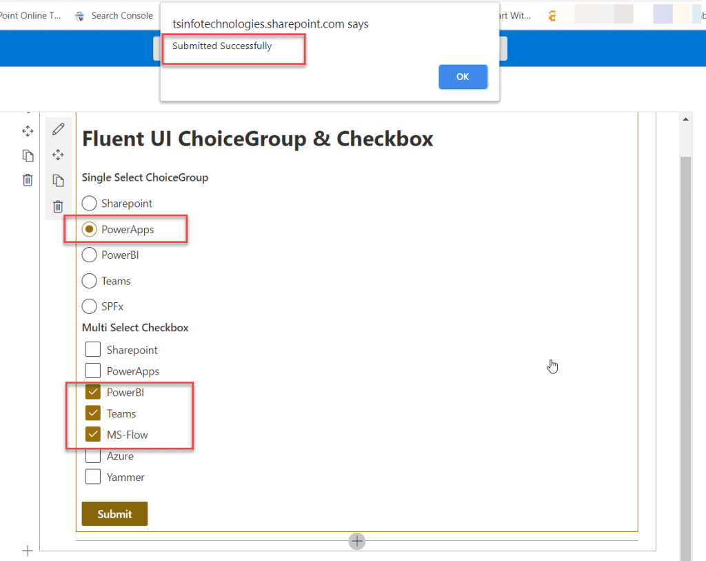
You can see the message, and if you will check the SharePoint Online list,

Deploy SPFx web part to Production
The above steps we saw to test the web part in the test environment, but if you want to deploy the web part to the production environment, then run the below commands.
gulp bundle --ship

gulp package-solution --ship
Once you run the above command, it will create the .sppkg file under the SharePoint folder like below:
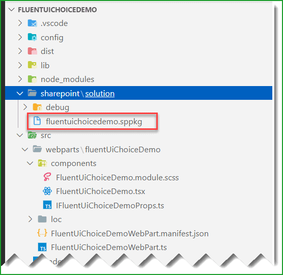
Simply, upload this file into the tenant app catalog site or SharePoint site collection app catalog site. Then you can add the web part into a modern web part page in SharePoint Online.
Error TS2307: Cannot find module ‘@fluentui/react’
If you get an error, Error TS2307: Cannot find module ‘@fluentui/react’ while running the gulp serve command, then run the below command to fix the error:
npm install @fluentui/reactYou can see like below:

You can install using yarn like below:
yarn add @fluentui/reactOnce you run the above npm cmdlets the error Error TS2307: Cannot find module ‘@fluentui/react’ will not come.
SharePoint Framework – Fluent UI React ChoiceGroup (Radio Button) and Checkbox Example (Video Tutorial)
I have also created a video tutorial on how to use the Fluent UI React ChoiceGroup (Radio Button) and Fluent UI React Checkbox control in SPFx client-side web part.
Subscribe to our YouTube channel for more free videos.
Download SPFx Solution
You may like the following SPFx tutorials:
- How to add new webpart in spfx solution
- office-ui-fabric-react combobox example in SharePoint Framework
- SharePoint Framework CRUD Operations using React
- error TS1192: Module has no default export
- SharePoint framework crud operations no javascript framework
- SPFx Fluent UI Basic List Example
Conclusion
In this SharePoint framework tutorial, we learned how to use fluent ui choice group (fluent ui radio button) and fluent ui react checkbox control inside SPFx client-side web part. In an example, we saw how to save fluent ui react checkbox and fluent ui react radio button value into a SharePoint Online list using PnP. Also, we saw how to fix the error, Error TS2307: Cannot find module ‘@fluentui/react’.
I am Bijay a Microsoft MVP (10 times – My MVP Profile) in SharePoint and have more than 17 years of expertise in SharePoint Online Office 365, SharePoint subscription edition, and SharePoint 2019/2016/2013. Currently working in my own venture TSInfo Technologies a SharePoint development, consulting, and training company. I also run the popular SharePoint website EnjoySharePoint.com