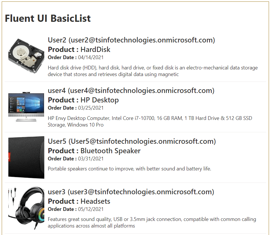
In this SPFx tutorial, we will see how to use Fluent UI basic list control in SPFx. Here is an example of an SPFx fluent ui basic list.
Here we will display SharePoint list items in an SPFx client side web part using the fluent UI basic list control. The output will look like below:

Fluent UI Basic List
In fluent ui, the basic list we can use to render or display large sets of items. Minimum the list items will have a selection, icon and name columns will be there.
SPFx Fluent UI Basic List Example
Now, let us see, how to create an SPFx client side web part using visual studio code.
If you are new to SharePoint framework development for SharePoint Online, then set up your development environment for SPFx first.
But before creating the SPFx client-side web part, let us first create the required list and columns in the SharePoint Online site.
Step-1: Create the required SharePoint list
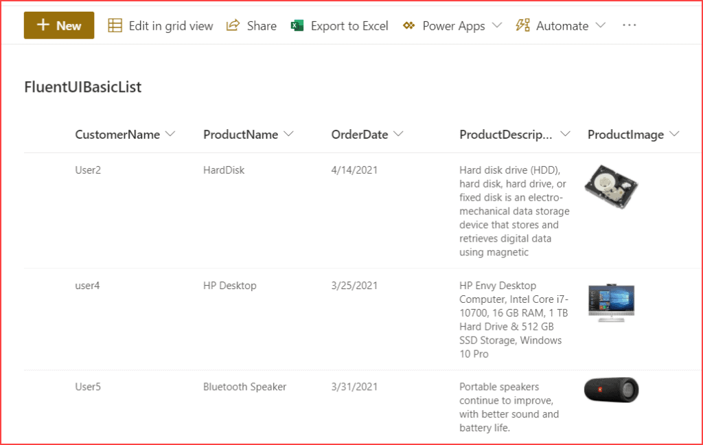
Here, first I have create a custom list in the SharePoint Online site and added the below columns.
- CustomerName (Person or group)
- ProductName (Single line of text)
- OrderDate (DateTime)
- ProductDescription (Multiline textbox)
- ProductImage (Image)
After adding some data in the SharePoint list, the list look like below:

Step-2: Create the SPFx web part
Open the nodejs command prompt and then create a directory in a location where you want to save the files.
md FluentUIBasicList

cd FluentUIBasicList
Then run the below command to start creating the spfx client side web part.
yo @microsoft/sharepointIt will ask you the below things:
- What is your solution name? Click on Enter to take the default name.
- Which baseline packages do you want to target for your component (s)? Here choose one from the below options:
- SharePoint Online only (latest)
- SharePoint 2016 onwards, including 2019 and SharePoint Online
- SharePoint 2019 onwards, including SharePoint Online
Here select SharePoint Online only (latest).
- Where do you want to place the files? Choose one from the following:
- Use the current folder
- Create a subfolder with solution name
Here choose Use the current folder.
- Do you to allow the tenant admin the choice of being able to deploy the solution to all sites immediately without running any feature deployment or adding apps in sites? Choose N.
- Will the components in the solution require permissions to access web APIs that are unique and not shared with other components in the tenant? Choose N.
- Which type of client-side component to create? Choose WebPart from the below options:
- WebPart
- Extension
- Library
- What is your web part name? Give FluentUIBasicList as the web part name
- What is your web part description? Click on Enter to take the default name.
- Which framework would you like to use? Choose React from the below options:
- No JavaScript framework
- React
- Knockout
Then it will take some time and then you can see a successful message.
Read How to add custom controls in SPFx property pane
Step-3: Install FluentUI react and PnP
Since we are going to use the flient ui react ui control, we have to install it into our solution.
Once we created the SPFx web part, we need to install fluentui/react. Below is the command:
npm install @fluentui/reactThen run the below command to install pnp, because here we are using PnP to save data to the SharePoint list.
npm i @pnp/spIt will take some time and install pnp.
Next, run the below command to open the solution using visual studio code.
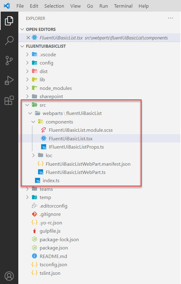
code .Now, the SPFx solution looks like below:

Now, our SPFx solution or web part got created.
Step-4: Add Code in Component File
Now, Open the src/webparts/components/FluentUiBasicList.tsx file and add the code like below:
import * as React from 'react';
import { IFluentUiBasicListProps } from './IFluentUiBasicListProps';
import { Web } from "@pnp/sp/presets/all";
import "@pnp/sp/lists";
import "@pnp/sp/items";
import { ITheme, mergeStyleSets, getTheme, getFocusStyle, List, ImageFit, Image } from '@fluentui/react';

const theme: ITheme = getTheme();
const { palette, semanticColors, fonts } = theme;

const classNames = mergeStyleSets({
  itemCell: [
    getFocusStyle(theme, { inset: -1 }),
    {
      minHeight: 54,
      padding: 10,
      boxSizing: 'border-box',
      borderBottom: `1px solid ${semanticColors.bodyDivider}`,
      display: 'flex',
      selectors: {
        '&:hover': { background: palette.neutralLight },
      },
    },
  ],
  itemImage: {
    flexShrink: 0,
  },
  itemContent: {
    marginLeft: 10,
    overflow: 'hidden',
    flexGrow: 1,
  },
  itemName: [
    fonts.xLarge,
    {
      whiteSpace: 'nowrap',
      overflow: 'hidden',
      textOverflow: 'ellipsis',
    },
  ],
  itemIndex: {
    marginBottom: 10,
  }

});
export interface IBasicListStates {
  Items: any;
}

export default class FluentUiBasicList extends React.Component<IFluentUiBasicListProps, IBasicListStates> {
  constructor(props) {
    super(props);
    this.state = {
      Items: [],
    };
  }
  public async componentDidMount() {
    await this.fetchData();
  }

  public async fetchData() {

    let web = Web(this.props.webURL);
    const items: any[] = await web.lists.getByTitle("FluentUIBasicList").items.select("*", "CustomerName/EMail", "CustomerName/Title").expand("CustomerName/ID").get();
    console.log(items);
    this.setState({ Items: items });
  }
  public onRenderCell = (item): JSX.Element => {
    var productimg = window.location.origin + item.ProductImage.match('"serverRelativeUrl":(.*),"id"')[1];
    return (
      <div className={classNames.itemCell} data-is-focusable={true}>
        <Image className={classNames.itemImage} src={productimg.replace(/['"]+/g, '')} width={100} height={120} imageFit={ImageFit.cover} />
        <div className={classNames.itemContent}>
          <div className={classNames.itemName}>{item.CustomerName.Title} ({item.CustomerName.EMail})</div>
          <div className={classNames.itemName}><strong>Product : </strong> {item.ProductName}</div>
          <div className={classNames.itemIndex}><strong>Order Date : </strong>{FormatDate(item.OrderDate)}</div>
          <div>{item.ProductDescription}</div>
        </div>
      </div>
    );
  }
  public render(): React.ReactElement<IFluentUiBasicListProps> {
    return (

      <div data-is-scrollable>
        <h1>Fluent UI BasicList</h1>
        <List items={this.state.Items} onRenderCell={this.onRenderCell} />
      </div>
    );
  }
}
export const FormatDate = (date): string => {
  // console.log(date);
  var date1 = new Date(date);
  var year = date1.getFullYear();
  var month = (1 + date1.getMonth()).toString();
  month = month.length > 1 ? month : '0' + month;
  var day = date1.getDate().toString();
  day = day.length > 1 ? day : '0' + day;
  return month + '/' + day + '/' + year;
};
In the FluentUiBasicListWebPart.ts file, modify the render() method like below:
 public render(): void {
    const element: React.ReactElement<IFluentUiBasicListProps> = React.createElement(
      FluentUiBasicList,
      {
        description: this.properties.description,
        webURL:this.context.pageContext.web.absoluteUrl
      }
    );

    ReactDom.render(element, this.domElement);
  }
Download the complete solution to get the complete project
Step-5: Run and Test the web part
Now, let us run and test the SPFx client side web part.
Run the below cmdlet to run the SPFx solution locally.
gulp serveWhile the local workbench is running, open the SharePoint workbench from the below URL:
https://tsinfotechnologies.sharepoint.com/sites/SPFxForBlog/_layouts/15/workbench.aspxOn the SharePoint workbench page, when you will add the web part, the web part will look like below:

Step-6: Deploy SPFx webpart to SharePoint
If you want to deploy the web part to SharePoint Online Office 365, then run the below commands.
gulp bundle --ship

gulp package-solution --ship
Once you run the above command, it will create the .sppkg file under the SharePoint folder that you can upload this file into the tenant app catalog site or SharePoint site collection app catalog site. Then you can add the web part into a modern web part page in SharePoint Online.
Download SPFx Fluent UI Basic List Example
You can download the SPFx flient UI basic list example and unzip and then run the below command.
npm i
npm install @fluentui/react
npm i @pnp/sp
You may like the following SPFx development tutorials:
- SPFx fluent UI react dropdown example
- SPFx SwatchColorPicker Office UI Fabric React Control example
- SharePoint Framework – Fluent UI React ChoiceGroup (Radio Button) and Checkbox Example
- How to add new webpart in spfx solution
- office-ui-fabric-react combobox example in SharePoint Framework (SPFx)
- SPFx Send Email using PnP
- How do I use Office UI fabric in SPFx?
Conclusion
In this SPFx tutorial, we learned how to use the fluent UI basic list in a SharePoint Framework web part. We can use the basic list fluent UI control to display items from a SharePoint Online list.
I am Bijay a Microsoft MVP (10 times – My MVP Profile) in SharePoint and have more than 17 years of expertise in SharePoint Online Office 365, SharePoint subscription edition, and SharePoint 2019/2016/2013. Currently working in my own venture TSInfo Technologies a SharePoint development, consulting, and training company. I also run the popular SharePoint website EnjoySharePoint.com
When running the flunt list code getting below error :
Error – [tsc] src/webparts/fluentUiBasicList/components/FluentUiBasicList.tsx(60,15): error TS7006: Parameter ‘props’ implicitly has an ‘any’ type.
[09:51:22] Error – [tsc] src/webparts/fluentUiBasicList/components/FluentUiBasicList.tsx(73,156): error TS2339: Property ‘get’ does not exist on type ‘IItems’.
[09:51:22] Error – [tsc] src/webparts/fluentUiBasicList/components/FluentUiBasicList.tsx(77,26): error TS7006: Parameter ‘item’ implicitly has an ‘any’ type.
[09:51:22] Error – [tsc] src/webparts/fluentUiBasicList/components/FluentUiBasicList.tsx(101,28): error TS7006: Parameter ‘date’ implicitly has an ‘any’ type.
unable to find what is causing the errror where as the steps followed as per given above