Want to know how to use react dropdown in SharePoint framework (SPFx)? This SPFx tutorial is all about how to use fluent UI react dropdown in SPFx. This is a complete SPFx fluent UI react dropdown example.
This is going to be a step by step tutorial, where we will see how to create a client side web part using SharePoint Framework, and then we will see how to use the fluent UI react dropdown control inside it. We will bind the react dropdown values from a SharePoint list choice column options and then we will see how to save the selected dropdown values to a SharePoint Online list.
You can also download the SPFx project from the Step-8.
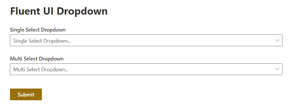
We will build a web part like below:
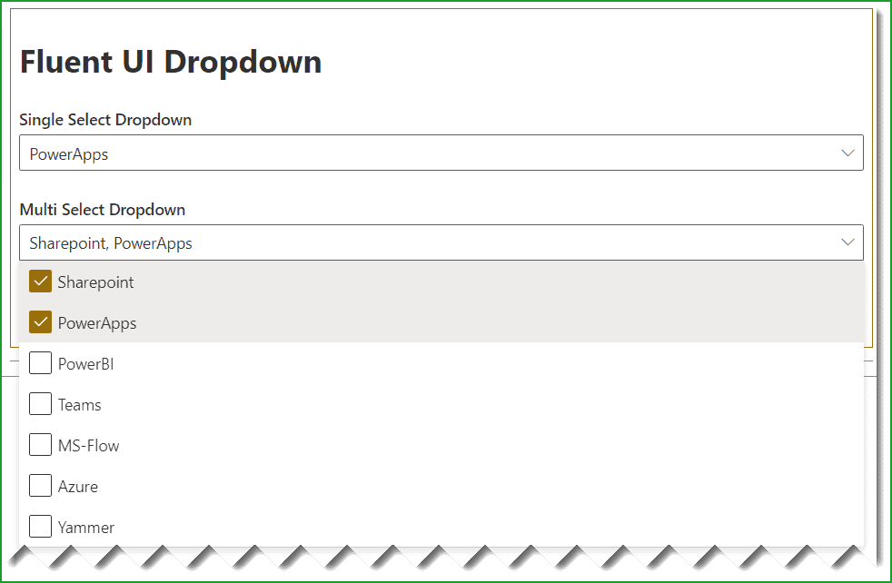
SPFx fluent ui react dropdown
Now let us see step by step how to use the react dropdown in SharePoint framework project.
You may like SharePoint Framework tutorial (SPFx) + Set up development environment.
Step-1: Create the Required SharePoint List
Here I have created a SharePoint list, having two columns as SingleValueDropdown and MultiValueDropdown.
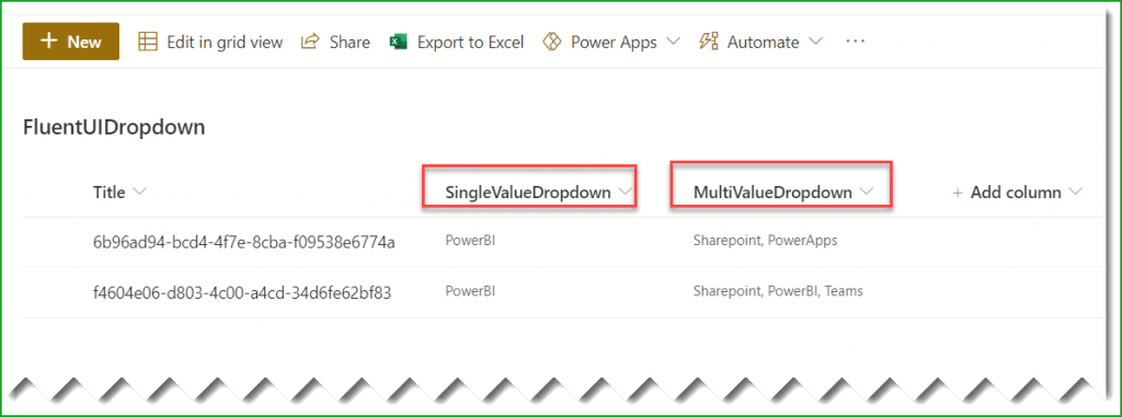
Here the above two columns are the choice columns. And we are going to bind choice options to the react dropdown.
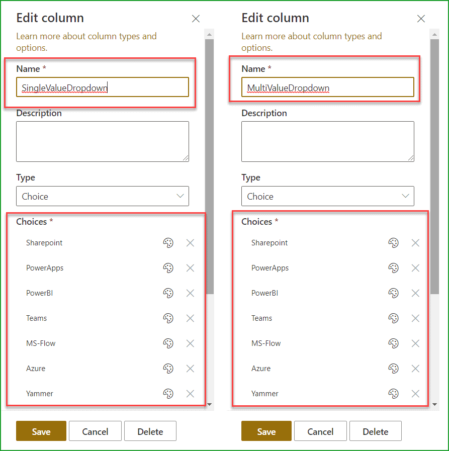
And also, there is a Submit button in the SPFx client side web part.
Step-2: Create Client Side SPFx web part
Now, let us see how to create a SharePoint framework (SPFx) client side web part. Follow the below steps:
Open the nodejs command prompt and then create a directory in a location where you want to save the files.
md fluentuidropdowndemo

cd fluentuidropdowndemo
Then run the below command to start creating the spfx client side web part.
yo @microsoft/sharepointIt will ask you the below things:
- What is your solution name? Click on Enter to take the default name.
- Which baseline packages do you want to target for your component (s)? Here choose one from the below options:
- SharePoint Online only (latest)
- SharePoint 2016 onwards, including 2019 and SharePoint Online
- SharePoint 2019 onwards, including SharePoint Online
Here select SharePoint Online only (latest).
- Where do you want to place the files? Choose one from the following:
- Use the current folder
- Create a subfolder with solution name
Here choose Use the current folder.
- Do you to allow the tenant admin the choice of being able to deploy the solution to all sites immediately without running any feature deployment or adding apps in sites? Choose N.
- Will the components in the solution require permissions to access web APIs that are unique and not shared with other components in the tenant? Choose N.
- Which type of client-side component to create? Choose WebPart from the below options:
- WebPart
- Extension
- Library
- What is your web part name? Give FluentUIDropdownDemo as the web part name
- What is your web part description? Click on Enter to take the default name.
- Which framework would you like to use? Choose React from the below options:
- No JavaScript framework
- React
- Knockout
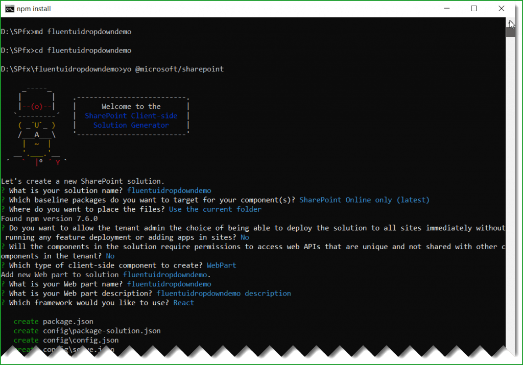
Then it will take sometime and then you can see a successful message.
Step-3: Install FluentUI react and PnP
Since, we are going to use the flient ui react ui control, we have to install into our solution.
Once we created the SPFx web part, we need to install fluentui/react. Below is the command:
npm install @fluentui/reactThen run the below command to install pnp, because here we are using PnP to save data to the SharePoint list.
npm i @pnp/spIt will take some time and install pnp.
Next, run the below command to open the solution using visual studio code.
code .Now, the SPFx solution looks like below:
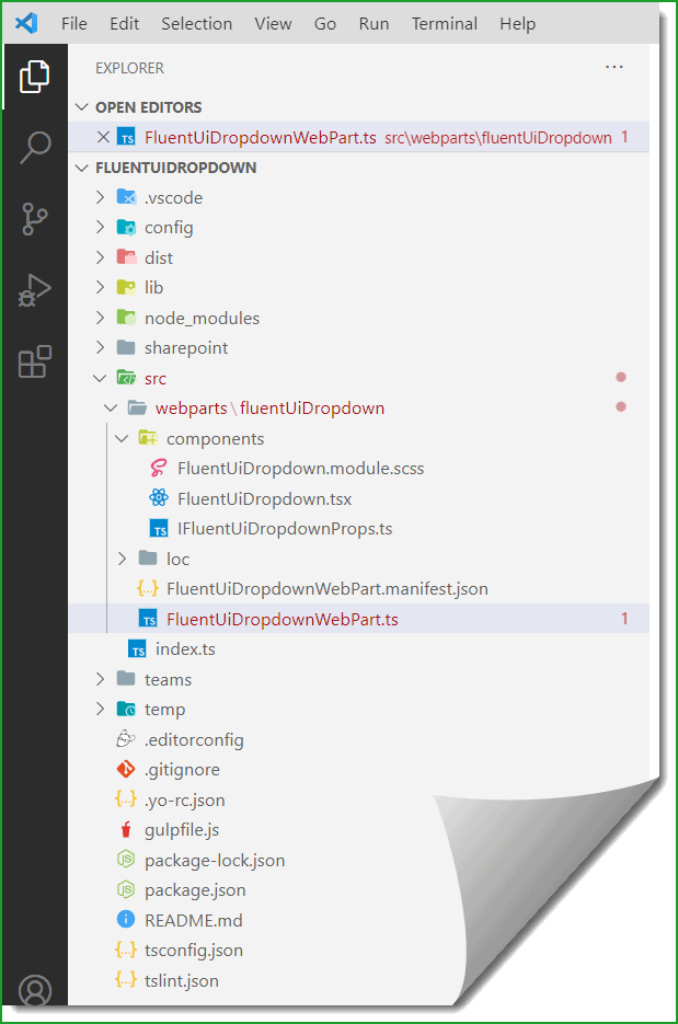
Now, our SPFx solution or web part got created.
Step-4: Bind Choice Options in React Dropdown
Now, let us see how to bind the choice options to dropdown from the SharePoint list column choice options.
Here I have added two dropdown control: Single Select Dropdown and Multi Select Dropdown
And we will bind the first dropdown from the list choice options from SingleValueDropdown column and in the second dropdown, we will bind with the choice options from MultiValueDropdown column.
I have added the dropdown controls in the .tsx file in the render method like below, but before that, we need to write the below import statement.
import {Dropdown, PrimaryButton, IDropdownOption} from '@fluentui/react';public render(): React.ReactElement<IFluentUiDropdownProps> {
return (
<div className={ styles.fluentUiDropdown }>
<h1>Fluent UI Dropdown</h1>
<Dropdown
placeholder="Single Select Dropdown..."
selectedKey={this.state.singleValueDropdown}
label="Single Select Dropdown"
options={this.props.singleValueOptions}
onChange={this.onDropdownChange}
/>
<br />
<Dropdown
placeholder="Multi Select Dropdown..."
defaultSelectedKeys={this.state.multiValueDropdown}
label="Multi Select Dropdown"
multiSelect
options={this.props.multiValueOptions}
onChange={this.onDropdownMultiChange}
/>
<div>
<br />
<br />
<PrimaryButton onClick={e => this.Save(e)}>Submit</PrimaryButton>
</div>
</div>
);
}Here I have added the code in the FluentUiDropdownWebPart.ts file like below, the complete code look like below:
The code I have written in the getChoiceFields method.
import * as React from 'react';
import * as ReactDom from 'react-dom';
import { Version } from '@microsoft/sp-core-library';
import {
IPropertyPaneConfiguration,
PropertyPaneTextField
} from '@microsoft/sp-property-pane';
import { BaseClientSideWebPart } from '@microsoft/sp-webpart-base';
import * as strings from 'FluentUiDropdownWebPartStrings';
import FluentUiDropdown from './components/FluentUiDropdown';
import { IFluentUiDropdownProps } from './components/IFluentUiDropdownProps';
export interface IFluentUiDropdownWebPartProps {
description: string;
}
export default class FluentUiDropdownWebPart extends BaseClientSideWebPart <IFluentUiDropdownWebPartProps> {
public async render(): Promise<void> {
const element: React.ReactElement<IFluentUiDropdownProps> = React.createElement(
FluentUiDropdown,
{
description: this.properties.description,
webURL:this.context.pageContext.web.absoluteUrl,
singleValueOptions:await getChoiceFields(this.context.pageContext.web.absoluteUrl,'SingleValueDropdown'),
multiValueOptions:await getChoiceFields(this.context.pageContext.web.absoluteUrl,'MultiValueDropdown')
}
);
ReactDom.render(element, this.domElement);
}
protected onDispose(): void {
ReactDom.unmountComponentAtNode(this.domElement);
}
protected get dataVersion(): Version {
return Version.parse('1.0');
}
protected getPropertyPaneConfiguration(): IPropertyPaneConfiguration {
return {
pages: [
{
header: {
description: strings.PropertyPaneDescription
},
groups: [
{
groupName: strings.BasicGroupName,
groupFields: [
PropertyPaneTextField('description', {
label: strings.DescriptionFieldLabel
})
]
}
]
}
]
};
}
}
export const getChoiceFields = async (webURL,field) => {
let resultarr = [];
await fetch(`${webURL}/_api/web/lists/GetByTitle('FluentUIDropdown')/fields?$filter=EntityPropertyName eq '${field}'`, {
method: 'GET',
mode: 'cors',
credentials: 'same-origin',
headers: new Headers({
'Content-Type': 'application/json',
'Accept': 'application/json',
'Access-Control-Allow-Origin': '*',
'Cache-Control': 'no-cache',
'pragma': 'no-cache',
}),
}).then(async (response) => await response.json())
.then(async (data) => {
for (var i = 0; i < data.value[0].Choices.length; i++) {
await resultarr.push({
key:data.value[0].Choices[i],
text:data.value[0].Choices[i]
});
}
});
return await resultarr;
};
Now, when you will open the web part page, you will be able to see the fluent ui react dropdown will be bind from the choice options.
Step-5: Save Dropdown Values to SharePoint List
Now, let us see how to save react dropdown values to a SharePoint list. We will use here pnp to save the dropdown selected values.
For the Title column, I have added a GUID.
private async Save(e) {
let web = Web(this.props.webURL);
await web.lists.getByTitle("FluentUIDropdown").items.add({
Title: Guid.newGuid().toString(),
SingleValueDropdown: this.state.singleValueDropdown,
MultiValueDropdown: { results: this.state.multiValueDropdown }
}).then(i => {
console.log(i);
});
alert("Submitted Successfully");
}The complete code (FluentUiDropdown.tsx) will look like below:
import * as React from 'react';
import styles from './FluentUiDropdown.module.scss';
import { Guid } from '@microsoft/sp-core-library';
import { IFluentUiDropdownProps } from './IFluentUiDropdownProps';
import { Web } from "@pnp/sp/presets/all";
import "@pnp/sp/lists";
import "@pnp/sp/items";
import { escape } from '@microsoft/sp-lodash-subset';
import {Dropdown, PrimaryButton, IDropdownOption} from '@fluentui/react';
var arr = [];
export interface IDropdownStates
{
singleValueDropdown:string;
multiValueDropdown:any;
}
export default class FluentUiDropdown extends React.Component<IFluentUiDropdownProps, IDropdownStates> {
constructor(props)
{
super(props);
this.state={
singleValueDropdown:"",
multiValueDropdown:[]
};
}
public onDropdownChange = (event: React.FormEvent<HTMLDivElement>, item: IDropdownOption): void => {
this.setState({ singleValueDropdown: item.key as string});
}
public onDropdownMultiChange = async (event: React.FormEvent<HTMLDivElement>, item: IDropdownOption): Promise<void> => {
if (item.selected) {
await arr.push(item.key as string);
}
else {
await arr.indexOf(item.key) !== -1 && arr.splice(arr.indexOf(item.key), 1);
}
await this.setState({ multiValueDropdown: arr });
}
private async Save(e) {
let web = Web(this.props.webURL);
await web.lists.getByTitle("FluentUIDropdown").items.add({
Title: Guid.newGuid().toString(),
SingleValueDropdown: this.state.singleValueDropdown,
MultiValueDropdown: { results: this.state.multiValueDropdown }
}).then(i => {
console.log(i);
});
alert("Submitted Successfully");
}
public render(): React.ReactElement<IFluentUiDropdownProps> {
    return (
      <div className={ styles.fluentUiDropdown }>
        <h1>Fluent UI Dropdown</h1>
        <Dropdown
          placeholder="Single Select Dropdown..."
          selectedKey={this.state.singleValueDropdown}
          label="Single Select Dropdown"
          options={this.props.singleValueOptions}
          onChange={this.onDropdownChange}
        />
        <br />
        <Dropdown
          placeholder="Multi Select Dropdown..."
          defaultSelectedKeys={this.state.multiValueDropdown}
          label="Multi Select Dropdown"
          multiSelect
          options={this.props.multiValueOptions}
          onChange={this.onDropdownMultiChange}
        />
        <div>
          <br />
          <br />
          <PrimaryButton onClick={e => this.Save(e)}>Submit</PrimaryButton>
        </div>
      </div>
    );
  }
}
Step-6: Run and Test Web Part
Now, let us run and test the SPFx client side web part.
Run the below cmdlet to run the SPFx solution locally.
gulp serveWhile the local workbench is running, open the SharePoint workbench and make sure the list should be there created before with the required choice columns.
The SharePoint workbench URL will be like below:
https://tsinfotechnologies.sharepoint.com/sites/SPFxForBlog/_layouts/15/workbench.aspxOn the SharePoint workbench page, when you will add the web part, the web part will look like below:
Now, once you will select any option and also select multiple values from the multi-select dropdown, then the values will be saved to the SharePoint list.
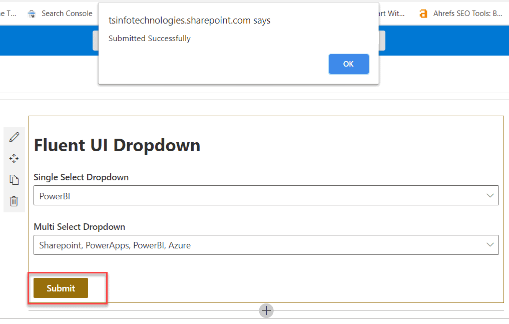
Once, you click on the Submit button, the values will be Saved and you can see like below:
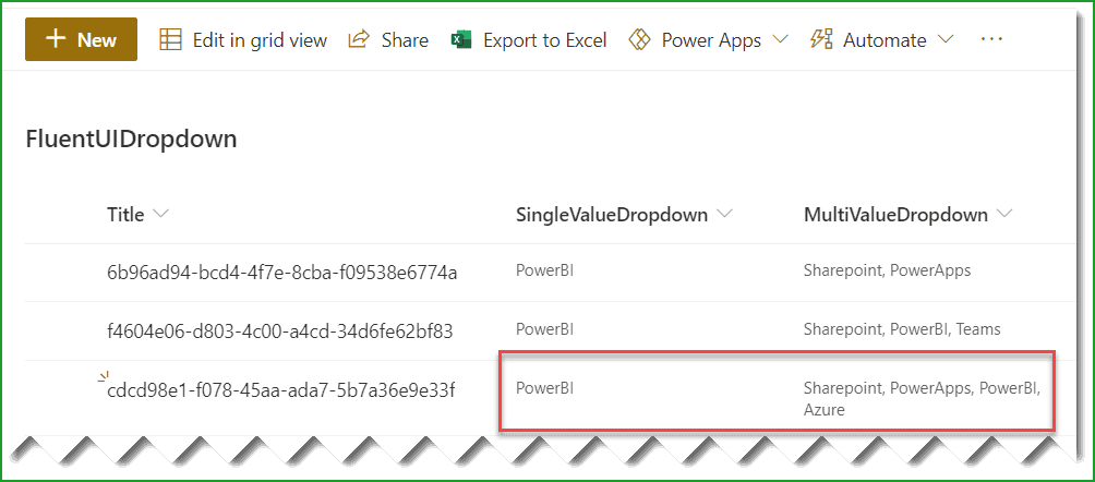
This is how we can work with fluent ui react dropdown example in SharePoint framework (SPFx) client-side web part.
Step-7: Deploy SPFx webpart to SharePoint
If you want to deploy the web part to SharePoint Online Office 365, then run the below commands.
gulp bundle --ship

gulp package-solution --ship
Once you run the above command, it will create the .sppkg file under the SharePoint folder that you can upload this file into the tenant app catalog site or SharePoint site collection app catalog site. Then you can add the web part into a modern web part page in SharePoint Online.
Step-8: Download SPFx fluent ui react dropdown
You can download the SPFx solution from the below link.
If you want to run the solution locally, then unzip the file and then run the below command.
npm iYou may like the following SPfx tutorials:
- SharePoint client-side web part configurable properties in Property Pane using spfx
- Retrieve SharePoint list items using SharePoint framework (SPFx)
- Create and Deploy SharePoint Framework (SPFx) extension field customizer
- SharePoint Framework (SPFx) Extensions Application Customizer Example
- SPFx SwatchColorPicker Office UI Fabric React Control example
- SharePoint Framework – Fluent UI React ChoiceGroup (Radio Button) and Checkbox Example
- SPFx Fluent UI Basic List Example
In this SharePoint framework tutorial, we learn how to use fluent UI react dropdown control in the SharePoint Framework (SPFx) client-side web part. This way, we can use the react dropdown control in the SPFx client-side web part.
I am Bijay a Microsoft MVP (10 times – My MVP Profile) in SharePoint and have more than 17 years of expertise in SharePoint Online Office 365, SharePoint subscription edition, and SharePoint 2019/2016/2013. Currently working in my own venture TSInfo Technologies a SharePoint development, consulting, and training company. I also run the popular SharePoint website EnjoySharePoint.com
How do you handle keeping the DropDown value when something in the PropertyPane is changed triggers a ‘componentDidUpdate’? When this happens, the dropdown selection is cleared even though the state still exists for the selected key.
Figured it out. I wasn’t properly awaiting the calls to fetch the dropdown options. As a result, the options didn’t exist yet to properly set the existing selected key.
Can we fetch the dropdown values on component itself? , we are pulling data on .ts file and not on .tsx