I developed a Power Apps Travel Request application a few days ago. I was required to create a dashboard to track the number of travel requests from each department. This will help the admin people understand things quickly, so I achieved this with a Power Apps pie chart.
In this article, I will explain how to create Power Apps Pie chart from SharePoint Choice column with an example.
Create Power Apps Pie Chart From SharePoint Choice Column
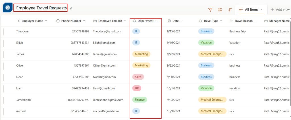
I have a SharePoint list named Employee Travel Requests with a Department Choice column. In the Power Apps pie chart, we need to display the number of travel requests per department.
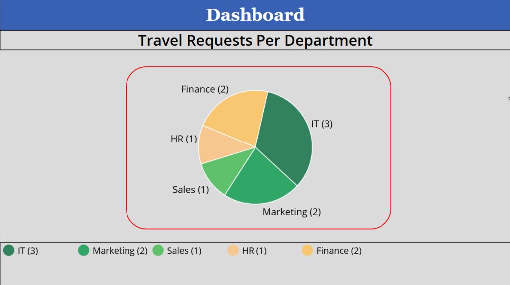
Look at the example below, the Power Apps pie chart displaying the number of travel requests per department.
Follow the steps below to achieve this!
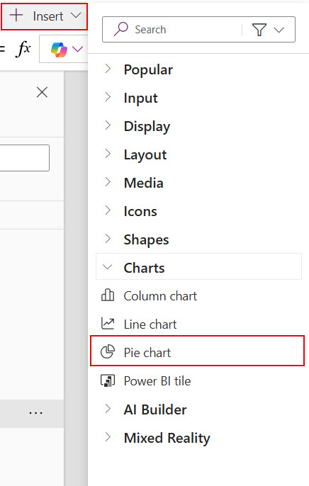
1. Connect the SharePoint list with Power Apps. Click on the +Insert tab -> Under Charts -> Select Pie Chart.
2. By default, the pie chart will look like in the image below. While we select a pie chart, it will be like a group of controls.
- Legend = It displays the names of each color the pie chart indicates.
- PieChart = It displays the portion of the item with different colors for understanding.
- Title = To display the Pie chart purpose means the title of the pie chart.

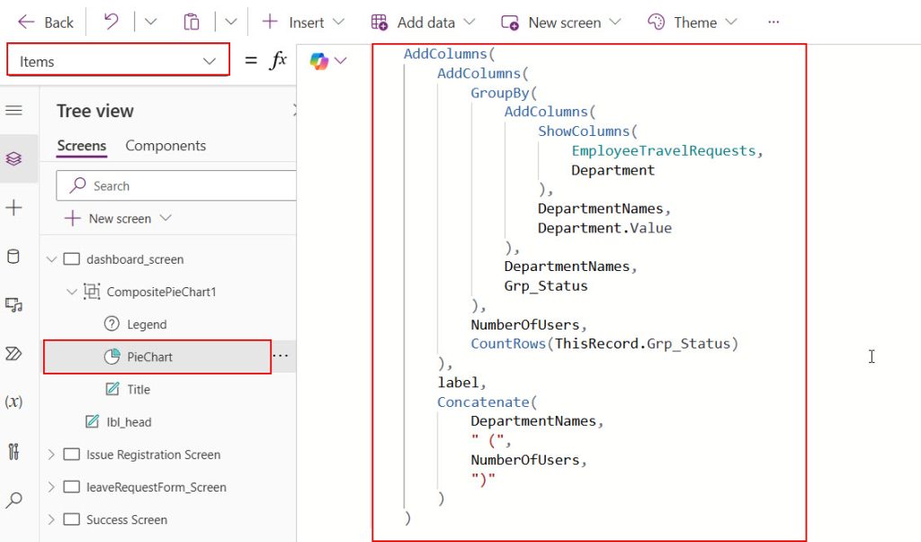
3. To display the number of travel requests per department, use the below formula in the Items property of the PieChart.
    AddColumns(
        AddColumns(
            GroupBy(
                AddColumns(
                    ShowColumns(
                        EmployeeTravelRequests,
                        Department
                    ),
                    DepartmentNames,
                    Department.Value
                ),
                DepartmentNames,
                Grp_Status
            ),
            NumberOfUsers,
            CountRows(ThisRecord.Grp_Status)
        ),
        label,
        Concatenate(
            DepartmentNames,
            " (",
            NumberOfUsers,
            ")"
        )
    )
Here,
- The ShowColumns() function will fetch only “Department” field values from the “EmployeeTravelRequests” SharePoint list. The field values are in the form of [Record].
- The AddColumns () function adds a new column to the datable created from the show columns function in the previous step. The column name is DepartmentNames; it contains the actual values of the department field.
- GroupBy() function will group the department values.
- AddColumns() functions again create another column named NumberOfUsers. It contains the number of travel requests per department with the help of CountRows().
- AddColumns() function creates another column named label, the values present in this field is a combination of department names and number of users per department.
4. Open the properties pane of the PieChart -> Click on Advanced -> Select the below values for Label and SerialNumber.
Label = label
SerialNumer =NumberOfUsers
5. Provide the formula below for the Items property of Legend.
PieChart.SeriesLabels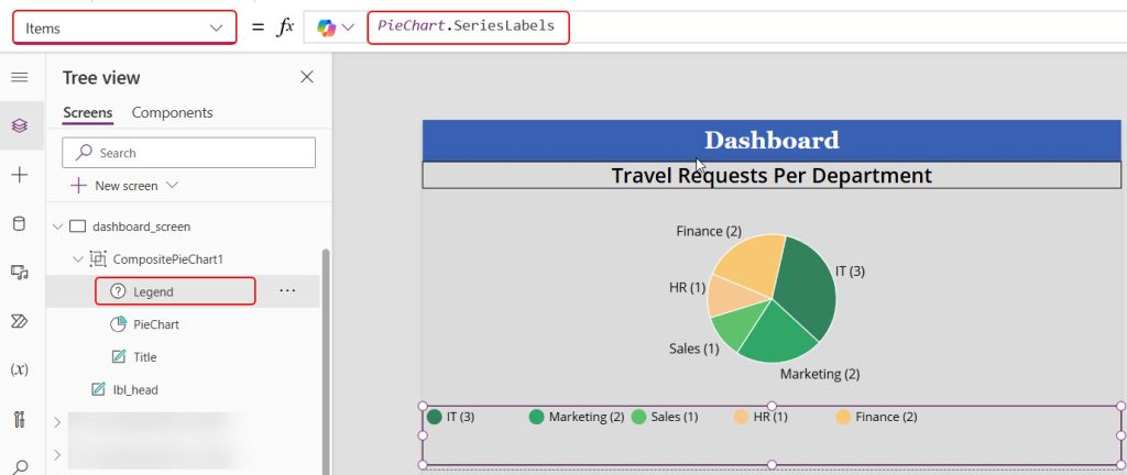
Save the changes and publish it once. Then, add some more travel requests and open this dashboard screen; you can see that each department displays the number of travel requests present in SharePoint’s list.
This way, we can display the SharePoint list items per choice field in the Power Apps pie chart. You can follow this article while creating dashboards for Power Apps applications so that users can understand the data easily with pie charts.
Also, you may like:
- Power Apps line chart based on date range
- Show Repeating Table Data From SharePoint List in Power Apps
- Add copilot to Power Apps
- Create Status Indicator Using Power Apps
- Generate Unique ID in Power Apps
- Send Approval Email Using Power Apps Button
- Power Apps charts
I am Bijay a Microsoft MVP (10 times – My MVP Profile) in SharePoint and have more than 17 years of expertise in SharePoint Online Office 365, SharePoint subscription edition, and SharePoint 2019/2016/2013. Currently working in my own venture TSInfo Technologies a SharePoint development, consulting, and training company. I also run the popular SharePoint website EnjoySharePoint.com