A primary control called Power Apps Modern Header Control makes creating an interface for a typical application simple. In this tutorial, I will explain a modern header control, its important properties, and how to add it to a Power Apps canvas application.
We will also discuss how to use a modern header control in Power Apps with a simple example. I will also tell you how to activate the Canvas application’s Power Apps Modern Controls.
Power Apps Modern Header Control
This modern header is a Power Apps control used for headings or banners. Before while creating a Power Apps application, we were creating a banner/header component for it. But now, Microsoft has made it easy for users to use this control directly instead of creating any component.
This control requires no setup and adapts to themes that use dynamic responsiveness and modern theming by resizing to fit the parent container or application.
We have to manually add the header to every screen in the app because it doesn’t automatically reappear.
The Header control offers several distinctive style options, supports a logo and a page title, and shows the user image. This control’s three primary properties are Title, OnSelectLogo, and Logo.
Refer to the image below:

Power Apps Modern Header Control Properties
Below are some of the important properties of the Power Apps Modern Header:
| It gives the name of the font family in which the text is shown. | Description |
|---|---|
| Title | The text is displayed in the header. The default value is the current screen name.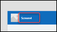 |
| Show title/IsTitleVisible | Specifies whether the title is displayed in the header. |
| Logo | The image/picture is displayed in the header. |
| Show logo/IsLogoVisible | Specifies whether the logo image is displayed. |
| Tooltip | The text that displays when we hover over the logo.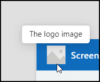 |
| Profile picture/IsProfilePictureVisible | Whether the user picture is displayed in the header. By default, it will display the current user profile picture. If you hover over this profile picture, it will display the user name and email. 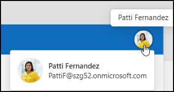 |
| Color palette/BasePaletteColor | The color palette is applied to a control, impacting all surfaces of the control that render a theme color. This property has no effect if the ThemeStyle property is set to Neutral. |
| Style | A variant of the header color depends on the theme colors. There are three different styles: 1. Neutral – 2. Primary –  3. Light – |
| Font | It gives the name of the font family that the text is shown in. |
| Font size/TitleFontSize | The font size of the title that appears on a control. If the value is null or zero, then the font size is driven by the selected Fluent theme. |
| Position | X – Distance between the control’s left side and the screen’s left edge. Y – Distance between the top of the control and the top edge of the screen. |
| Size | Width – The distance between the control’s left and right sides. Height – Distance between the control’s top and bottom. |
| Visible | Specifies whether to display or hide the Modern header control. |
| OnSelectLogo | Actions to perform when the user selects the logo. |
| DisplayMode | There are three display modes: 1. DisplayMode.Edit – The user can edit the header 2. DisplayMode.View – Users only can be allowed to see the header 3. DisplayMode.Disabled – The header is greyed out with disabled mode |
These are the essential properties of a modern Power Apps header control.
Add Power Apps Modern Header Control
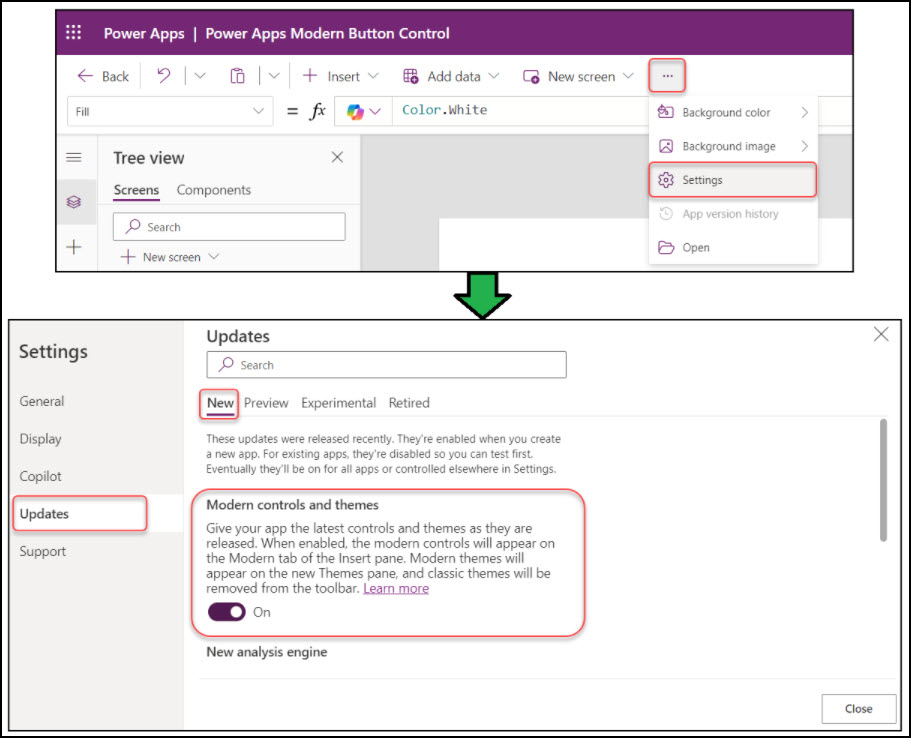
The Power Apps canvas app hides all modern controls by default. You must enable the Modern Controls and Themes option from the app’s Settings page to use them.
Go to More commands (…) -> Settings -> Updates -> New -> Enable Modern controls and themes as shown below.
Next, expand the + Insert tab (from the top) -> expand Layout -> Select the Header control as below.

Once added, the Modern Header control will appear on the screen with its default name, Header1. We can rename it to suit your requirements better.
How to Use Power Apps Modern Header Control
Let’s see how we can use the modern header control in the Power Apps canvas application.
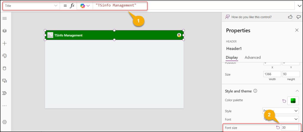
As shown in the screenshot below, I have created a modern header control for my current screen. If you want to use the same header on every screen of the application, you need to copy it, move to the next screen, and paste it there.

Here, I will describe each control that I have applied in the above Power Apps Modern Header Control:
1. Title: Provide your app header text using the Title property and set the font size as per your need (For example, 30).
2. Logo: To add your desired logo in the modern header, you can go to the Logo property and upload any logo from your system or stock images.

3. Suppose you want to navigate to other screens (let’s say the Home screen) from the current screen, then add a Home icon and set its OnSelect property to the code below:
OnSelect = Navigate(Screen1,ScreenTransition.Cover)Where,
Screen1 = Provide the screen name where you want to navigate when user will press the home icon button

If you want to use this modern header throughout the application, the best way is to add a Power Apps Container control instead of adding one individual control in the header.
Add a Container control and insert this modern header into it. To reuse this header in the application, copy the container and paste it into your desired screen. That’s it.
This way, we can use Power Apps modern header control.
Additionally, you may like some more Power Apps tutorials:
- Power Apps Modern Button Control
- Create Multi Select Checkboxes in Power Apps From a SharePoint List
- Show/Hide Password in Power Apps Login Page
- Show/Hide Button Based on Condition in Power Apps
- Replace Position of First Name and Last Name in Power Apps
- Power Apps Modern Dropdown Control
I hope this article helped you to understand all about the header modern control in Power Apps, it’s properties and how to use it with a simple scenario.
I am Bijay a Microsoft MVP (10 times – My MVP Profile) in SharePoint and have more than 17 years of expertise in SharePoint Online Office 365, SharePoint subscription edition, and SharePoint 2019/2016/2013. Currently working in my own venture TSInfo Technologies a SharePoint development, consulting, and training company. I also run the popular SharePoint website EnjoySharePoint.com