In our recent Power Apps Travel Management project, we created a form for employees to apply for a new request. Additionally, we added a modern button to save the data to a SharePoint list that looks more professional than the classic one.
So, I thought I would share all the information about Power Apps Modern Button Control through this article. Here, we will discuss the Modern button in Power Apps, its key properties, and how to use modern button control in Power Apps with a simple example.
Additionally, I will explain how to enable the Power Apps Modern Controls for the Canvas application.
Power Apps Modern Button Control
Power Apps Modern Button control is an input control that allows users to interact with the app by clicking or tapping on it. The user is intended to perform tasks and navigate an interface.
It’s very similar to the Power Apps classic button; the only difference is some design interfaces, like its look, theme, icons, etc.
To initiate an action, you can add your code to the OnSelect property of the button. Nothing will happen if you don’t provide a code for this property when you click the button. Refer to the image below how it looks like:
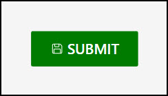
Power Apps Modern Button Control Properties
The table below represents all the important properties of a Power Apps Modern Button control:
| Property | Description |
|---|---|
| AcceptsFocus | Specifies whether the button can receive focus when the user navigates through the app using the keyboard. |
| AccessibleLabel | Label for screen readers. |
| Text | Text that appears on the button. |
| Icon | With the button control, you can add Fluent icons to improve visual appeal. In the properties pane, choose the preferred icon from a dropdown menu showing every available choice.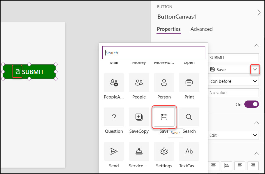 |
| IconStyle | It allows icons to be rendered in an outline or filled state. 1. Outline –  2. Filled – 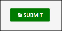 |
| Layout | Defines the positioning of the icon relative to the text on the button or no icon at all. 1. Icon before –  2. Icon after – 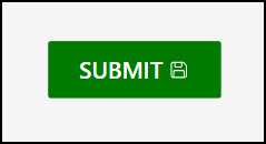 3. Text only – 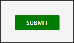 4. Icon only – 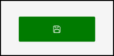 |
| Appearance | The content and borders of a button can be customized to stand out or to fit in. The possible options are shown below: 1. Primary – Emphasizes the button as a primary action. 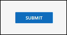 2. Secondary – Emphasizes the button to indicate a secondary action. 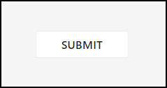 3. Outline – Removes background styling. 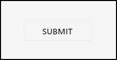 4. Subtle – Minimizes emphasis to blend into the background until hovered or focused. 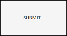 5. Transparent – Removes background and border styling. 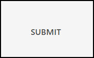 |
| BasePaletteColor/ColorPalette | The color palette is applied to a control, impacting all surfaces of the control that render a theme color. If the value is null or zero, then the color is driven by the selected Fluent theme.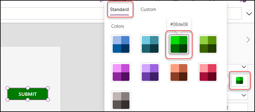 |
| ContentLanguage | Indicates the audience’s language (for example, “en-US”). |
| DisplayMode | There are three display modes: 1. DisplayMode.Edit – The user can enter values 2. DisplayMode.View – Users only can be allowed to see the values 3. DisplayMode.Disabled – The button is greyed out with disabled mode |
| Font | The name of the family of fonts in which text appears. |
| FontItalic | Whether the text in a control is italicized. |
| FontSize | The font size of the text that appears on a control. If the value is null or zero, then the font size is driven by the selected Fluent theme. |
| IconRotation | With the button control, you can add Fluent icons to improve visual appeal. In the properties pane, choose the preferred icon from a dropdown menu that shows every choice available. |
| Border Radius | There are four different types of border-radius. Such as: 1. Top left border radius: 25 2. Top right border radius: 25 3. Bottom left border radius: 25 4. Bottom right border radius: 25  |
| OnSelect | Actions to perform when the user selects a control. |
| Position | X – Distance between the control’s left side and the screen’s left edge. Y – Distance between the top of the control and the top edge of the screen. |
| Size | Width – The distance between the control’s left and right sides. Height – Distance between the control’s top and bottom. |
| Visible | Specifies whether to display or hide the Modern Button control. |
These are the Power Apps modern button control properties with details.
Add Power Apps Modern Button Control
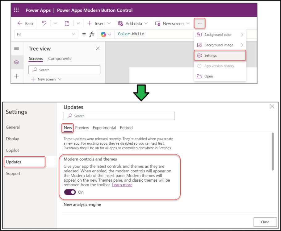
By default, the Power Apps canvas application hides all modern controls. To use them, you must enable the Modern controls and themes option from the app’s Settings page.
Go to More commands (…) -> Settings -> Updates -> New -> Enable Modern controls and themes as shown below.
Next, expand the + Insert tab (from the top) -> expand Recommended/Input -> Select the Button as below.
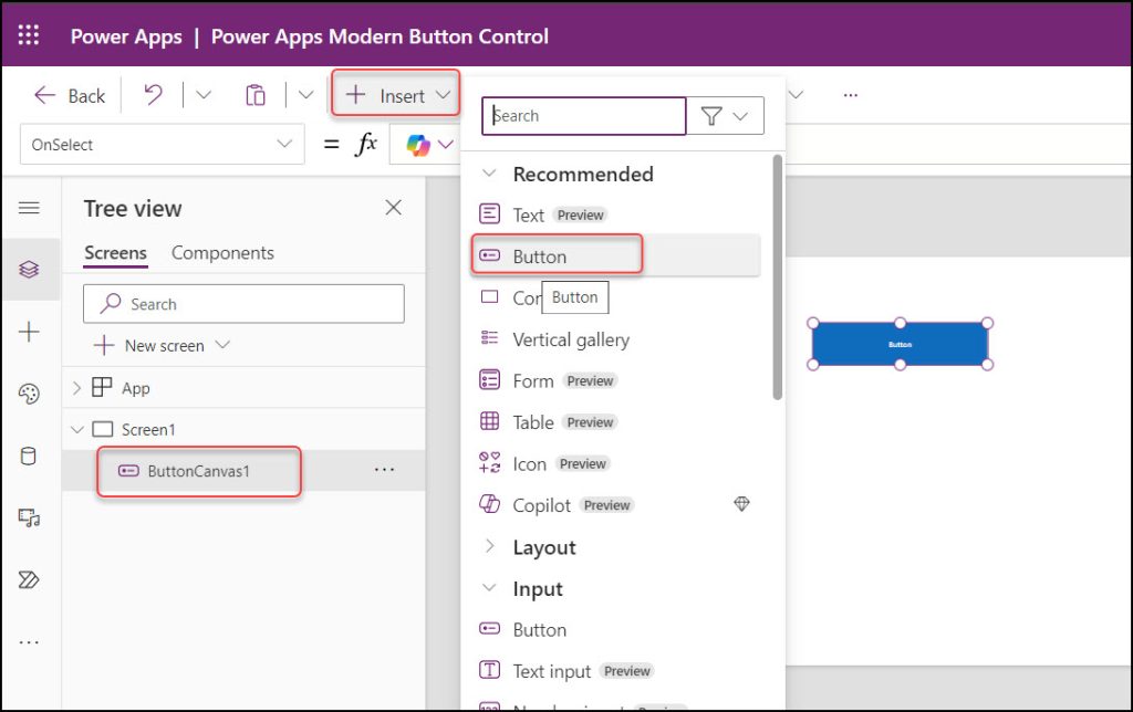
Once added, the Modern Button control will appear on the screen with its default name, ButtonCanvas1. We can rename it to suit your requirements better.
How to Use Power Apps Modern Button Control
Let’s discuss a few examples of Power Apps modern button control.
Example – 1: [Enable/Disable Power Apps Modern Button Based On Text Input’s Length]
In Power Apps, I would like to enable/disable a modern button unless a specific text Input has a value of at least one character.
Let’s say:
- if the text input control has no value, then the modern button will be disabled mode
- if the text input control value is at least one character, then the modern button will be enabled mode

To work around this, write the code below on the SAVE button’s DisplayMode property as:
DisplayMode = If(
    Len(TextInputCanvas1.Value),
    DisplayMode.Edit,
    DisplayMode.Disabled
)
Where,
TextInputCanvas1 = Modern Text input control

Now, preview the app. Enter the value in the text field and click outside. Then, the modern button will be in edit mode.
This way, we can enable or disable the Power Apps modern button based on condition.
Example – 2: [Power Apps Submit Form On Modern Button Click]
I have a Power Apps Employee Survey Form. When a user enters the details and clicks the SUBMIT button, the data will be stored in the SharePoint list. Additionally, the specific employee can see the success notification at the top of the screen.

To achieve this, select the SUBMIT button and set its OnSelect property as:
OnSelect = SubmitForm(Form1);
Notify(
    "Your Record Has Been Submitted Successfully",
    NotificationType.Success
);
Where,
- Form1 = Edit form name
- “Your Record Has Been Submitted Successfully” = Provide the success message that will display once the user submits the item.

Go to the specific SharePoint list and refresh it once. The item has been created as shown below.

This way, we can submit the Power Apps form a modern button click.
Additionally, you may like some more Power Apps tutorials:
- Power Apps Modern Header Control
- Power Apps Modern Badge Control
- How to Use Power Apps Modern Information Button Control
- Show/Hide Password in Power Apps Login Page
- Apply Multiple Filters On Power Apps Gallery
I hope you find this article helpful. Here, we discussed the modern Power Apps button control, its properties, and how to use it in a Power Apps canvas app with various examples.
I am Bijay a Microsoft MVP (10 times – My MVP Profile) in SharePoint and have more than 17 years of expertise in SharePoint Online Office 365, SharePoint subscription edition, and SharePoint 2019/2016/2013. Currently working in my own venture TSInfo Technologies a SharePoint development, consulting, and training company. I also run the popular SharePoint website EnjoySharePoint.com