I developed a Power Apps application for leave management a few weeks ago. Since I had to switch between the screens there constantly, I made a left navigation component so that users could do it quickly.
In this tutorial, I will explain how to create a Power Apps left navigation component step by step.
Create Power Apps Left Navigation Component
If we want to use the same controls in Power Apps on every screen, we can use a component rather than repeatedly using the same controls. Once a left menu component is created in Power Apps, it can be used repeatedly across several screens.
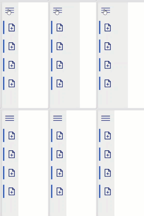
In the example below, you can see that my Power Apps application has a left navigation component for each screen. Thus, I can easily navigate between the screens.
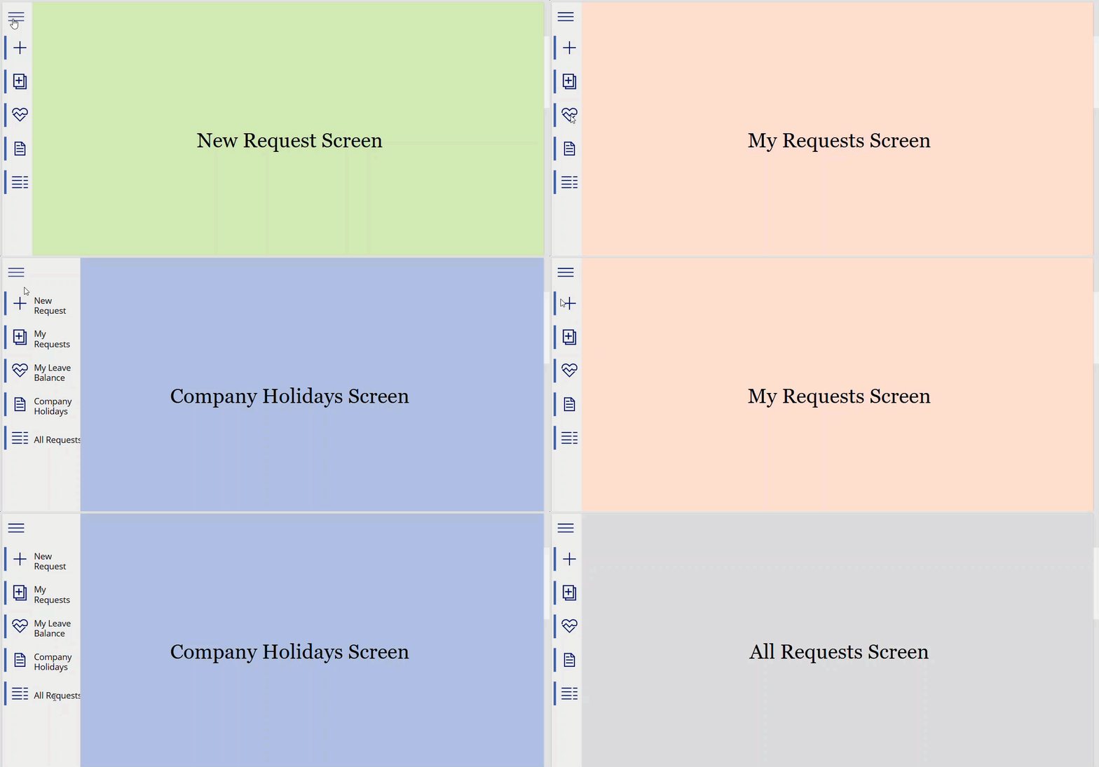
To achieve this, follow the steps below!
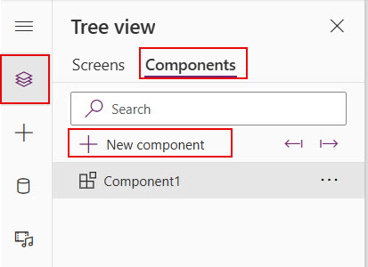
1. Open the Power Apps application -> On Tree view -> Select Components -> Then, click on +New component. It will create a component and rename the component like “LeftNavigationMenu.”
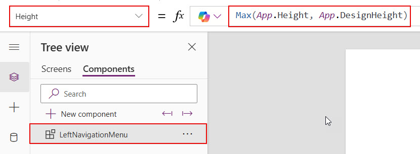
2. Set the Height property of the LeftNavigationMenu component with the below formula.
Max(App.Height, App.DesignHeight)This formula takes the screen’s full height.
3. Add a Hamburger menu icon to the Power Apps component. Then, adjust the icon’s height, width, and padding properties with the values below.
Height: 70
Width: 70
Left padding: 15
Right padding: 15
Top padding: 15
Bottom: 15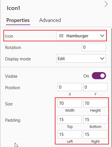
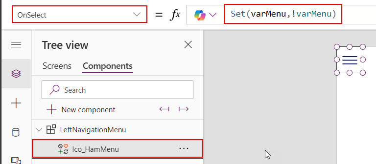
4. Provide the below formula in the OnSelect property of the Hamburger menu icon.
Set(varMenu,!varMenu)We’re using this formula for opening and closing the left navigation component based on the click on this icon. This formula always sets true and false values for the varMenu variable.
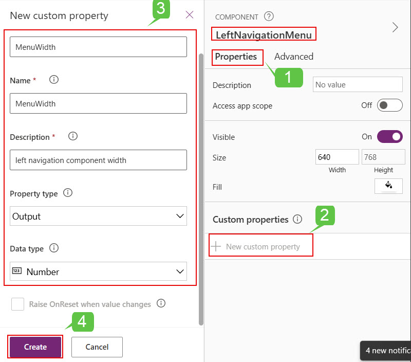
5. Open the Properties of the LeftNavigationmenu component ->Under Custom properties -> Click on +New custom property -> After providing the below details ->Click on Create.
- Name: Provide the name of the custom property.
- Description: Description of the custom property.
- Property type: Output
- Data type: Number
6. Save the changes and provide the formula below in the custom property [ MenuWidth] of the LeftNavigationMenu component.
If(varMenu,Max(App.Width, App.DesignWidth)/10,75)If this width is not enough for your component you can adjust the values like below.
If(varMenu,Max(App.Width, App.DesignWidth)/10+60,75)
7. Then, provide the formula below in the Width property of the LeftNavigationMenu component.
LeftNavigationMenu.MenuWidth
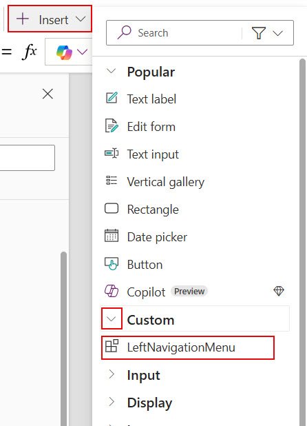
8. To test the component in Power Apps screens, provide some color to its Fill property. Then, open Screens -> Click on the +Insert tab to import the component into the screen -> Under Custom -> Select LeftNavigationMenu.
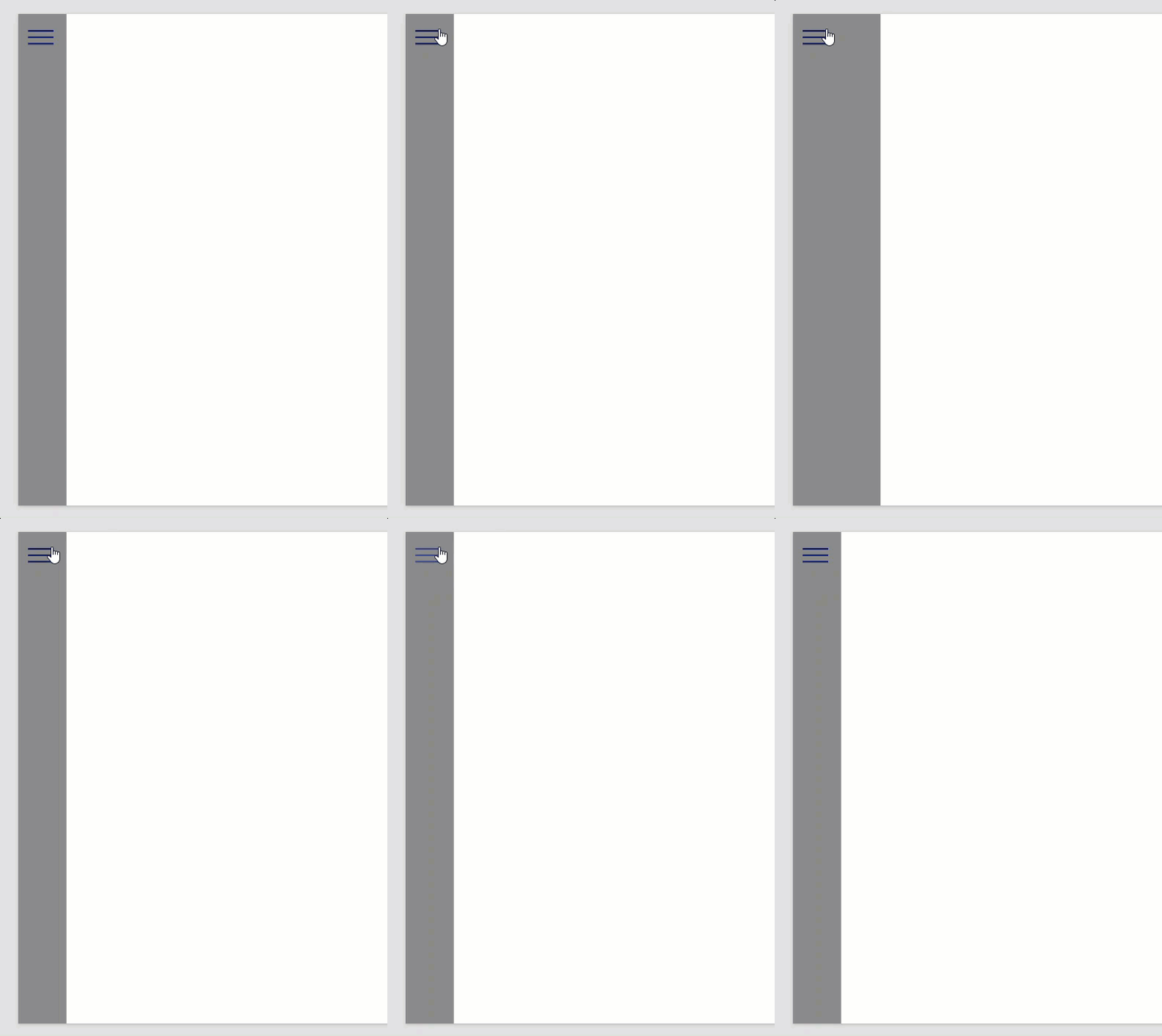
9. Now, preview the app once. You can see the component width will change dynamically based on the hamburger icon click.
Now, we’ll see how to add the remaining icons for navigating between the screens.
10. Add a Power Apps Blank Vertical Gallery control to the component. Then, add the following formulas to its height and width properties.
Height: Parent.Height-Ico_HamMenu.Height
Width: Parent.Width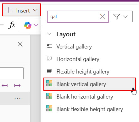
11. Add a Rectangle to the gallery within the Power Apps component. Then, set its Height, Width, and Y properties with the values below. Also, set the Gallery Control’s Template size property with the value below.
//Rectangle properties
Height: 60
Width: 6
Y:10

//Gallery property
Template size: 80
12. Then, add any one Icon to the gallery control within the Power Apps component. After adding, set its following properties with the below values.
Height: Parent.TemplateHeight
Width: 60
X: 10
Y: 0
Left Padding: 10
Right Padding: 10
Top Padding: 10
Bottom Padding: 10
So, when the left navigation width increases or decreases, the icon’s positions won’t change, and they will be visible.
13. To display the icon’s usage, add a Text label. Then, set its properties with the values below.
Height: Parent.TemplateHeight
width: Parent.Width
LeftPadding: 75
RightPadding:0
TopPadding:0
BottomPadding:0
Font size:16
X:0
Y:5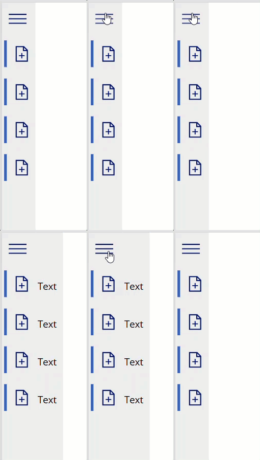
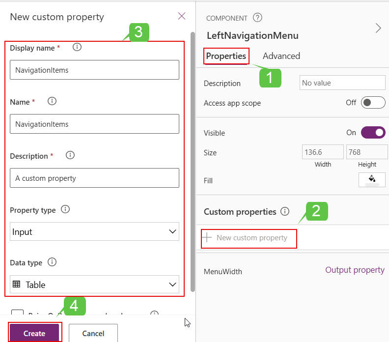
14. Add another custom property to the left navigation menu component in Power Apps. For adding different icons and navigation things, etc.
Open component Properties pane -> +New custom property -> Provide the below values for the properties -> Click on Create.
- Display name: NavigationItems [Change the display name according to your needs].
- Name: NavigationItems [By default, it takes the display name. If you don’t need it, change it].
- Description: Provide the usage of creating this property.
- Property type: Input
- Data type: Table
15. Open the newly created custom property [NavigationItems] of the LeftNavigationMenu component. Replace the code below with the default one.
Table(
    {
        Title: "New Request",
        Screen: App.ActiveScreen,
        Icon: Icon.Add
    },
     {
        Title: "My Requests",
        Screen: App.ActiveScreen,
        Icon: Icon.AddLibrary
    },
     {
        Title: "My Leave Balance",
        Screen: App.ActiveScreen,
        Icon: Icon.Health
    },
     {
        Title: "Company Holidays",
        Screen: App.ActiveScreen,
        Icon: Icon.DocumentWithContent
    },
     {
        Title: "All Requests",
        Screen: App.ActiveScreen,
        Icon: Icon.DetailList
    }
)
This formula contains three parameters,
- Title: This parameter is for representing the usage of icons in the left navigation component.
- Screen: It represents the screen name.
- Icon: It represents the icon.
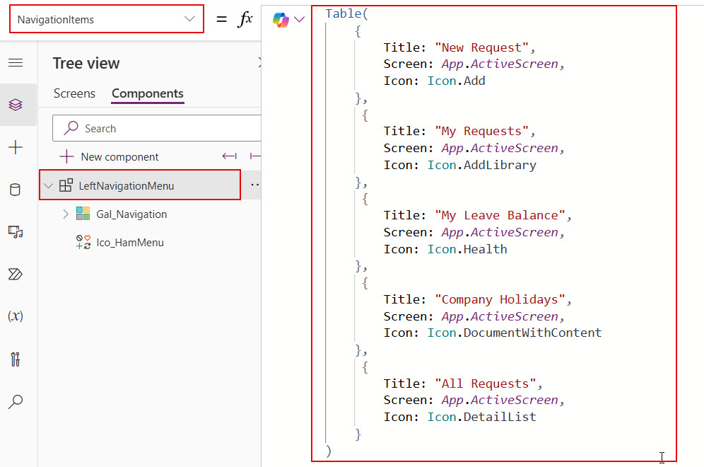
16. Provide the formula below in the Items property of the gallery within the Power Apps component.
LeftNavigationMenu.NavigationItems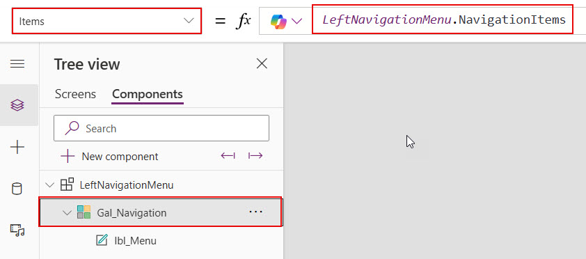
17. For the icon present within the gallery, provide the formula below in its Icon property.
Icon: ThisItem.IconAlso, provide the formula below in the OnSelect property of the same icon in the gallery.
OnSelect: Navigate(ThisItem.Screen)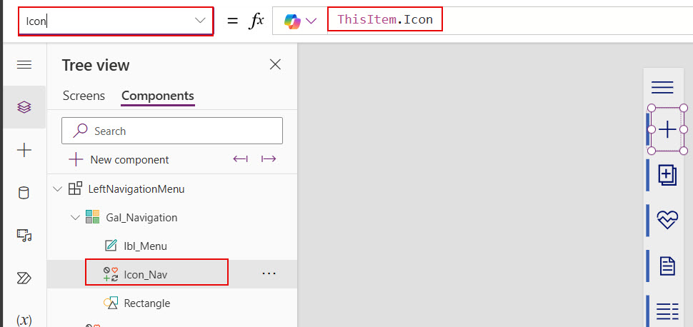
18. Provide the formula below in the Text property of the text label present within the gallery.
Text: ThisItem.Title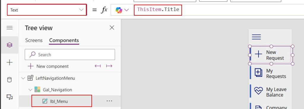
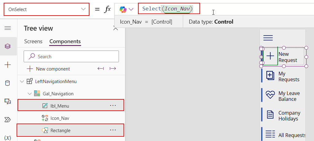
19. Select the text label and rectangle within the gallery and set its OnSelect property with the formula below.
OnSelect: Select(Icon_Nav)Here, Icon_Nav is the icon name that is present in the gallery.
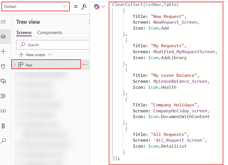
20. Provide the formula below in the OnStart property of the Power Apps’s App object.
ClearCollect(colNav,Table(
    {
        Title: "New Request",
        Screen: NewRequest_Screen,
        Icon: Icon.Add
    },
     {
        Title: "My Requests",
        Screen: Modified_MyRequestScreen,
        Icon: Icon.AddLibrary
    },
     {
        Title: "My Leave Balance",
        Screen: MyleaveBalance_Screen,
        Icon: Icon.Health
    },
     {
        Title: "Company Holidays",
        Screen: CompanyHoliday_screen,
        Icon: Icon.DocumentWithContent
    },
     {
        Title: "All Requests",
        Screen: 'All_Request Screen',
        Icon: Icon.DetailList
    }
));
Here, we’re changing the screen names in our Power Apps application for the Screen parameter within the table.
21. Now add this left navigation component on all the screens where you want and provide the below collection in its NavigationItems property.
NavigationItems: colNav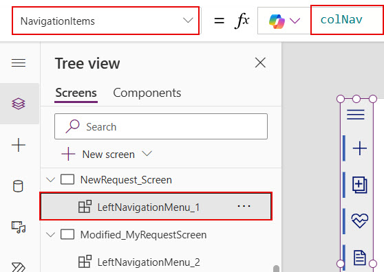
Now save changes and preview the app. In Power Apps, you can navigate between screens by selecting the icons in the left navigation component.
I hope you understand how to create a Power Apps left navigation component with menu icons. You can follow this article while trying to create a left navigation component in Power Apps to avoid adding the same controls on each screen for navigating.
Also, you may like:
- Generate and Download PDFs From Power Apps
- Calculate Business Days Excluding Weekends Holidays in Power Apps
- Sort Power Apps Combo Box Items
- How to Use Environment Variables in Power Platform
I am Bijay a Microsoft MVP (10 times – My MVP Profile) in SharePoint and have more than 17 years of expertise in SharePoint Online Office 365, SharePoint subscription edition, and SharePoint 2019/2016/2013. Currently working in my own venture TSInfo Technologies a SharePoint development, consulting, and training company. I also run the popular SharePoint website EnjoySharePoint.com